React Native Snackbar Component Save
A snackbar component for Android and iOS
Project README
react-native-snackbar-component
A snackbar component for Android and iOS, customizable and simple.
See Google Material Design for more info on Snackbars.
Installation
npm install --save react-native-snackbar-component
Basic Usage
import SnackBar from 'react-native-snackbar-component'
Code
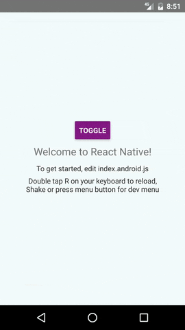
<SnackBar visible={true} textMessage="Hello There!" actionHandler={()=>{console.log("snackbar button clicked!")}} actionText="let's go"/>
Options
| Prop | Type | Effect | Default Value |
|---|---|---|---|
| visible | boolean | Show or hide the snackbar | none |
| textMessage | string / function | The main message text, can also supply a function returning JSX to render custom message UI | none |
| actionHandler | function | Function to be called when button is pressed, if absent no action button is shown | none |
| actionText | message | The text of action button, will be uppercased automatically | none |
| backgroundColor | color | The background color of snackbar | #484848 |
| accentColor | color | The color of action button text | orange |
| messageColor | color | The color of main message text | #FFFFFF |
| distanceCallback | function | Function to be caled whenever snackbar moves in and out or changes layout, the function will be supplied a number indicating distance taken up by snackbar on bottom or top, based on position. | (distance) => {} |
| position | string | The position of the snackbar: top, bottom | bottom |
| top / bottom / left / right | number | Use these to position the snackbar | 0 |
| autoHidingTime | number | How many milliseconds the snackbar will be hidden | 0 (Do not hide automatically) |
| containerStyle | object | Override or add style to the root container View | {} |
| messageStyle | object | Override or add style to the message Text | {} |
| actionStyle | object | Override or add style to the action button Text | {} |
Note
- When visible prop is changed, the snackbar will be animated in/out of screen
- The snackbar will not auto-dismiss by itself, for auto-dismiss use setTimeout() and change value passed to prop to false,
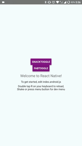
OR you can setautoHidingTimeto any particular value to hide the snackbar itself, although you will need to resetvisibleto false manually after theautoHidingTimeperiod is over, sincevisibleis controlled from outside. - This works great together with react-native-fab. See demo for example and instructions how to.
Open Source Agenda is not affiliated with "React Native Snackbar Component" Project. README Source: sidevesh/react-native-snackbar-component
Stars
186
Open Issues
6
Last Commit
3 weeks ago
Repository
License
Open Source Agenda Badge
