CoronaTracker Versions Save
Coronavirus tracker app for iOS & macOS with maps & charts
v1.7.2
3 years agoStability Improvements
- Always show day and month in charts.
- FIXED: Some numbers were not shown because of an issue in JHU data.
- FIXED: Some annotations were placed in the wrong locations.
- FIXED: Negative numbers were shown for some stats.
2 New Translations
- Kurdish by @rawaz4
- Croatian by @FranicevicNikola
And other minor UI enhancements and bug fixes.
v1.7.1
3 years agoStability Improvements
- FIXED: Province-level data isn't shown for all countries.
- FIXED: Time-series data is missing for Germany, Italy, and Spain.
- FIXED: macOS app crashes for some users.
3 New Translations
- Ukrainian by @ValeriySoglaev
- Albanian by @lor1x
- Greek by @marquicodes
And other minor UI enhancements and bug fixes.
v1.7
4 years agoProvince/State Level Data
- Added state-level data for Germany (Contributed by @stuffmc) (Data source)
- Added state-level data for Austria (Contributed by @patricks) (Data source)
- Added province-level data for many other counties (Data source)

- Show provinces in the charts when a country is selected and province data is available.

Fullscreen Charts
As the volume of the data increases, it becomes more difficult to read charts and interact with them. With the new chart screen, you can now see the charts fullscreen and zoom in to see the finest details.
- Tap/click on a chart to open it in a fullscreen mode.
- Swipe down (iOS) or press the ESC button (macOS) to dismiss.

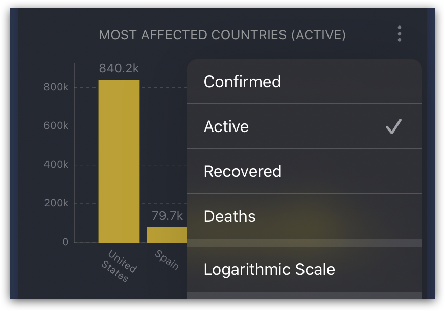
New Chart Options
- Added an option to show the total deaths since the 10th death.
- Added an option to show the active cases for the most affected countries chart.
- Added a logarithmic scale option to all charts.

Better macOS UI
- Added a toolbar to the main window
- Added menu items and keyboard shortcuts for the main actions.

Ten New Translations
- Dutch by @hdatteln
- Romanian by @rhcpfan
- Korean by @dev-yong
- Arabic by @hussamzain
- Norwegian Bokmål by @comradekingu
- Indonesian by @nikotidar
- Danish by @peme
- Chinese, Traditional (Taiwan) by @League2EB
- Turkish by @nesimtunc
- Hungarian by @BrotherLouie
And lots of improvements, bug fixes, and UI enhancements.
A big thank you to all who have contributed or supported this project in any way. Stay safe, stay healthy!
v1.6
4 years agoA New Chart
The chart shows the confirmed cases by days since the 100th case for the most affected countries in addition to the selected location.
 Tip: You can tap on a country name to focus on its trendline.
Chart Options
You can now also see the daily new recovered and deaths by tapping on the new chart options button ( ⠇) and changing the mode. The same options are also added to the most affected countries chart.

Improvements for macOS
-
Added a context menu to all charts and stats view that includes the chart options and a new item to copy the chart or stats image.

-
The country screen is now shown by default on macOS.
-
And the app icon has been updated to look more macOS-ish.
Four New Translations
- Simplified Chinese (by @erickzli)
- Spanish (by @ejewik)
- Japanese (by @dev-sora)
- Polish (by @pbeo)
And lots of improvements, bug fixes, and UI enhancements.
v1.5
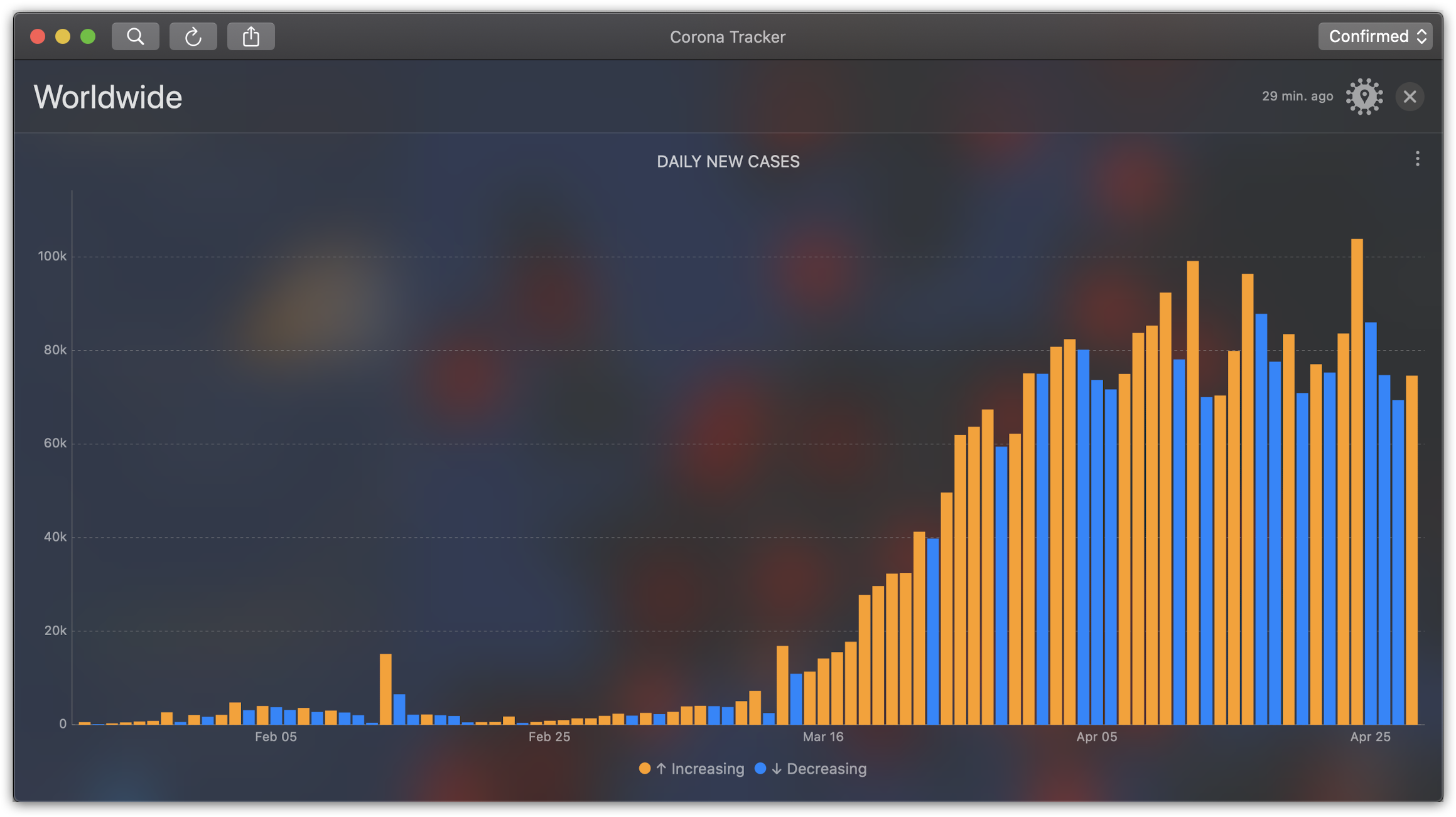
4 years agoDaily New Cases Chart
Added a new chart for daily new cases. This is an important chart as it shows how fast the virus is spreading in a given country. Keep your eyes on it and hope for an all-blue chart soon.

Annotation Mode
Added Annotation Mode button (on the top right). You can now switch between Confirmed, Active, Recovered, or Deaths.

Active cases
Show the number of active cases in the annotation balloon.

Quick Share
Added a context menu for quickly sharing charts & statistics (iOS: Tap and hold to see. macOS: Click the " ⠇" button -> Share)
Six New Translations
- German (by @sebastianbinder)
- Swedish (by @FluffyDev2019)
- Portuguese (by @ppamorim)
- Italian (by @Ale111)
- French (by @Risengan)
- Russian (by @wacumov)
And More
- Show the charts for the active date range only.
- Show all countries in the search screen.
- Lots of improvements, bug fixes, and UI enhancements.
Finally
If you like the app you can help us by translating the app to your language or spreading the word. Thank you!
v1.4
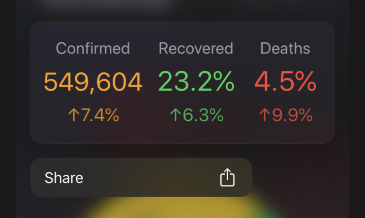
4 years ago- Added new stats for the daily growth of confirmed, recovered, and death cases.
- Added share functionality. You can share the stats & charts now (tap ⠇ button).
- Added an update button (tap ⠇ button).
- Added Today Widget for iOS (Contributed by Piotr Ożóg).
- Removed the annoying alert and show a button when an update is available.
- Bug fixes and improvements.
v1.3.1
4 years ago• Fixed an issue that prevented scrolling.
v1.3
4 years ago• Added search for affected countries & cities.
v1.2.1
4 years ago• Check for app updates. • Bug fixes and improvements.