XivParty Save
A party list addon for Windower 4.
XivParty
A party list addon for Windower 4.
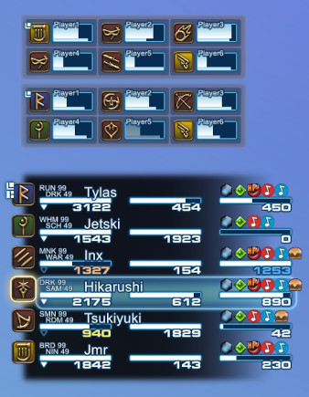
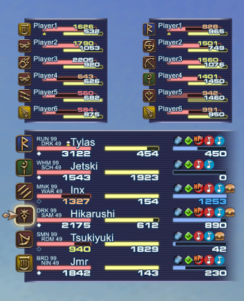
Shows party members' HP/MP/TP, main job, sub job and current buffs. Buffs can be filtered and are sorted debuffs before buffs for easier visibility. Distance to party members is indicated by dimming HP bars when out of casting or targeting range.
Installation
- Download the latest release and extract it to Windower4/addons
- Load using "//lua load xivparty" in the chat window
- To load the addon automatically when the game starts, edit Windower4/scripts/init.txt and add "lua load xivparty" at the end
- RECOMMENDED: Download and install the free font "Grammara" for a more authentic FF14 look of the numbers (restart Windower afterwards, or it won't find the newly installed font)
Commands
| Command | Action |
|---|---|
| //xp filter add [ID] | Adds filter for buff with specified ID. |
| //xp filter remove [ID] | Removes filter for buff with specified ID. |
| //xp filter clear | Clears all buff filters. |
| //xp filter list | Shows list of all current filters in log window. |
| //xp filter mode | Switches between blacklist and whitelist filter mode (both use same filter list). |
| //xp buffs [name] | Shows list of currently active buffs (and IDs) for a party member. Omit name to see own buffs. |
| //xp range [near] [far] | Shows a marker for each party member closer than the set distances. "off" or "0" to disable. |
| //xp range num | Shows distance as numeric values, disables near/far markers. |
| //xp customOrder | Toggles custom buff order (customize in bufforder.lua). |
| //xp hideSolo | Hides the UI while solo. |
| //xp hideAlliance | Hides alliance party lists. |
| //xp hideCutscene | Hides the UI during cutscenes. |
| //xp mouseTargeting | Toggles targeting party members using the mouse. Disabling allows click through. |
| //xp swapSingleAlliance | When only one alliance party exists, its members will be shown in the 2nd alliance list. Prevents a gap when party lists are stacked in the same order as the original game UI. |
| //xp alignBottom | Expands the party lists from bottom to top. |
| //xp showEmptyRows | Shows empty rows in partially filled parties. |
| //xp job | Toggles job specific settings for current job. Settings changes to range or buffs will only affect this job. |
| //xp setup | Toggles setup mode showing a full alliance of fake party members. Move the UI via drag and drop, hold CTRL for grid snap. Use mouse wheel to scale the UI. |
| //xp layout [file] | Loads a UI layout file from the XivParty/layouts directory. |
Range Indication
The distance to party members is indicated by dimming their HP bars in two stages: out of standard casting range (~20.8) and out of targeting range (50).
There is also a customizable range indicator useful when casting aoe buffs. Set a near and an optional far distance with the "range" command. A filled icon (near) or a hollow icon (far) will appear below the HP bar of any party member in range. The main player will always have the icon displayed when the feature is active. Set the range to "off" or "0" to disable. Alternatively set "range num" to show party member distances as numeric values. This will disable the near / far markers.
Buff Filters
When the UI gets too cluttered with buff icons, you can set filters to only show or hide certain buffs. Use the command "filter add [ID]" to add a buff to the filter list. The buff IDs can be found in bufforder.lua or in-game using the "buffs" command, which shows the current buff IDs of a party member. The filter list works in "blacklist" mode by default, meaning any added buffs are hidden. You can switch the mode to "whitelist" to only display buffs that are on the filter list instead. Filters can also be set up separately for each job, see below for details.
Custom Buff Order
By default buffs are sorted debuffs first, then buffs by various categories. This can be disabled to revert back to the game's original order, which is sometimes random and based on when the buff was added to the game.
You can customize the sorting order by editing the file bufforder.lua. Just reorder the lines of the list. Do not change the IDs. The name strings are not used by the addon and are only there for readability. Save the file as UTF-8 without BOM or ANSI (however this will destroy the Japanese translations).
Job Specific Settings
Can be toggled separately for each job using the "job" command. While on a job with enabled job specific settings, the following commands will only affect the settings of that job: range, filter, customOrder. Switching jobs will automatically apply a job's specific settings, or the global settings when none present or disabled.
Hiding the UI
The UI can be automatically hidden in certain situations: while you are not in a party (solo) or during cutscenes. This behavior can be configured using in-game commands. The UI is always hidden while zoning.
In addition, you can hold down the "End" key on your keyboard to temporarily hide the UI. This can be useful while reading the expanded chat log, currently there is no way to detect the expanded log to hide automatically. This hotkey can be changed to any other key by manually setting the "hideKeyCode" parameter in your data/settings.xml to the desired DirectInput key code.
Creating Custom Layouts
Layouts consist of XML files in the XivParty/layouts directory and image files in XivParty/assets. Values defining positions, sizes, image paths, fonts and colors of various UI elements can be set in the XML files, so editing the LUA files should not be necessary to customize the look of the UI. Alliance party lists can have a different layout than the main party, if a second XML file with the name suffix "_alliance" is present (e.g. myLayout.xml + myLayout_alliance.xml).
Layout Structure
The UI is made up of individual image and text primitives, which are logically grouped into UI elements. All UI elements are part of a hierarchical structure. For example a HP bar consists of five images and a text. The HP bar is part of a list item (representing one party member), which itself is part of the whole party list. The position and scale of every UI element is relative to their parent element and the parent's position and scale affects all child elements. This has the benefit of being able to position whole groups of images and texts by only adjusting the coordinates of a common parent. The hierarchy in the XML represents the logical hierarchy of the UI elements, but does not define it.
All UI elements support the following parameters:
- enabled: When set to false, the UI element and all its children will not be displayed. This also disables background updating to save resources. Alternatively, remove the whole XML node of an element to disable it.
- pos: X and Y position (comma separated, float), relative to the parent element.
- scale: Horizontal and vertical scale (comma separated, float), relative to the parent element.
- zOrder: Sets the ordering of elements in the context of their parent (integer). Low values will place elements below ones with higher values. Due to a Windower limitation, z-order for images and texts are handled separately. This means that texts will always be above images, but elements of the same type can be ordered using this parameter.
- snapToRaster: When true, the screen coordinates of the element will be rounded down to align with the pixels on the screen. This can help images and fonts to appear less blurry when scaled. However, since the positions are slightly changed while scaling, gaps can appear when an element is made up of multiple aligned images. For stacked elements like HP bars, it is recommended to make all image assets of the same size to prevent such alignment issues.
In addition, primitives also have the following parameters.
Image parameters:
- path: Path to the image file, relative to the addon's directory.
- size: Width and height of the image (comma separated, float). This should be set to the original image's size in pixels, but can have different values to scale the image (in addition to the scale parameter).
- color: Image color as a hexadecimal color code in the format #RRGGBBAA (red, green, blue, alpha). Should be set to white (#FFFFFFFF) to preserve the original image file colors.
Text parameters:
- font: Font name to be used for the text. Can be any system installed font. When the specified font is not found, "Arial" is used as a fallback.
- size: Vertical font size in pixels, subject to scale.
- color: Font's fill color as a hexadecimal color code in the format #RRGGBBAA.
- stroke: Stroke (outline) color as a hexadecimal color code in the format #RRGGBBAA.
- strokeWidth: With of the outline in pixels, subject to scale.
- alignRight: Set to true to make the text right-justified instead of the default left. This will change the position origin to top-right.
- maxChars: Maximum number of characters to display. Longer texts will be cut off by replacing the last allowed character with an ellipsis (three dots). Set to 0 to allow unlimited characters.
- short: Zone text only: display shortened zone name instead of full length one.
Party List
The party list is the root UI element. It positions a party list item for every party member in a grid, which is configurable in the layout.
Parameters:
- rows: Number of rows in the party list (integer).
- columns: Number of columns in the party list (integer).
- rowHeight: The height of a row. Affects list item positioning, mouse interaction and sizing of the background image.
- columnWidth: The width of a column. Affects list item positioning and mouse interaction.
When adjusting the grid dimensions, it can be helpful to temporarily visualize the list items by editing uiListItem.lua and setting the local isDebug variable to true. The draggable area of the whole party list can also be shown in this way by editing uiPartyList.lua.
Background
Consists of a fixed top and bottom image, and a center (mid) texture that repeats vertically when the party list resizes. When using repeating patterns, make the mid texture height as low as possible, as it can only repeat in full height steps and will be slightly compressed in between.
Status Bars
The HP/MP/TP bars are three stacked images: imgBg (background), imgBar and imgFg (foreground). The glow effect consists of a center part which is horizontally scaled (imgGlow) and a fixed image to cap off both sides (imgGlowSides). When creating custom assets, it is recommended to use a foreground image that vertically overlaps the bar image by at least one pixel. This reduces aliasing and scaling artifacts between the bar and its frame. The bar image must not have any empty transparent space on the left and right sides, or horizontal scaling will not look good when the bar's value changes.
Parameters:
- hideOutsideZone: When true, the status bar is hidden while the party member is not in your current zone.
- hpYellowColor: HP bar only: color of the text when HP falls below 75%.
- hpOrangeColor: HP bar only: color of the text when HP falls below 50%.
- hpRedColor: HP bar only: color of the text when HP falls below 25%.
- tpFullColor: TP bar only: color of the text when TP is at or above 1000.
For the HP/TP based color changes, there are also optional equivalents that change the bar color with a similar naming scheme (e.g. hpRedBarColor).
Bar parameters:
- animSpeed: Speed of the bar animation in percent per frame (float, range 0 to 1). This is a multiplicator applied to the remaining distance the bar has to travel. The higher the value, the faster the animation. When set to 1, the bar will move instantly without animation.
Buff Icons
Buff icons are placed in a grid, defined by the numIconsByRow parameter (see below). The game supports a fixed maximum of 32 buffs per character.
Parameters:
- path: Path to directory where buff icons images are located. Images must follow naming pattern: [buff-ID].png (e.g. 123.png)
- numIconsByRow: Maximum number of icons displayed per row (comma separated list, integer). E.g. three rows with 8 icons each would be "8,8,8,". Due to a Windower limitation, when using a single row, add a zero as a second row to prevent a warning message (e.g. "16,0"). When a player has more buffs than the sum of all rows, the remaining buffs will be cut off.
- offsetByRow: Offset each row by this many icon widths to the right (comma separated list, integer). This list must have the same number of entires as the numIconsByRow parameter.
- spacing: Horizontal and vertical distance between each icon (comma separated, float).
- alignRight: When true, icons will extend from right to left (the overall buff position origin will change to top-right).
Job Icons
Consist of five stacked images (front to back): frame, icon, gradient, background and highlight. The background image color is set in code based on the job's role and can be customized in the layout. Job roles can be changed or added in jobs.lua, when adding new roles also add a color entry with the same name in the layout.
Parameters:
- path: Path to directory where job icons are located. Images must follow the naming pattern: [3-letter-job].png (e.g. smn.png)
- colors: List of background colors for each job role.
Acknowledgments
- SirEdeonX (xivbar) - early prototype based on xivbar's code
- KenshiDRK (partybuffs) - buff packet code and buff icons
- Windower - buff listing for custom ordering feature
Open Source Agenda Badge
