Vuejs Clipper Save
Vue.js image clipping components using Vue-Rx.
vuejs-clipper
Vue.js image clipping components using Vue-Rx.

- Add image clipping components to your Vue application in nothing flat.
- Touch devices supported and fully responsive.
Demo/Document
You can find the source code of examples under the examples branch.
Table of Contents
Notice
Before using the plugin & components, here's something you should know:
- It's based on vue-rx.
- rxjs and vue-rx are required as peer dependencies.
- Components are responsive base on width instead of height, see Component Layout.
- You can clip your images (local uploaded images or images served on your site), but you cannot clip a cross-origin image unless the image server sets the CORS headers.
- Components' input is an image URL, output is a canvas element, they only help you clip images to canvas, you need to handle other things like transform file input to image URL or transform output canvas to image by yourself.
- If you set the clipper to be responsive, for example: put it in a
Row, Colsystem or set its width based on the container's width, you will lose a little bit of precision. The result of the clipper and the clip box position might not be that accurate. If you cannot tolerate the slippage, use fixed width${width + border*2}pxon the clipper component likewidth: 502px.
Installation (NPM & ESM)
Install vuejs-clipper
npm install vuejs-clipper --save
Install peer dependencies if you haven't.
npm install vue-rx rxjs --save
Vuejs-clipper is based on vue-rx, so make sure you have the vue-rx plugin installed.
import Vue from 'vue'
import VueRx from 'vue-rx'
// install vue-rx
Vue.use(VueRx)
Make sure to install vue-rx plugin first.
Import
use dist files (Recommanded)
import Vue from 'vue'
import VueRx from 'vue-rx'
// Use build files
import VuejsClipper from 'vuejs-clipper/dist/vuejs-clipper.umd.min'
import 'vuejs-clipper/dist/vuejs-clipper.css'

Vue.use(VueRx)
Vue.use(VuejsClipper)
use vuejs-clipper soruce
Not Recommanded, through this way you need to make sure your project' sass and sass-loader version is supported
You are using vuejs-clipper directly with your build process(webpack etc).
So make sure you have css loader, ex: sass-loader if you haven't installed :
vuejs-clipper@4 only support
sass(notnode-sass) for this approach
npm install -D sass-loader sass
import Vue from 'vue'
import VueRx from 'vue-rx'
import VuejsClipper from 'vuejs-clipper'
// install vue-rx
Vue.use(VueRx)
// install vuejs-clipper
Vue.use(VuejsClipper)
Config
By default vuejs-clipper plugin will register all components to Vue global scope.
register some components to global with default component name
Vue.use(VuejsClipper, {
  components: {
    clipperBasic: true,
    clipperPreview: true
  }
})
with the customized component name
Vue.use(VuejsClipper, {
  components: {
    clipperBasic: 'image-clipper-basic',
    clipperPreview: 'my-preview'
  }
})
not register any components, but with some plugin options
Vue.use(VuejsClipper, {
  components: null,
  parentPropName: 'myCustomerName'
  /*
   parentPropName:
    Vuejs-clipper Adds property to Vue instance in order to store `clipper-preview` list.
    You can change the property name
    default: '_imgPreviewLists'
  */
})
separately import components (need css loader)
import Vue from 'vue'
import VueRx from 'vue-rx'
// install vue-rx
Vue.use(VueRx)
then import in your components (SFC)
import { clipperBasic, clipperPreview } from 'vuejs-clipper'

export default {
  components: {
    clipperBasic,
    clipperPreview
  }
}
Installation (Script)
Include vuejs-clipper umd script after Vue.js.
<!-- rxjs-->
<script src="https://unpkg.com/rxjs/bundles/rxjs.umd.js"></script>
<!--vue-->
<script src="https://cdn.jsdelivr.net/npm/[email protected]/dist/vue.js"></script>
<!-- vue-rx-->
<script src="https://unpkg.com/[email protected]/dist/vue-rx.js"></script>
<!--vuejs-clipper script & style -->
<script src="./dist/vuejs-clipper.umd.min.js"></script>
<link rel="stylesheet" href="./dist/vuejs-clipper.css" />
Use in html/template
<clipper-basic src="example.jpg"></clipper-basic>
Components
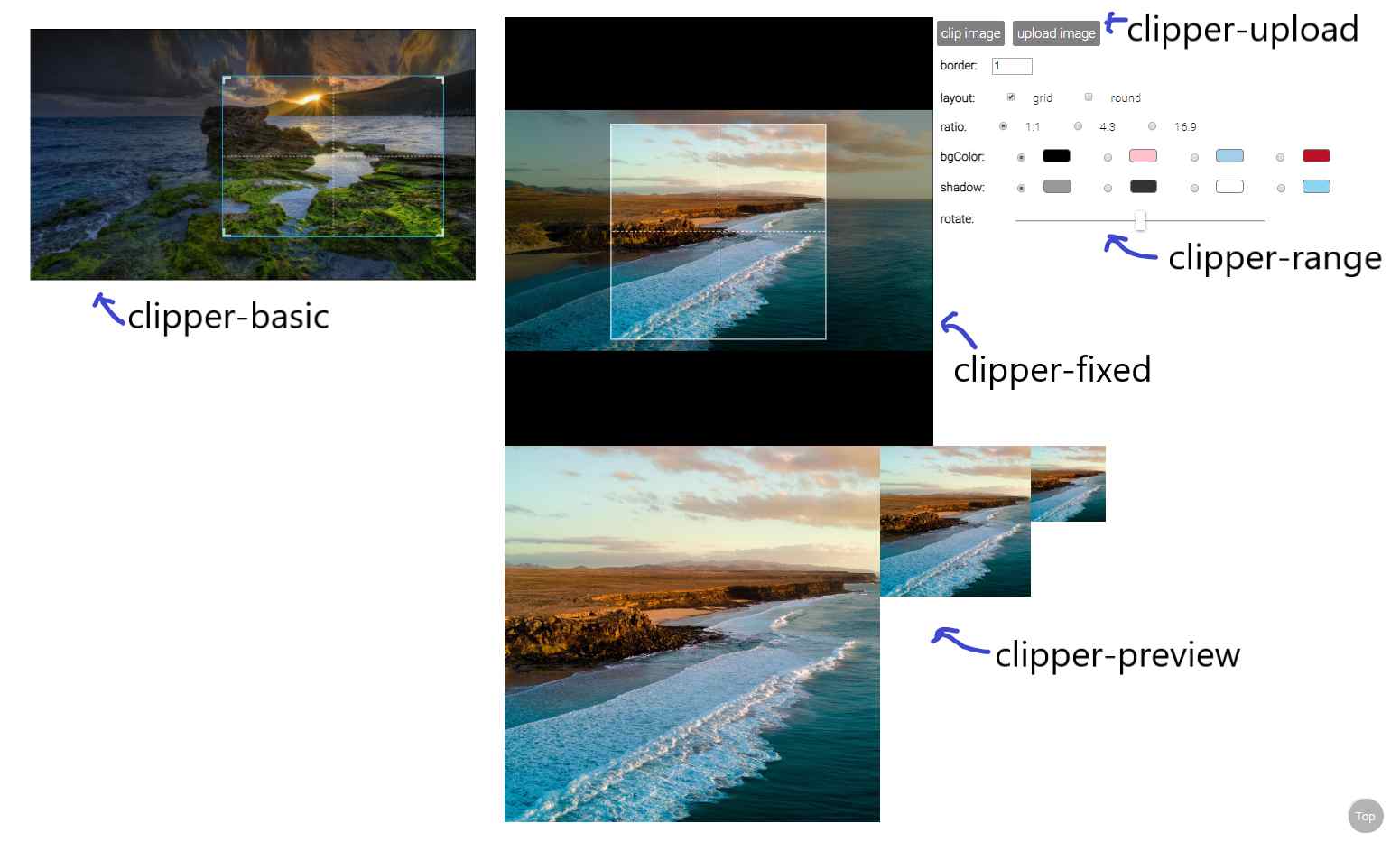
See detail examples.
clipper-basic
an image clipping component
import { clipperBasic } from 'vuejs-clipper'
- Props
| Prop | Type | default | description |
|---|---|---|---|
| src | string | image src | |
| preview | string | matches clipper-preview's name to show preview image. |
|
| border | number | 1 | border width |
| outline | number | 6 | outlines near by the border to help user zooming. |
| corner | boolean | true | show corner layout |
| grid | boolean | true | show grid layout |
| ratio | number | ratio of clipping area (width/height). ex: 1, 4/3 . |
|
| wrap-ratio | number | NaN | ratio of clipping container (width/height). ex: 1, 4/3 . |
| mode | 'normal'/'switch' | 'normal' | if ratio is set, this prop will affect how clipping area zoom. |
| bg-color | string | 'white' | background color |
| lineColor | string | '#1baae8' | clip box line color |
| shadow | string | 'rgba(0,0,0,0.4)' | shadow color |
| rotate | number | 0 | rotate degree |
| scale | number | 1 | transform scale |
| min-width | number | 1 | minimum width(%) of clipping box related to clipping component's width |
| min-height | number | 1 | minimum height(%) of clipping box related to clipping component's height. |
| init-width | number | 50 | clipping area's width(%) when the image loaded. |
| init-height | number | 50 | clipping area's height(%) when the image loaded. |
| touch-create | boolean | true | enable/disable create new clipping area on touch device |
| cross-origin | string | undefined | crossorigin attribute of <img /> inside clipper. ex: anonymous |
For more detail about the layout settings, pleases see Component layout in depth.
- Methods
| method | argument | return | description |
|---|---|---|---|
| clip | options | canvas element | get clipping canvas element |
| getDrawPos | {pos, translate}: positions and transformation |
get result canvas information |
clip() arguments
| name | type | default | description |
|---|---|---|---|
| options.wPixel | number | undefined | Set the the width (pixel) of result canvas. |
| options.maxWPixel | number | undefined | Set the the maximum width (pixel) of result canvas. |
set ref to use component methods
<clipper-basic ref="clipper" />
in your Vue instance methods
const canvas = this.$refs.clipper.clip()
- Event
| event | parameters | description |
|---|---|---|
| load | $event | image onload |
| error | $error | image onerror |
usage :
<clipper-basic @error="errorCb" @load="loadCb" />
- Data
| data | type | default | description |
|---|---|---|---|
| imgRatio | number | NaN | upload image's ratio (image naturalWidth/natrualHeight). Default value is NaN, after the load event the value will be set. |
| zoomTL$ | object | clipping area's position(%), can be top/bottom and left/right. | |
| zoomWH$ | object | clipping area's width and height(%) |
usage :
this.$refs.clipper.imgRatio
this.$refs.clipper.zoomWH$.width
- Slot
| slot | description |
|---|---|
| placeholder | if no src provided, show placeholder |
<clipper-basic src="">
  <div slot="placeholder">No image</div>
</clipper-basic>
- rxjs Subject
| subject | description |
|---|---|
| setTL$ | Set the position of the zooming area. |
| setWH$ | Set the width and height of the zooming area. |
| onChange$ | Subject that subscribes to zooming, moving, and rotating subjects. |
usage:
this.$refs.clipper.setTL$.next({ left: 0, top: 0 }) // percentage 0%
this.$refs.clipper.setTL$.next({ right: 0, bottom: 10 })
this.$refs.clipper.setWH$.next({ width: 100, height: 100 }) // percentage 100%

this.$refs.clipper.onChange$.subscribe(() => {
  // This happens whenever zooming, moving, and rotating occur.
})
clipper-fixed
an image clipping component
import { clipperFixed } from 'vuejs-clipper'
- Props
| Prop | Type | default | description |
|---|---|---|---|
| src | string | image src | |
| preview | string | matches clipper-preview's name to show preview image. |
|
| ratio | number | 1 | ratio of clipping area (width/height). ex: 1, 4/3 . |
| zoom-rate | number | 0.04 | zooming faster if this value is larger |
| min-scale | number | 0.1 | minimum transform scale |
| border | number | 1 | border width |
| border-color | string | 'white' | border color |
| grid | boolean | true | show grid layout |
| round | boolean | false | Use a round clipping area, this only effect the component layout, also affect clipping results. |
| bg-color | string | 'white' | background color |
| shadow | string | 'rgba(0,0,0,0.4)' | shadow color |
| rotate | number | 0 | rotate degree |
| area | number | 50 | width or height (%) of clipping box(depends on ratio). |
| cross-origin | string | undefined | crossorigin attribute of <img /> inside clipper. ex: anonymous |
| handle-zoom-event | function | (scale) => scale |
handle zooming, accept the calculated scale value, return the scale value. |
- Method
| method | argument | return | description |
|---|---|---|---|
| clip | options | canvas element | get clipping canvas element. |
| getDrawPos | {pos, translate}: positions and transformation |
get result canvas information |
clip() arguments
| name | type | default | description |
|---|---|---|---|
| options.wPixel | number | undefined | Set the the width (pixel) of result canvas. |
| options.maxWPixel | number | undefined | Set the the maximum width (pixel) of result canvas. |
- Event
| event | parameters | description |
|---|---|---|
| load | $event | image onload |
| error | $error | image onerror |
- Data
| data | type | default | description |
|---|---|---|---|
| imgRatio | number | NaN | upload image's ratio (image naturalWidth/natrualHeight). Default value is NaN, after the load event the value will be set. |
| bgTL$ | object | image's translate(X,Y) | |
| bgWH$ | number | image's scaling |
- Slot
| slot | description |
|---|---|
| placeholder | if no src provided, show placeholder |
- rxjs Subject
| subject | description |
|---|---|
| setTL$ | Set the top and left of the image. |
| setWH$ | Set the sizing(scaling) of the image. |
| onChange$ | Subject that subscribes to zooming, moving, and rotating subjects. |
usage:
this.$refs.clipper.setTL$.next({ left: 50, top: 50 }) // percentage 0%
this.$refs.clipper.setWH$.next(0.6) // transform scale(0.6)

this.$refs.clipper.onChange$.subscribe(() => {
  // This happens whenever zooming, moving, and rotating occur.
})
clipper-preview
preview clipping result
import { clipperPreview } from 'vuejs-clipper'
- Props
| Prop | Type | default | description |
|---|---|---|---|
| name | string | name that matches clipper component's preview property |
- Slot
| slot | description |
|---|---|
| placeholder | if no src provided, show placeholder |
clipper-range
a simple input range component
import { clipperRange } from 'vuejs-clipper'
use v-model binding data with clipper-range
- Props
| Prop | Type | default | description |
|---|---|---|---|
| max | number | 10 | maximum value of range |
| min | number | 0 | minimum value of range |
clipper-upload
a new component in 0.2.0
an upload button that transforms image files to URL
import { clipperUpload } from 'vuejs-clipper'
use v-model binding data with clipper-upload
- Props
Props that are not defined below will apply to the file input as attributes, for example: accept, id, and name.
| Prop | Type | default | description |
|---|---|---|---|
| check | boolean | true | Check if upload file is an image. If set to true, when upload files that are not images, it will do nothing, so you will not get an error event on the clipping component. |
| exif | boolean | true | Transform EXIF image to correct orientation when uploading. |
- Event
| event | parameters | description |
|---|---|---|
| input | $event | Result domgstring on change |
- Data
| data | type | default | description |
|---|---|---|---|
| file | File Object | null | Uploaded file's original File Object. |
Changelog
-
4.1.0
-
clipper-fixed: if proproundistrue, result image will clip in rounded background #119.
-
-
4.0.0
- Use dart-sass instead of node-sass.
- update sass syntax: use
math.divinstead of/
-
3.2.0
- [Deprecated] should be
4.0.0
- [Deprecated] should be
-
3.1.2
- Fix touch devices zooming bug: #91
-
3.1.1
- Fix #82
-
3.1.0
- Fix
clipper-basicratio is not correct.
- Fix
!Before v3.1.0,
clipper-basicwithratioprop has a bug that the clip area is not calculated correctly withborderprop, so the ratio of the clipping result isn't precise. (issue #80)
- 3.0.4
-
clipper-uploadaccept rest props as input attributes.
-
- 3.0.3
- Feature: Add
handleZoomEventtoclipper-fixedfor controlling zoom behavior. (issue #54
- Feature: Add
- 3.0.2
- Fix: move clipper-basic init/reset position function into
$nextTick(issue #71)
- Fix: move clipper-basic init/reset position function into
- 3.0.1
- Fix clipper-basic initalize ratio clip-box & wrong border layout.
- 3.0.0
- Move
rxjs,vue-rxfrom dependencies to peer dependencies.
- Move
- 2.1.2
- Fix
clipper-basicincorrect layout for scaling & rotation (bug of 2.1.1).
- Fix
- 2.1.1
- Fix
clipper-basicincorrect layout for verticle images on Firefox.
- Fix
- 2.1.0
- Fix broken
wrap-ratio.
- Fix broken
- 2.0.0
- Change css naming to BEM.
- 1.1.6
- Update dependencies.
- 1.1.5
- Add new prop
areaforclipper-fixed.
- Add new prop
- 1.1.4
- Add
crossoriginattribute biding for<img/>in clipper (crossOriginprop).
- Add
- 1.1.3
- Add
!importantstatements to components' style.
- Add
- 1.1.2
- Set pixel of
clipresult canvas.clip({ wPixel, maxWPixel })
- Set pixel of
- 1.1.1
- Add
clipper-fixedplaceholder slot.
- Add
- 1.1.0
- Fixed
clipper-basicpropsratioandwrapRatiobehaviors, nowratiowill not affect clipper's layout since there'swrapRatioto control the layout.
- Fixed
- 1.0.1
- Fixed
clipper-fixedloading images overflow. - Add
wrapRatio,initWidthandinitHeightprops toclipper-basic
- Fixed
- 1.0.0
- Change the
clipper-basicdesign, it will judge layout depends on the ratio. - Production version.
- Change the
- 0.2.13
- Decrease css specificity
- 0.2.12
- Fixed issue #13
- 0.2.11
- Expose rxjs subjects that can set position and layout of the movable area.
- 0.2.10
- Use passive event listener on wheel event (issue #8).
- 0.2.9
- New prop
border-colorforclipper-fixed - Fixed issue #4
- New prop
- 0.2.8
Open Source Agenda Badge
