ToolTipPopupWordTV Save
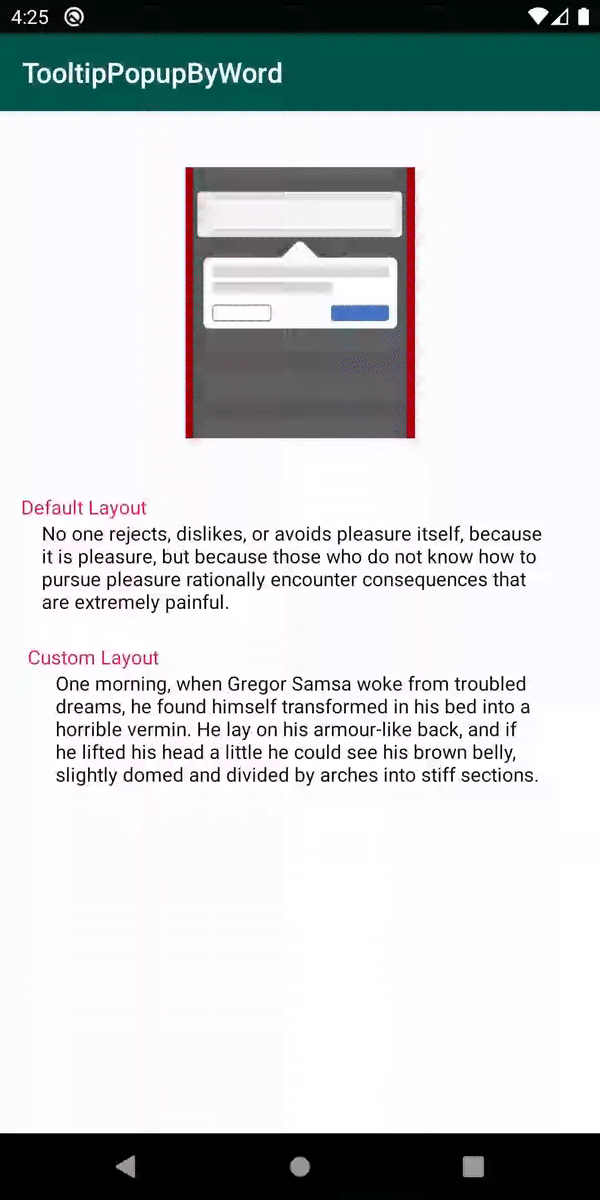
ToolTipopupWordTV is an Open Source Android library that allows developers to easily open a popup with details by select a word from a textview.
TooltipPopupWord
:loudspeaker: ToolTipopupWordTV is an Open Source Android library, that allows you to easily open a popup like tooltip, fully customizable, with details about selected word from your text. :tada:

Demo
Including in your project

Gradle
Add below codes to your root build.gradle file.
allprojects {
		repositories {
			...
			maven { url 'https://jitpack.io' }
		}
	}
And add a dependency code to your module's build.gradle file.
dependencies {
	        implementation 'com.github.EusebiuCandrea:ToolTipPopupWordTV:1.0.3'
	}
Features
- Selectable word from text;
- Show PopupWindow based on selected word;
- Customizable textsize, typeface, color, backround and alignment;
- Customizable ToolPopupWindows and Arrow
- Customized layout.
Custom attributes for SelectableWordTextView
| attribute name | attribute description |
|---|---|
| highlightBackgroundColor | The backround color of selected word. |
| highlightTextColor | The text color of selected word. |
| setUnderline | You can set a underline for selected word (true/false) |
Usage
Basic Example (Kotlin)
Firstly, you need to add this custom text view to the layout of the class, with custom attributes
<com.ecandrea.library.tooltipopwordtv.wordTextView.SelectableWordTextView
        android:id="@+id/word"
        android:layout_width="match_parent"
        android:layout_height="wrap_content"
        android:layout_gravity="center"
        android:layout_margin="@dimen/space_30dp"
        android:textColor="@color/colorPrimaryDark"
        app:highlightBackgroundColor="@color/blue"
        app:highlightTextColor="@color/white"
        app:layout_constraintBottom_toBottomOf="parent"
        app:layout_constraintLeft_toLeftOf="parent"
        app:layout_constraintRight_toRightOf="parent"
        app:layout_constraintTop_toTopOf="parent"
        app:setUnderline="true" />
Here is a basic example of implementing ToolPopupWindows with a default layout using ToolPopupWindows.ToolTipBuilder class.
 word.apply {
        text = "Select a word from this example."
        setToolTipListener(object : SelectableWordListeners {
            override fun onWordSelected(anchorView: TextView, wordSelected: String, lineNumber: Int, width: Int) {
                val toolPopupWindows = ToolPopupWindows.ToolTipBuilder(this@MainActivity)
                    .setToolTipListener { Toast.makeText(applicationContext, "dismissed", Toast.LENGTH_SHORT).show() }
                    .setTitleTextColor(ContextCompat.getColor(this@MainActivity, R.color.colorAccent))
                    .setTitleTextSize(20f)
                    .setBackgroundColor(ContextCompat.getColor(this@MainActivity, R.color.colorPrimary))
                    .setIsOutsideTouchable(false)
                    .setArrowCustomizer(...)
                    .build()

                word.showToolTipWindow(anchorView, wordSelected, lineNumber, width, toolPopupWindows)
            }
        })
        }
        word.setBackgroundWordColor(ContextCompat.getColor(this, R.color.colorAccent))
Also, the arrow can be customized using an ArrowCustomizer.Builder class
 ArrowCustomizer.Builder(this@MainActivity)
    .setArrowColor(ContextCompat.getColor(this@MainActivity, R.color.colorAccent))
    .setArrowSize(20)
    .build()
Customized layout
We can fully customize the ToolPopupWindows layout using below method.
.setCustomLayout(R.layout.custom_layout)
This is an example of implementing custom ToolPopupWindows.
Firstly create an xml layout file like custom_layout.
   val toolPopupWindows = ToolPopupWindows.ToolTipBuilder(this@MainActivity)
        .setToolTipListener { Toast.makeText(applicationContext, "dismissed", Toast.LENGTH_SHORT).show() }
        .setCustomLayout(R.layout.custom_layout)
        .setAutoDismissDuration(1500)
        .setIsOutsideTouchable(false)
        .setArrowCustomizer(ArrowCustomizer.Builder(this@MainActivity)
                .setArrowColor(ContextCompat.getColor(this@MainActivity, R.color.colorAccent))
                .setArrowSize(20)
                .build())
        .build()
And next we can get the inflated custom layout using getCustomInflatedView method.
 val inflatedView = toolPopupWindows.getCustomInflatedView()
        inflatedView?.let {
            it.newText.text = wordSelected
            it.newDescription.text = "Press remove button to delete this word!"
            it.testButton.setOnClickListener {
                removedWord(anchorView, wordSelected, wordTwo)
                toolPopupWindows.dismissTooltip()
            }
        }
:warning: If you didn't added your custom layout this method can return null
ToolPopupWindows.ToolTipBuilder methods:
.setWidthPercentsFromScreen(value: Double)
.setBackgroundColor(value: Int)
.setBackgroundDrawable(@DrawableRes value: Int)
setTextTitle(value: String)
.setToolTipDescription(value: String)
.setTitleTextColor(@ColorInt value: Int)
.setTitleTextColorResource(@ColorRes value: Int)
.setTitleTextTypeface(value: Int)
.setTitleTextSize(@Sp value: Float)
.setDescriptionTextColor(@ColorInt value: Int)
// same for description
.setCustomLayout(value: Int)
.setAutoDismissDuration(value: Long)
.setIsOutsideTouchable(value: Boolean)
.setToolTipListener(listener: ToolTipListeners)
.setArrowCustomizer(value: ArrowCustomizer)
.setToolTipListener(unit: () -> Unit)
.build()
ArrowCustomizer.Builder methods:
.setArrowDrawable(value: Drawable?)
.setArrowDrawableResource(@DrawableRes value: Int)
.setArrowSize(@Px value: Int)
.setArrowColor(@ColorInt value: Int)
.setArrowColorResource(@ColorInt value: Int)
.setArrowVisibility(isVisible: Boolean)
.build()
Find this library useful? :heart:
Be free to use it and enjoy. :star:
License
 Copyright 2020

   Licensed under the Apache License, Version 2.0 (the "License");
   you may not use this file except in compliance with the License.
   You may obtain a copy of the License at

       http://www.apache.org/licenses/LICENSE-2.0

   Unless required by applicable law or agreed to in writing, software
   distributed under the License is distributed on an "AS IS" BASIS,
   WITHOUT WARRANTIES OR CONDITIONS OF ANY KIND, either express or implied.
   See the License for the specific language governing permissions and
   limitations under the License.
Open Source Agenda Badge
