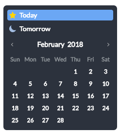
Things Calendar Save
Simple but elegant datepicker for the web — inspired by Things for mac
Project README
Things-calendar


Installation
npm install things-calendar
Usage
import ThingsCalendar from 'things-calendar';

<ThingsCalendar
  ref={calendar => this.calendar = calendar}
  show={true}
  onSelect={(date) => console.log(date)}
/>
Note: This library requires react
Configuration
Things-calendar leaves the heavy lifting up to pikaday and supports every feature pikaday has to offer:
-
fieldbind the datepicker to a form field -
triggeruse a different element to trigger opening the datepicker, see [trigger example][] (default tofield) -
boundautomatically show/hide the datepicker onfieldfocus (defaulttrueiffieldis set) -
ariaLabeldata-attribute on the input field with an aria assistance tekst (only applied whenboundis set) -
positionpreferred position of the datepicker relative to the form field, e.g.:top right,bottom rightNote: automatic adjustment may occur to avoid datepicker from being displayed outside the viewport, see [positions example][] (default to 'bottom left') -
repositioncan be set to false to not reposition datepicker within the viewport, forcing it to take the configuredposition(default: true) -
containerDOM node to render calendar into, see [container example][] (default: undefined) -
formatthe default output format for.toString()andfieldvalue (requires [Moment.js][moment] for custom formatting) -
formatStrictthe default flag for moment's strict date parsing (requires [Moment.js][moment] for custom formatting) -
toString(date, format)function which will be used for custom formatting. This function will take precedence overmoment. -
parse(dateString, format)function which will be used for parsing input string and getting a date object from it. This function will take precedence overmoment. -
defaultDatethe initial date to view when first opened -
setDefaultDatemake thedefaultDatethe initial selected value -
firstDayfirst day of the week (0: Sunday, 1: Monday, etc) -
minDatethe minimum/earliest date that can be selected (this should be a native Date object - e.g.new Date()ormoment().toDate()) -
maxDatethe maximum/latest date that can be selected (this should be a native Date object - e.g.new Date()ormoment().toDate()) -
disableWeekendsdisallow selection of Saturdays or Sundays -
disableDayFncallback function that gets passed a Date object for each day in view. Should return true to disable selection of that day. -
yearRangenumber of years either side (e.g.10) or array of upper/lower range (e.g.[1900,2015]) -
showWeekNumbershow the ISO week number at the head of the row (defaultfalse) -
pickWholeWeekselect a whole week instead of a day (defaultfalse) -
isRTLreverse the calendar for right-to-left languages -
i18nlanguage defaults for month and weekday names (see internationalization below) -
yearSuffixadditional text to append to the year in the title -
showMonthAfterYearrender the month after year in the title (defaultfalse) -
showDaysInNextAndPreviousMonthsrender days of the calendar grid that fall in the next or previous months (default: false) -
enableSelectionDaysInNextAndPreviousMonthsallows user to select date that is in the next or previous months (default: false) -
numberOfMonthsnumber of visible calendars -
mainCalendarwhennumberOfMonthsis used, this will help you to choose where the main calendar will be (defaultleft, can be set toright). Only used for the first display or when a selected date is not already visible -
eventsarray of dates that you would like to differentiate from regular days (e.g.['Sat Jun 28 2017', 'Sun Jun 29 2017', 'Tue Jul 01 2017',]) -
themedefine a classname that can be used as a hook for styling different themes, see [theme example][] (defaultnull) -
blurFieldOnSelectdefines if the field is blurred when a date is selected (defaulttrue) -
onSelectcallback function for when a date is selected -
onOpencallback function for when the picker becomes visible -
onClosecallback function for when the picker is hidden -
onDrawcallback function for when the picker draws a new month -
keyboardInputenable keyboard input support (defaulttrue)
Configurations at runtime
import ThingsCalendar from 'things-calendar';

<ThingsCalendar
  ref={calendar => this.calendar = calendar}
  show={true}
  onSelect={this.onSelect}
/>


// Reset datepicker onSelect
onSelect(date) {
  this.calendar.calendarPicker.goToToday();
  this.calendar.calendarPicker.setDate(null);
}
For a full list of methods for the calendarPicker check out pikaday's official documentation
Special thanks to
Ionicons for an awesome icon set Ionicons
Calendar picker Pikaday
The best to-do app for mac on the market Things
Open Source Agenda is not affiliated with "Things Calendar" Project. README Source: FalkoJoseph/things-calendar
Stars
168
Open Issues
0
Last Commit
6 years ago
Repository
License
Open Source Agenda Badge
