Storybook Addon Styled Component Theme Save
storybook addon
Project README

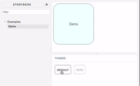
This addon allows storybook to showcase components with multiple different styled-component themes. Supports storybook v4, v5, v6 and newer
Installation
yarn add storybook-addon-styled-component-theme --dev
Configuration
storybook v6
Add a decorator to stories in .storybook/preview.js
import { addDecorator } from "@storybook/react";
import { withThemesProvider } from "storybook-addon-styled-component-theme";
import { ThemeProvider } from "styled-components";

const themes = [theme1, theme2];
addDecorator(withThemesProvider(themes, ThemeProvider));
Add to .storybook/main.js
module.exports = {
  ...
  addons: [
    ...
    "storybook-addon-styled-component-theme/dist/preset"
  ]
};
storybook v5 and v4
Add to .storybook/addons.js
// v1.3, storybook v5.2
import "storybook-addon-styled-component-theme/dist/register";

// v1.2, storybook v4, v5.0
import "storybook-addon-styled-component-theme/dist/src/register";
addDecorator to .storybook/preview.js
import { addDecorator } from "@storybook/react";
import { withThemesProvider } from "storybook-addon-styled-component-theme";

const themes = [theme1, theme2];
addDecorator(withThemesProvider(themes));
Remind
Make sure every theme object has a name property
Contributing
Build local library
yarn

yarn build
Start the local example
cd example

yarn

yarn storybook
Run all the spec
yarn test
Open Source Agenda is not affiliated with "Storybook Addon Styled Component Theme" Project. README Source: echoulen/storybook-addon-styled-component-theme
Stars
190
Open Issues
11
Last Commit
2 years ago
License
Open Source Agenda Badge
