SlimyCard Animated Flutter Package Save
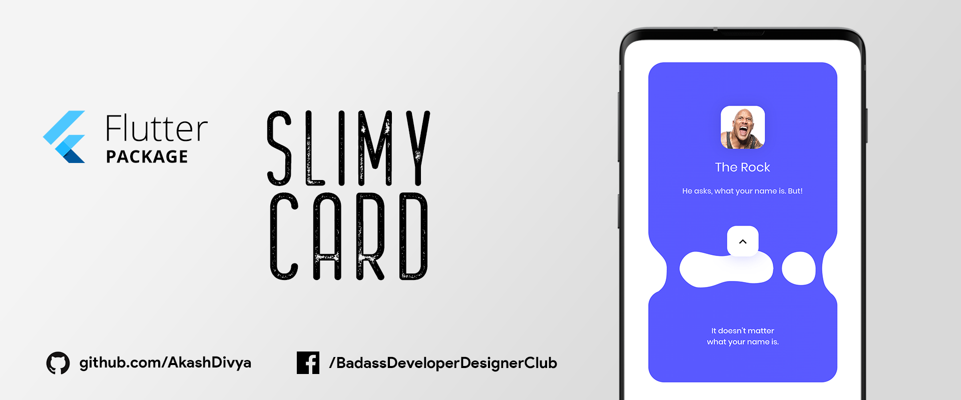
SlimyCard provides a beautiful slime-like animation of a Card that separates into two different Cards, one at the top and the another at bottom. It is possible to put any custom widget in these two separate cards.
SlimyCard - Animated Flutter Package
SlimyCard provides a beautiful slime-like animation of a Card that separates into two different Cards, one at the top and the another at bottom. It is possible to put any custom widget in these two separate cards.
How to install this package
-
1. Depend on it
Add this to your flutter app's pubspec.yaml file:
dependencies: slimy_card: ^1.0.4 -
2. Install it
You can install packages from the command line:
with Flutter:
$ flutter pub getAlternatively, your editor might support flutter pub get. Check the docs for your editor to learn more.
How to use this package
-
1. Import it
In your Dart code, import the package as mentioned below:
import 'package:slimy_card/slimy_card.dart'; -
2. Use It
Create a ListView, and in its children use SlimyCard()
ListView( children: <Widget>[ SlimyCard(), ], ); -
3. Customize It
You can customize SlimyCard as per need, by using the following parameters:
ListView(
  children: <Widget>[
    SlimyCard(
      color: Colors.red,
      width: 200,
      topCardHeight: 400,
      bottomCardHeight: 200,
      borderRadius: 15,
      topCardWidget: myWidget01(),
      bottomCardWidget: myWidget02(),
      slimeEnabled: true,
    ),
  ],
),
myWidget01 & myWidget02 are your custom widget which you can display in Top Card & Bottom Card respectively.
Actual ScreenShots
.gif)
.gif)
.gif)
How to get the status of this package
You can get the real-time status of this Package by wrapping the SlimeyCard in StreamBuilder as below:
StreamBuilder(
  initialData: false,
  stream: slimyCard.stream, //Stream of SlimyCard
  builder: ((BuildContext context, AsyncSnapshot snapshot) {
    return ListView(
      children: <Widget>[
        SlimyCard(
          color: Colors.red,
          width: 200,
          topCardHeight: 400,
          bottomCardHeight: 200,
          borderRadius: 15,
          topCardWidget: myWidget01(),
          bottomCardWidget: myWidget02(),
          slimeEnabled: true,
        ),
      ],
    );
  }),
),
snapshot.data will contain the real-time
State change in the Package
SlimeyCard also supports changing of state, check the code below:
SlimyCard(
  topCardWidget: topCardWidget((snapshot.data)
      ? 'assets/images/rock_aggresive.jpg'
      : 'assets/images/rock_calm.jpg'),
),
In the code above, snapshot.data contains status of SlimeyCard and have two states according to it & hence updates UI according to it.
App Demonstration Video
Cooming Soon...
About Me
Hi! my name is Akash Divya.
I'm a veteran Designer/Animator with 10+ years of experience. I always hated the excuses Developers gave me when they fail to implement my Design. One day, when I found about Flutter I said no more & started learning it.
Other Repo you may Like

My Links
Email: [email protected]
Now go out there and do what you Love.
Open Source Agenda Badge
