Release Notes Versions Save
Central repository of VTEX IO weekly release notes.
2021-01-15
3 years agoWeep no more, team: here we (finally) are :tada:
Let's make room for the VTEX IO Release Notes, this time around bringing you double the excitement from last November and December!
If 2020 made us shed some tears, our VTEX IO team worked around the clock to bring a smile back on our faces :grin: Just look at the awesome stuff they've delivered as last year came to an end:
- 🚀 Condition Layout v2
- ➕ Importing private CSS Classes
- ⚠️ Unannotated queries requested as public
- 🐛 Search results with special characters
And unlike 2020, things are looking up, okay? In addition to the tremendous deliveries the team had, we also have a special announcement regarding IO Docs and the migration of our documentation to the Developer Portal.
Believe me when I say it... you can't sit this one out! Without further ado, introducing the one and only VTEX IO Release Notes:
Special announcement :speaker:
- New home for the VTEX IO documentation
Officially housing VTEX IO documentation since September, 2019, IO Docs was the successful result of VTEX's effort to create a more in-depth and narrowly focused documentation.
With almost a year gone by, it's time to say goodbye: to better take advantage of existing and future VTEX IO documentation and to leverage the development experience of our users, VTEX IO documentation will henceforth be stored on our Developer Portal, starting today (January 15, 2021)!
:information_source: All existing documentation will be redirected and automatically migrated to the new platform. No existing link will be lost during this process.
Home to our API documentation and guides aimed at developers working with integrations and customization, the Developer Portal - formerly known as Help Center Developer Docs - offers all the necessary resources for VTEX's most advanced users in a single place.
Such changes to the VTEX IO documentation mean a lot more than just content redistribution, trust me: they will ensure a better and greater support for VTEX IO users and their specific objectives on our platform.
As to the future of our beloved Release Notes, don't worry: in addition to the Developer Newsletter bringing you all the essential updates on platform changes, the Developer Portal also has its own Release Notes section:
Nothing but the address will change, I promise! Everything else stays the same, with the same high-quality impactful content, working together as always, but now housed in a place that can fully encourage our potential :sparkles:
Features 🚀
-
Condition Layout v2 - What is better than the Condition Layout v1? Its second and most optimized version, of course! Welcome the Condition Layout v2, bringing you features such as verification by product specification value and product availability. Learn more about the new version by checking out the new documentation and the specially-prepared migration guide!
-
Native integration between the Subscription module and the front-end - Forget the messy old days when you had to develop a custom app to manage subscriptions on the front-end! The Product Customizer app is now natively compatible with the Subscription module, meaning you are now able to edit the name and the frequency of a product subscription through the store component in the product details page. Access the Product Customizer app documentation now to get more details of this new feature!

-
The
product-referenceblock - Let's greet the newproduct-reference, exported by the Product List app! The block is responsible for rendering product reference data onto components that leverage from its app, such as the Minicart. Do we have your attention? Do not forget to cast your eyes on the documentation for more details! -
Google Customer Review badge - The Google Customer Reviews pixel app now counts on a new component to enrich your store's front-end: we're talking about the
google-customer-review-badgeblock, which renders the Google Customer Review icon to the UI! Check out the docs to better understand how to set it up! -
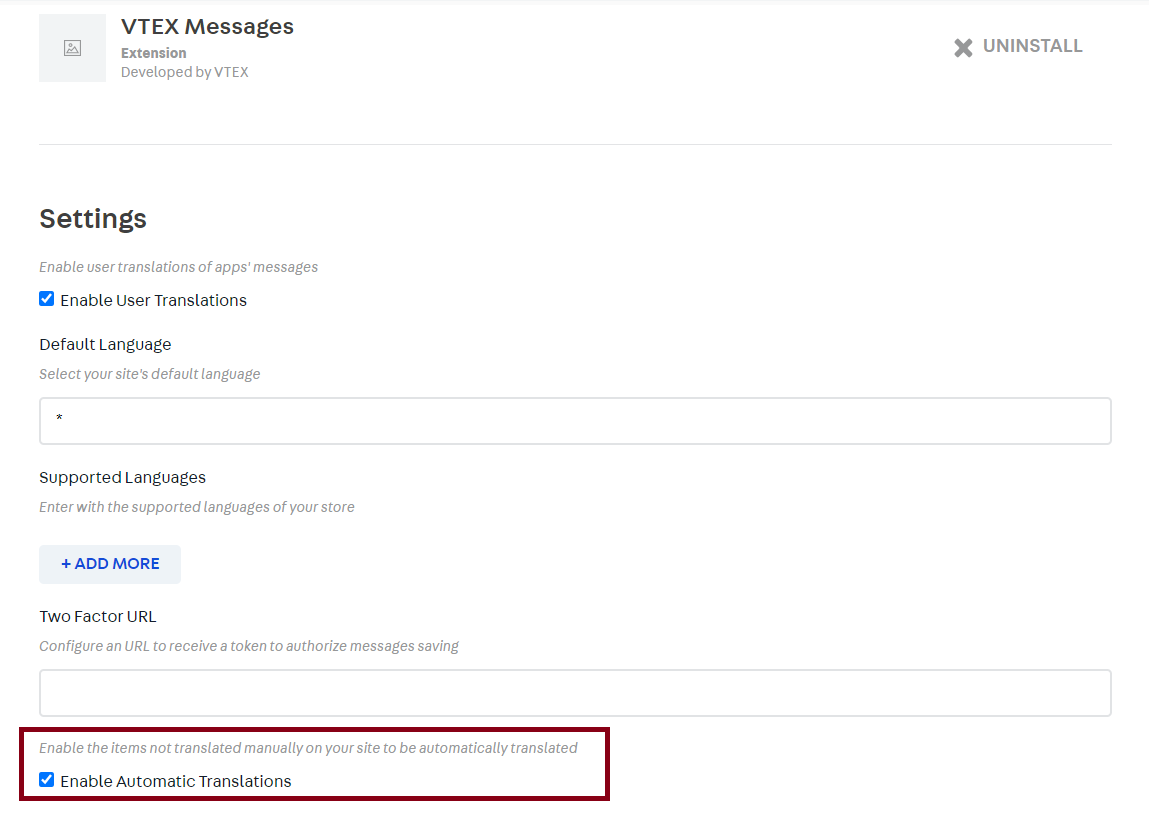
Enabling automatic translation in the Messages app - Safely and quickly enable or disable automatic Messages app translations directly from your VTEX admin account, as highlighted in the screen grab below! But please note: the toggle only defines the configuration for automatic translations, not for manual ones. If you need more info, access the recipe on Disabling automatic translation!
Improvements ➕
-
Importing private CSS Classes - Avoid external editions and customize your store components using private CSS classes i.e. classes whose name contains a hash (unique identifier) instead of the traditional
vendor-app-major-x-classnameformat that is generated when importing. For more info on how to import CSS classes (private or public, as we call the ones with the traditional format), access our documentation on Defining styles! -
Dynamic routes customization on CMS - Customizing dynamic routes can now be done through the admin's CMS, thanks to a wonderful new update to the Pages GraphQL. For more on the possibilities of this customization, access this documentation!
-
Catalog translation by variable - Translating a store's catalog can be done in the blink of an eye thanks to this improvement which makes it possible to translate the desired catalog data simply by filling in the specific variables in the object of the GraphQL API. Previous translations were only enabled when all the object's variables were filled in. Caught your attention? Have a closer at our documentation on catalog internationalization!
-
Placeholders on the Store Form component - Thanks to the new
placeholderprop, added to theform-input.textareablock, the Store Form component now accepts placeholders for text inputs, meaning that from now on you can add descriptions as well as other desired instructions to the form's text fields.

-
Link building in the product brand's name - A new prop has arrived for the
product-brandblock from the Store Components app: thewithLink! Replacing the formerlogoWithLinkprop, the new one is here to help you create links for the product brand's website based on text strings or image icons.
take a deep breath, we're half way through already... it's been two whole months! There's a lot where that came from! Check it out:
-
Multiple gallery layouts - Having multiple layout configurations for your search results page may sound impossible, but thanks to the Search Result's
gallery-layout-switcherandgallery-layout-optionnew blocks, it is not! To learn how to customize the page, check out the Building a search results page with multiple layouts recipe!
-
Multiple seller compatibility - The Add To Cart Button, Buy Button and Product Price now use as their default behavior the first available seller's data, meaning they are able to work with multiple seller data. Previously, the components only worked with the first seller's data, regardless of their availability and ignoring the rest of the seller list - tricky, wasn't it? now, this is what our team calls an improvement!
-
Product image placeholder - From now on, set a default image as placeholder for your store products thanks to the new
placeholderprop, available for theproduct-imagesandproduct-summary-imageblocks, respectively from the Store Components and the Product Summary apps. -
Product list identification on Google Analytics - Thanks to the new
listNameprop added to theproduct-summary-listblock, part of the Product Summary, and additional improvements made to the Tag Manager'sproductClickevent, you can now identify which store shelf users interacted with. No more misleading results for the poor Analytics! -
Close drawer on the UI - A new
textprop was added to thedrawer-close-buttonblock, part of the Drawer app, responsible for closing components on the UI. Thanks to it, you can now close the Drawer using a text button, instead of the traditionalXicon. -
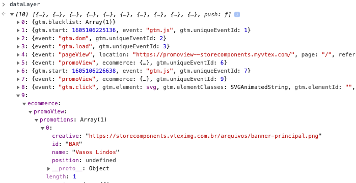
The
promoViewandpromotionClickevents - New events for the Google Tag Manager pixel app. Best of all? They all follow the official google enhanced commerce format! Please welcome thepromoViewand thepromotionClickevents, responsible for displaying a store's promotion impressions.
Warnings ⚠️
- Unannotated queries requested as public
The fallback cache option for GraphQL queries that didn't have an annotation on cache policy (@cacheControl) has changed from the default public scope to the private instead, in order to solve an internal issue on the platform.
Although it does not affect functionality, this can impact the store front's performance due to changes to the queries essence, since all unannotated that were being requested as public are now automatically coming in as private.
Our team advises developers that have created custom VTEX IO GraphQL services to closely review their schemas and, if necessary, add the @cacheControl(scope: PUBLIC) directive for the unannotated queries. This Pull Request should illustrate how to code the workaround solution.
Bug fixes 🐛
-
Displaying modals according to URL changes - Previously, modals were not automatically closed according to changes in the URL, meaning that they were kept open regardless of the user's navigation. The question is: was it the best behavior our component could have for our users? We all know the answer to that, so it is time to celebrate: this behavior was fixed and modals are now automatically closed whenever changes to the URL occur.
-
Empty-label validation on Tab Layout - Still thinking of enhancing user experience, the Tab Layout app will from now on only display tabs (i.e. the
tab-list.itemblocks) whoselabelprops has been properly filled out. In practice, it is safe to say that it is the end of empty tabs being displayed on the UI! Cheers to that! -
Product ordering in the
productImpressionevent - Thepositionfield, part of theproductImpressionevents, was not being properly filled out with the real positioning of listed products. An accurate ordering is now taken into account by our Product Context and this bug is (praise the Lord) fixed! -
Search results with special characters - Forget about the times when no results were fetched for searches with special characters: due to this magical fix, the Search Result's search bar is more cooperative, meaning that results are now properly displayed regardless of the special characters used to fetch them.
-
productImpression's threshold - The Google Tag Manager'sproductImpressionevent was only triggered when 75% or more of the Product Summary component was displayed. This type of threshold for sending data resulted in misleading results to the GTM, since Product Summaries are usually displayed as carrousels of many products and slides. With this bug fix, theproductImpressionevent no longer has a threshold, being sent out as soon as the Product Summary is visible on the UI.
Praises ✨
We would not be able to deliver so many amazing results during these last two months if it were not for the following outstanding contributors:
- Wesly Souza from ACCT
- Gustavo Vasconcellos from ACCT
- Lucas Castro from ACCT
- Matheus Araujo from Corebiz
- Renan Guerra from ACCT
- Luiz Eduardo
- Pmarignan
Thank you, team :muscle:
2020-11-24
3 years agoWhile Santa Claus is still not in town, the VTEX IO Release Notes for October 2020 is the one in charge of delivering lots of goodies for you and delight your home-office days with :sparkles:joy:sparkles:!
A tough ask, I know, since there is no end to this terrible and long-lasting virus in our gift basket, but I promise you that our team has prepared some rewards almost as long-awaited as that, such as:
- 🚀 The new Store Locator app
- ➕ Time optimization for hotfix deploys
- 🐛 The fix in the
Add to cartbutton performance
Caught your attention?
What a question... surely it did! Check out what October 2020 has brought us:
Features 🚀
-
Blueknow pixel app - A new pixel app is out of the oven for the Blueknow solution, responsible for using big data techniques and digital merchandising to provide recovery of lost sales, onsite retargeting, customized recommendations, and more! Check out the app documentation in order to learn how to set it up in your store!
-
Kokeel pixel app - The more native integrations, the better: get ready for the Kelkoo native integration! The new pixel app is here to help your store with incremental e-commerce leads!
-
Store Locator app - If adding information regarding pickup points to your store sounded complicated, it's water under the bridge! The Store Locator is among us to untie the knots in this setup - check out its documentation now!
- Newsletter app - Display a newsletter subscription form for your store users using the Store Newsletter app! Leveraging from the former Newsletter block (from the Store Components app), this latest and prettier one is here to let bygones be bygones and upgrade your store!

- Condition Layout v2 - The Condition Layout as we know was remodeled in order to achieve a clearer logic when setting the conditions to build your store's layout. In addition to its new documentation, do not forget to access the migration guide, especially prepared to help you with this upgrade!
Improvements ➕
-
Time optimization for hotfix deploys - The VTEX IO team has finally made it possible to warp time exactly as those kids from Dark did in order to deploy your hotfixes in less than 7 minutes! Using the Toolbelt's
2.118.0version or newer, you can now runvtex deploy --forcein your terminal when needed. But take note: the--forceflag is only recommended for hotfixes! Normal deploys should use thevtex deployas usual, since the 7 minutes are fundamental for testing your store's performance. -
CSS and GraphQL query optimization - It's what I always say: If it contains performance improvements, then we can call it a good VTEX IO Release Notes! Glad to say that our team has worked really hard on CSS and GraphQL query optimizations and that these are already natively enabled in your store. For more info, check out our documentation on best practices for optimizing performance!
-
Store performance natively enabled - If performance improvements are great and loved by everyone, shouldn't they be natively enabled? The VTEX IO team thinks the answer to that is a resounding yes! From now on, all new accounts using the platform will automatically inherit all the currently available store performance best practices.
-
Sorting products by their collection - Display products on your store's search results page according to the collection in which they were first sorted! Yep, that's right: the
order-byblock, part of the Search Result app, now works with products' colletions (OrderByCollection). Do not forget to learn more about it in the Search Result documentation! -
Error message for JSON parsing - The lack of additional information was part of the developers' routine whenever something went wrong with parsing the app's JSON files. But not anymore: file and error line references will from now on be displayed in the error message.
-
Render Runtime's typings - These really are the glory days for VTEX IO developers: you can now count on a marvelous auto-complete feature in your IDE by running the
vtex setup --typingscommand to add the Render Runtime's types to your app. For more info, check out the Render Runtime documentation! -
Error message for Store Form's schema - Error messages were added to the Store Form app in order to warn developers whenever the JSON schema was invalid, i.e. built with an inaccurate structure! What more can I say? It is safe to claim that the dog days are (almost) over for VTEX IO developers!
-
Submenu navigation - Opened submenus are now natively closed whenever another submenu is clicked/hovered on. Previously, the shift between submenus was so fluid that users were not able to notice when content changed - now that's what I call a smooth experience! This behavior was enhanced as shown below:
-
Filters closing - Let's make room for the new
closeOnOutsideClickprop from the Search Result'sfilter-navigator.v3block, responsible for defining whether the component should be closed with an outside click (as shown below) or not!

-
Zendesk's chat button - A new Zendesk's chat button was developed to lazy-load the default and heavier one provided by the solution. The replacement button, exported by the Zendesk Chat pixel app, can add 15 and 30 points to your Lighthouse score for mobile and desktop devices, respectively. And it gets better: you can also customize the button in your account's admin page.
-
Quantity Selector in dropdown mode - The Quantity Selector block, exported by the Product Quantity app, can now be rendered as a dropdown thanks to its new prop: the
selectorType!

-
Decimal place customization - Customization is power and we do know that! CSS Handles were added to the product price's decimal places, allowing you to display them half a character above the normal line, and/or in a smaller font.
-
Sitemap extension - Shall we talk about SEO now? Your store's Sitemap can now be extended by other apps, meaning new files can now be natively added to the Sitemap's root XML. Want to know more? Access the Store Sitemap app documentation to keep up with the latest!
Bug fixes 🐛
-
addToCartevent with inaccurate currency value - TheaddToCartevent was displaying misleading data on product prices, harming Facebook tracking tools. The bug was quickly fixed and the currency values are now fetched as they ought to be! -
Inconsistency between values in the Minicart - The total value displayed in the Minicart was ignoring the value passed to the
totalizersToShowprop, generating a mismatch between the values listed and their final sum. This crazy math was adjusted by our team and the total value now respects the vallue passed to the prop! -
Broken Product Quantity on IE11 - Internet Explorer 11 is one of the browsers supported by the Store Framework, but it seems to me that the Product Quantity component didn't get that until now... silly component! This disruptive behavior had been fixed and the component now works perfectly for IE11 users as well.

-
Unwanted product specifications being displayed - Although we have a checkbox in the Catalog module to set whether a specification should be displayed on the product details page or not, this info was not properly handled in our Product Specifications component. But not anymore: unwanted specifications are now blocked from being displayed when you select this option. This is what I call power of choice, my friends!
-
Add to cartbutton performance - Shopping experience was being harmed because of the unexpected extra time needed to redirect users to the Minicart once theAdd to cartbutton was clicked on. Our wonderful team deployed a series of performance fixes and small improvements, such as adding a native loading bar to the page, in order to enhance navigation during the shopping experience! -
Product Highlights - The Product Highlights app misunderstood its concept and was displaying all collections as highlighted in the store. The undesired behavior was properly fixed, with the component now only displaying collections that have the highlight feature turned on!
Docs :page_facing_up:
Documentation is the key! Check out below our out-of-the-oven docs:
Recipes
- Consulting B2B order statuses
- Safely enabling performance settings
- Indicating alternate versions of localized pages in cross-border stores
- Displaying asynchronous prices
Concepts
Praises ✨
We would not be able to deliver so many amazing results during this last month if it were not for the following outstanding contributors:
- Julio Moreira from B80ne
- Gabriel Sampaio from econverse
- Gustavo Vasconcellos from ACCT
- Felipe Ireslan from ACCT
- khrizzcristian
- mariusfiliutamindcell
Thank you, team :muscle:
2020-10-23
3 years agoJust in time: the VTEX IO Release Notes for September 2020 is finally among us!
That being said, your task list from now on consists of:
- Read our hot-off-the-press news.
- Implement the latest and best configs in your store.
- Spread the word to your crewmates about the newest VTEX IO Release Notes.
Easy-peasy... and let me tell you this: our team has prepared so many delightful releases that I'm 100% sure that the above tasks will be done even before tiredness gets to you! No sabotage is allowed!
Shall we?
Features :rocket:
- Store Video app - The Store Video app has arrived, allowing you to display video assets on your store pages with divine features such as auto-play, loop, and mute. It gets even better: the app also supports YouTube, Vimeo, and other third-party players! What are you waiting for? Check out now the documentation!

- Product SKU Attributes block - The Store Component app's brand new block is here to allow you to effortlessly display product SKU attributes. Learn more about it in the Product SKU attributes documentation!

-
Facebook Domain Verification app - The Facebook Domain Verification adds a meta-tag containing the Facebook verification code to your homepage
<head>, which is used by Facebook for checking your website's accountability. The new app is more than ready to be installed: access its documentation here! -
Auto-complete for
product-contextproperties - A new improvement forproduct-context' types enables the auto-complete feature when declaring the desired app's properties in your custom components. In practice, your code editor is from now on able to tell you which properties are actually valid and which are not, avoiding errors and saving you precious development time!
Improvements :heavy_plus_sign:
- Performance optimization - If there is one thing that everyone dreams about, it's performance optimization! With that in mind, the VTEX IO team has prepared a bunch of new configs for you, such as partial fetching of facets on the search results page and CSS concatenation. The best part is that they are just a couple of clicks away: check out now the documentation on improving your store's performance and apply our best practices in your store!

-
Repetitive purchase of products - Before this release, adding the same product to the Minicart v2 multiple times was kind of a big challenge for store users. Due to the
Item already on carterror message, displayed whenever theAdd to cartbutton was clicked on more than once, users were being blocked from having a smooth shopping experience. Good thing that loss in sales is not something we condone, nor want. Therefore, users are now able to click on the Add to cart button as many times as desired! Cheers to that!

-
Filtering payment methods in the search query - Thanks to two new props, namely
includedPaymentSystemsandexcludedPaymentSystems, it finally became possible to define which payment methods should and should not be taken into account in the search query when displaying the installment options to your store users. Access the Search Results app documentation now and learn how to set these props up in your search results page! -
Power Review app internationalization - The Power Review app now works properly with international stores! When globalizing your brand, you no longer need to worry about user reviews in different languages: from this release onward, reviews are automatically fetched, translated, and displayed according to the store locale set by users.
-
Radio and Radiogroup customization - The Radio and Radiogroup VTEX Styleguide components have gained these new CSS Handles to call their own:
vtex-radiogroup__fieldset,vtex-radiogroup__legend,vtex-radiogroup__label,vtex-radiogroup__radioContainer, andvtex-radiogroup__error, thus allowing you to customize several store components that are built using them, including Store Form and Newsletter. -
Sales channel parameter in the
productsByIdentifierquery - A new parameter was added to theproductsByIdentifiersearch query, allowing your custom components to fetch and display products according to the desired sales channel. -
Item ID as product identifier - From now on, the Product Identifier app also accepts item IDs as product identifiers. Before this release, only Product Reference, Product ID, SKU EAN, and SKU Reference ID were accepted as valid to be displayed on the component.

Bug fixes :bug:
-
Title attribute missing in image components - The title attribute was nowhere to be found in store images. Poor little guy! It was linked to the incorrect HTML element when components were rendered -
ainstead ofimg. This behavior is now fixed and the title attribute can be properly found and tracked. -
SKU Selector frozen on slider component - The SKU Selector had its product data frozen when rendered on slider components. In this previous and ugly scenario, users could only update the data displayed either when scrolling the page or when changing the slide currently hovered on. The good thing is that we are close to summer in Brazil and the SKU Selector was defrosted just in time: it is now working as expected!
Docs :page_facing_up:
Documentation is key! Check out our out-of-the-oven docs below :
Tracks
- Develop components using VTEX IO and React (Develop components using VTEX IO and React) - Currently only available in Portuguese!
Recipes
- Using events to trigger component behavior
- Cross-border store content internationalization
- Managing landing pages in cross-border stores
- Creating robots files for cross-border stores
- Checking your store’s binding ID
- Multi-language stores
- Migrating CMS settings after a theme major update
- Running IO scripts in any VTEX store
Concepts
Praises :sparkles:
We would not be able to deliver so many amazing results during this last month if it were not for the following outstanding contributors:
- Marcos Ewbank from ACCT
- Raissa Campos from ACCT
- Lucas Pacheco from ACCT
- Gabriel Carafizi from ACCT
- Erislandio from ACCT
2020-09-18
3 years agoIt may make a delayed entrance, but it never fails: it's finally here guys :pray:
Did you know that August is called the month of chagrin by some in Brazil? Nonsense.... VTEX IO is here to prove them wrong with this month's release notes.
A lot of freshly baked wonder-cakes are finally out of our development oven, among which:
- 🚀 The new Disclosure Layout app
- ➕ Change in the app deploying time
- ❌ Product Specifications block deprecation
Wonderful right? And it is not just because I wrote everything here... this month's release notes is so blissful that is would change anyone's mood. Have a closer look:
Features 🚀
- Disclosure Layout app - The Disclosure Layout app is finally among us! The new layout app is responsible for creating a layout structure based on disclosure triggers, as shown below. For more details on the new app, access the Disclosure Layout documentation.

- Product Highlights app - The Product Highlights app is here to allow you to display highlight badges on products according to the collection or promotion they are linked to. To learn how to configure it in your store, check out the Product Highlights app documentation.
- Product Specifications app - Aiming to bring you more flexibility when using the Product Specifications component, our product team developed the Product Specifications app, replacing the former Product Specifications block exported by the Store Components app. Its setup is just a few clicks away: check out the new Product Specifications app documentation!

-
Product Price block for seller name - A new block responsible for displaying the seller name next to the product price is among us! Learn how to configure the
product-seller-nameblock in your store by accessing the Product Prices app documentation.

Improvements ➕
-
Slider Layout's elements positioning - The Slider Layout has gained a new prop called
centerMode, which is responsible for defining how slider elements are positioned on the screen for each device. One of its possible values iscenterwhich allows you to display your slider element in a centered way to your users, as shown below. This improvement is extremely useful for Shelves and other components that use the Slider Layout for rendering product data.

-
Filters display on Search Result page - Thanks to the new
openFiltersModeprop, you can now define how many filters a user can concomitantly open on the Filter Navigator component. For more details, access the Search Result app documentation!
Note that only one filter can be opened at any time. In the example above, the prop openFiltersMode is declared as one.
- Bazaar Voice info in Google structured data - From now on, user review data fetched by the Bazaar Voice app is considered in Google's structured data, used to understand and gather information about the content of the store's page. This improvement is extremely useful for SEO purposes since google will now be able to effectively fetch product reviews and display them on search result pages.

-
Markdown interpretation by Assets Builder - The Assets Builder now supports assets whose URLs are built using markdown. This improvement is extremely useful and relevant since block props use the markdown structure to declare media on components.
-
App deploying time - Aiming to strengthen the security of our development process, published apps will now have to wait 7 minutes until they become ready to be deployed. Note the following: if this timing is not respected, an
Invalid state transitionerror will be received from Toolbelt. For more on this process, check out the Publishing an app documentation. -
pageInfoevent on search results page - Retailers can now benefit from the new search results page event: thepageInfo. Your store's new taggable event is triggered whenever the search results page content is changed due to user interaction, namely: selecting new filters, reordering the results, and clicking on theShow Morebutton. -
EAN in Google Analytics events - The EAN (product identifier) data is now included in the
addToCartevent. In practice, this means that the VTEX Store Framework now provides EAN data to Google Analytics events, allowing for a deeper analysis and extra integrations. -
Dynamic content on Slider Layout - The Slider Layout has gained full dynamic content support! Previously, the component couldn't behave as expected with a dynamic number of slides i.e. when slides were added and removed according to user interaction (as in the case with product-comparison components). The Slider Layout is now adapted to always work as it is configured, regardless of its new content.
-
Minicart v2 automatic display - A trigger responsible for automatically opening the Minicart v2 on the interface can now be set by using any desired store event and the block's new
customPixelEventIdandcustomPixelEventNameprops! A long-awaited scenario, in which this new release is extremely useful, is to automatically open the Minicart component whenever theAdd To Cart buttonis clicked on by users. Brace yourselves because the wait has finally come to an end: to prettify this release, theadd-to-cart-buttonblock has also gained a new prop calledcustomPixelEventIdto broadcast an event of its own when it is clicked on. In practice, this means that you can now set up bothadd-to-cart-buttonandminicart.v2blocks to configure this behavior in your store, displaying the options to move to checkout or just keep shopping to your users.
Hold on tight, my friend! Some amazing improvements related to store customization still await you:
-
Image's non-active dots customization [CSS Handle] - Previously, we had no CSS handles that would enable users to select and customize non-active dots in the
product-imagesblock (from Store Components app). Thanks to the newswiperBulletandswiperBullet--activeCSS Handles, an image's non-active dots can now be selected and customized. For more on this, access the Product Images block documentation and our documentation on Using CSS Handles for store customization.
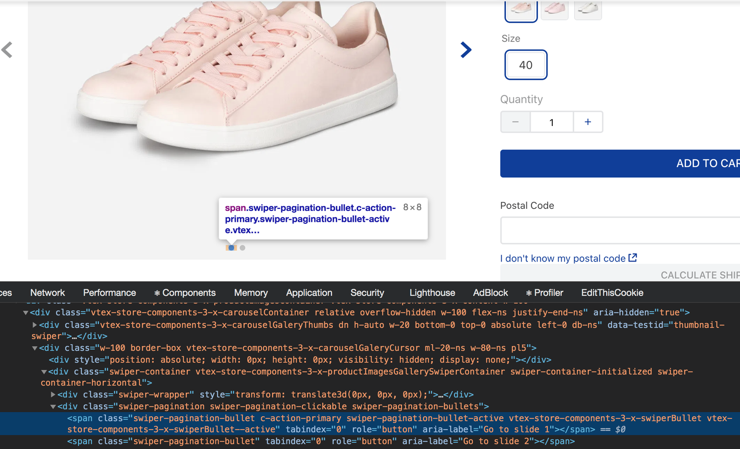
In the image above only the first image dot, which was currently selected (or active), had both vtex-store-components-3-x-swiperBullet and vtex-store-components-3-x-swiperBullet--active CSS classes. The second image dot, which was not active, did not have any CSS class which basically meant that users could not select it for customization.
-
Product Specifications block customization [CSS Handles] - New CSS Handles, namely
specificationsTableRow,specificationsTableHead, andspecificationsTableBody, were added to the Product Specifications block, exported by the Store Components app, in order to grant you more flexibility while customizing the component's elements.

Caution: As previously informed, the Product Specifications block was deprecated and replaced with the Product Specifications app. This release only applies to the former.
-
Drawer overlay customization [CSS Handles] - The Drawer app has gained two new CSS Handles, namely
overlayandoverlay--visible, responsible for allowing retailers to customize the overlay structure used by the mobile component. For further details, access this practical example recorded on loom, as well as the Drawer app documentation. -
nth-childCSS Selector with step size -:nth-childselectors with step size, such as:nth-child(2n)are now allowed when customizing your store with CSS! For more on customizing your store with CSS and HTML selectors, access Using CSS Handles for store customization.
Deprecations ❌
- Product Specifications block - The Product Specification block, pertaining to the Store Components app was deprecated. Although support for this block is still provided, we strongly recommend you to update your store theme with the Product Specifications app in order to benefit from greater flexibility and to keep up with the component's evolution.
Bug fixes 🐛
- Sum of installments without interest on search results page - Previously, the search query was presenting price errors when displaying product data on the search results page. As shown in the image below, the sum of installments without interest was higher than the product price itself, leading to a poor and frustrating user experience. The search query for this page was fixed and the bug removed, meaning that the sum of installments without interest is now displayed mathematically correct on search results pages as well as on the product details page.

Praises ✨
We would not be able to deliver so many amazing results during this last month if it were not for the following outstanding contributors:
- BeatrizMiranda from ACCT
- Lucas Pacheco from ACCT
- Marcos Ewbank from ACCT
- Gabriel Carafizi from ACCT
- Gustavo Vasconcellos from ACCT
- Jayendra from Clouda
Thank you, team! 💪
2020-08-18
3 years agoMake room for the VTEX IO Release Notes - July 2020 version, team!
It is time to step aside from all the world's craziness and restfully read the goodies brought to us in the past month by the VTEX IO team.
Stretch your legs, take a deep breath and a sip of coffee: you are about to reach the high-point of your August home-office days with our *latest news!
Some of the key changes include:
- 🚀 The new
font-faces.cssfile in Store Theme - ➕ Product Price blocks for installment options
- ❌ Animation and Slider blocks deprecation
- 🐛 Related Products Shelf rendering on mobile devices fix
And much more. Cast you eyes on these freshly baked releases right now:
Features 🚀
-
Cookie Script pixel app - A VTEX Cookie Script native integration is now available for your store, making your website cookies comply with GDPR and CCPA. Learn how to install it by accessing the Cookie Script app documentation.
-
Tawk.to pixel app - Another pixel app on the front lines: a Tawk.to native integration is also now available for your store. It allows you to monitor and chat with visitors on either your website, mobile app, or from a free customizable page. Learn how to install it in your VTEX account by accessing the Tawk.to app documentation.
-
Elfsight pixel app - They say three is a charm, don't they? A VTEX Elfsight native integration is available, providing widgets to increase sales, engage visitors, collect leads, and more. Learn how to install it in your VTEX account by accessing the Elfsight app documentation.
-
OneSignal pixel app - What do we call it? Four is a blast? I think so! A OneSignal native integration is among us, providing web push notifications for customer engagement. Learn how to install it in your VTEX account by accessing the OneSignal app documentation.
-
New
font-faces.cssfile in the Store Theme app - Create a CSS global file specifically for your store's fonts and change your store's typography according to your business needs using your Store Theme app code. But keep in mind: thefont-faces.cssfile is now mandatory when changing your store's typography using your store theme code, meaning you can no longer upload fonts directly in the app's CSS by overriding files. For more on this topic, access the Customizing your store's typography documentation.
Improvements ➕
-
Product spot price in Google structured data - The product spot price is now considered in the
lowPricefield from Google structured data, used to understand and gather information about the content of the store page. This improvement is extremely useful for stores that use Google Shopping, since it will now be able to effectively fetch the product's lowest price (meaning the spot price). -
Product spot price on search results page - The product spot price is really deciding to come out. It is now displayed on the store's search results page (whether the store uses VTEX Intelligent Search or the former search solution).
 Previously, the product spot price was only available for product detail pages.
-
Order custom tax data in the
dataLayerobject - New fields were added to thedataLayerobject, allowing the store's website to export data related to the order custom taxes. This improvement is extremely useful for stores wishing to handle order custom tax data in Google tracking mechanisms, such as Google Analytics. -
Product Price blocks for installment options - The Product Price component now displays all the available installment options according to the desired payment method, thanks to the new blocks
product-installments-listandproduct-installments-list-item. Previously, the Product Price component only rendered the max number of installments, regardless of the payment method. For more, do not forget to access the Product Price app documentation. -
Assets builder's file paths in CSS files - Media uploaded on Assets builder can now be referenced in your store theme CSS files by adding the accurate file path. Previously, file paths from Assets builder only worked in
blocks.jsonandblocks.jsoncfiles. For more on this topic, check out the Using the Assets Builder documentation. -
List price presentation on product selling price - The
hasListPriceprop was added to theproduct-selling-priceblock from the Product Price app. It is responsible for defining whether the product should display its list price (if any) on its selling price or not.
 Product selling price with no list price being displayed.
 Product selling price with the list price also being displayed.
-
Submenu customization per user navigation [CSS Handles] - New CSS Handles with modifiers (
submenuWrapper--isOpenandsubmenuWrapper--isClosed) were added to the Menu app, making it possible to create animation effects when the submenu opens and closes according to the user navigation. For more on how to properly use CSS Handles, access the Using CSS Handles for store customization documentation.
 Notice how the menu animation showed above only works because the
 submenuWrapper--isClosed Handle is being applied.
-
Shelf slide dot customization [CSS Handle] - A new CSS Handle (
dot--isActive) was added to the Shelf app, enabling the customization of the shelf active slide dot.
 The shelf slide dot highlights the shelf slide currently being hovered on by users.
We already are half way through! Hold on tight, some marvelous improvements still await you:
-
Filter Navigator customization on mobile devices [CSS Handles] - New CSS Handles were added to the Search Result app to enable the Filter Navigator component customization on mobile devices. They are, namely:
accordionFilterContainer,accordionFilterContent,filterBreadcrumbsContent, andfilterBreadcrumbsText. -
Search results page customization per display mode [CSS Handles] - It became possible to apply CSS classes to search results according to the way they are displayed on the interface! This release marvel is all thanks to the way
galleryItemCSS Handle (exported by the Search Result app) presently behaves when inspected. It now accepts an HTML modifier ({displayMode}) meaning that the handle name changes according to the display mode used to render search results.
 In the example above, the CSS Handle
 galleryItem presents itself as galleryItem-inline when inspected. Notice that the new Handle name is defined according to the display mode set on the search results page.
-
Product Images' active slide dot customization [CSS Handles] - A new CSS Handle (
swiperBullet--active) was added to the Product Images block(from the Store Components app), enabling the customization of the active slide dot. This handle is extremely useful for scenarios where the Product Images block is used to build a slider component, such as a Carousel.
 The slider active dot highlights the slide currently being hovered on by users.
-
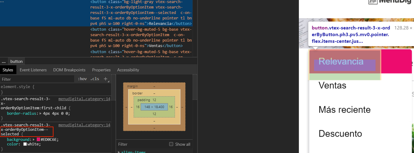
Search result's Order By customization [CSS Handles] - A new CSS Handle (
orderByOptionItem--selected) was added to the Search Result app, allowing you to customize the item selected by users on the page's Order by component.
-
Seller Selector context - Other VTEX Store Framework apps can now use the context exported by the Seller Selector app (
SellerContext) regarding seller data by using theimport { SellerContext } from 'vtex.seller-selector'expression in the Store Theme code. -
Breadcrumb structured data - Previously, neither the Breadcrumb app nor the store itself provided the
positionanditemListElementdata necessary to guide search engines to the current page position in the store category tree. The Breadcrumb app is now configured to have structured data, improving your store's SEO.
Removals ⛔
- Back button as modal closing button - The browser's Back button no longer works as a modal closing button when configuring the Modal Layout app. This feature was extremely useful for users from mobile devices since the modal opened in them works as a brand new page. In the meantime, it was leading users to a poor experience when using desktop devices since the Back button wasn't taking users to the previous page as expected. Instead, it only closed modals (if any on the page). In order to improve the website navigation, this feature was removed, meaning that the Modal Layout now depends on its own button in order to be properly closed.
Deprecations ❌
- Animation and Slider blocks - The Animation and the Slider blocks, pertaining to the Store Components app were deprecated. Although support for both blocks is still provided, it is strongly recommended to update your store theme with the Slider Layout block in order to keep up with the Slider component evolution.
Bug fixes 🐛
-
Product variation sorting on SKU Selector - Previously, the SKU Selector rendered in a Product Summary Component (
product-summary-sku-selectorblock) did not respect the Catalog data when displaying product variations. As a result, product variations didn't have a specific sorting when displayed to users, leading to a poor UX. This unexpected behavior is now fixed and the SKU Selector now presents the variations according to how they are ordered in the Catalog module. -
hideImpossibleCombinationsprop behavior - Before this fix, SKU Selector'shideImpossibleCombinationsprop was not properly hiding impossible specifications (specifications that can't be chosen according to the filter previously selected) when defined astruein certain scenarios. In addition, when the prop value wasfalse, impossible specifications were not being displayed by the component in an intuitive way. These behaviors are now fixed and the prop is working as expected, improving user experience when using the SKU Selector component. Check out this link to watch a practical demonstration of this bug and its fix. -
Slider Layout's slide navigation - The Slider Layout app has gone through fundamental changes in order to improve its usability and therefore the user's experience on it. Previously, the component was showing a mobile delay (mobile users were facing a delay when sliding across products by swiping instead of using the arrow buttons) and a rewind effect (due to the lack of an infinite scroll feature, the component was presenting a rewind effect, taking users back to the first displayed product when the last one was presented). Both issues were addressed and fixed! Cheers to that! Now the Slider Layout automatically works with a smooth slide transition (infinite scroll effect) and also quickly responds to user interaction on mobile devices.
-
Related Products Shelf rendering on mobile devices - Due to an implementation detail in the
isMobileprop, the Related Products Shelf component was only being rendered in its desktop mode, even when displayed on mobile devices. This undesirable behavior is now fixed and the Related Products Shelf is working for mobile users as expected.
Praises ✨
We would not have been able to deliver so many amazing results during this last month if it were not for the following outstanding contributors:
- BeatrizMiranda from ACCT
- Matheus Araujo from Corebiz
- Sahan Jayawardana from Clouda Inc
Thank you, team! 💪
2020-07-16
3 years agoWelcome to the VTEX IO Release Notes for June 2020, team!
I know home office can be extremely a little bit tiring, but I do hope you will be able to set some time aside from your busy workweek to catch up with VTEX IO latest news.
Notice: i'm not saying this only because I'm the one writing the VTEX IO release notes, you know... it's actually because the past month of June really brought us some goodies worth looking at asap, such as:
- :rocket: The new Sitemap app
- :heavy_plus_sign: The 404 pages improvement
- :bug: The Clear button (from mobile filter sidebar) bug fix
Check out the last month's key changes below:
Features :rocket:
-
Sitemap - One long awaited tool for SEO is finally out of the oven: manage your website's sitemap file from now on using the new VTEX IO Sitemap app.
-
Image zooming in a modal - Open a modal for product image zooming whenever the Product Images component (
product-imageblock) is clicked on. The instructions for setting up this new feature are available in the Advanced configuration section of the Product Image block documentation. -
Confirmation modal on Minicart - Using the Modal Layout app, you can now display a confirmation modal when users decide to remove an item from the minicart. Learn how to configure the confirmation modal in your store by accessing the Creating modals using icons documentation.
-
VTEX IO Service Worker management - Activate and deactivate the native VTEX IO service worker according to your store needs! This feature is a must if you are dealing with a third solution service worker. For more info, access the Managing VTEX IO native service worker documentation.
Improvements :heavy_plus_sign:
-
404 pages - The 404 pages feature was remodeled. It was already possible to natively enable 404 pages for nonexistent product pages and for URLs that have more than one invalid segment. But in addition to that, you can now also allow 404 pages when URLs have a single invalid path segment. Cheers to that! Learn more about this setup in the Enabling 404 pages documentation.
-
Checkbox buttons customization - New CSS Handles were added to the VTEX Styleguide in order to simplify the Checkbox button customization, such as those ones used in filters from the search results page, namely
vtex-checkbox__box-wrapper,vtex-checkbox__box, andvtex-checkbox__input. For further details, do not forget to check out the VTEX Styleguide. -
Price Range component customization - A new CSS Handle called
vtex-slider__base-internalwas also added to the VTEX Styleguide in order to simplify the customization of the Price Range component, rendered on the Search Result page. As previously recommended, you can access the VTEX Styleguide for more info. -
Search bar in modals - Displaying a search bar in a modal using the Modal Layout app and the Search Result block
search-barwas already possible. Now, however, the modal is immediately closed when a search is performed by users, enhancing their navigation experience. -
Product Specifications customization - It became possible to apply CSS classes for each product specification displayed on the interface, allowing for their independent customization. This marvel of a release is all thanks to the way CSS Handles (used by the Product Specifications block) currently behave when inspected.
-
Product Summary Name heading tags - Forget about when a single heading tag was mandatory: using the new
tagprop, you can now choose which heading tag should be applied when rendering the Product Summary Name block. Don't forget to check out the block documentation. -
Add To Cart Button text label - We really mean to empower our users: decide which text should be displayed on the Add To Cart Button using its new props
textandunavailableText. For more, access the Add To Cart Button documentation. -
Add To Cart Button behavior - One more for the Add To Cart Button: thanks to its new prop
onClickBehavior, you can now set the button's behavior once it is clicked on, defining whether it will redirect users to the product page or directly add the given product to the minicart. Check out more in the Add To Cart Button documentation.
Still with us? We are just half way there! Hold on tight, because we still have some great improvements to show you:
-
Product Summary Buy Button behavior - We're really improving some buttons here, aren't we? The
product-summary-buy-buttonblock, exported by the Product Summary app, has a new prop calledbuyButtonBehaviorthat defines the button's behavior when clicked on. Understand which behaviors are accepted by accessing the Product Summary Buy Button documentation. -
Open Graph meta tags - Open Graph meta tags (used by Facebook) are now available in the
store.home,store.product, andstore.searchtemplates (respectively home, product, and search result pages). These tags are extremely useful when these pages are shared on Facebook, since they're used to display rich previews to users. -
CSS Handles for Search Result - A VTEX IO release notes is not a proper one if it does not include new CSS Handles.
filterBreadcrumbsItemandfilterBreadcrumbsItemNamewere added to the Search Result app, allowing for the customization of filter breadcrumbs on mobile devices. -
CSS handles for Search Bar - Another CSS Handles release to make you smile: the Search Bar block, exported by the Store Components app, gained new handles responsible for customizing the search bar component specifically when it is opened and/or filled out by users.
-
Quantity badge behavior on Minicart - The
minicart.v2block, part of the Minicart app (v2), received a new prop calleditemCountMode. This new prop is responsible for defining the quantity badge's behavior when displaying the number of items added to the Minicart. Understand which behaviors are accepted by accessing the Minicart app documentation. -
Minicart icon - Flexibility is what we aimed for this past month! Thanks to the new
MinicartIconprop, you can now change the Minicart icon (v2) by choosing from the icons exported by the Store Icons app. Check out the Minicart documentation in order to learn how to use this new prop. -
Progress bar on the search results page - The
search-products-progress-barblock, responsible for displaying a progress bar for product results on the search results page, can now be declared as a child of thesearch-resultblock from the previous version of the Search Result app. Previously, it only could be declared as a child of thesearch-result-layoutblock pertaining to current version of the app.
Bug fixes :bug:
-
Clear button from mobile filter sidebar - The Filter sidebar's
Clearbutton was not properly working on mobile devices, since it was not properly clearing filters applied by users. This behavior has been fixed and the button now clears every checked filter. -
Assembly options selection - Previously, assembly options were only selected if the user clicked on the Radio button/checkbox. In order to improve user experience, assembly options are now duly selected whenever users select them (whether using the buttons or not).
-
Newsletter's email address field - Spaces unintentionally added to the Newsletter's email address field were invalidating user subscriptions. The component no longer accepts spaces in the field, thus improving user experience.
-
Search Result's custom query - The
search-result-layout.customQueryblock, exported by the Search Result app and responsible for performing custom queries to the Search API, was not properly working when declared in a column built by the Flex Layout app. This unwanted behavior is now fixed.
Praises :sparkles:
We would not be able to deliver so many amazing results during this last month if it were not for the following outstanding contributors:
- BeatrizMiranda from ACCT
- gustavopvasconcellos from ACCT
- ygorneves10 from Corebiz
- igorpoubel from Corebiz
Thank you, team :muscle:
2020-06-18
3 years agoWelcome to the May 2020 VTEX IO Release Notes, team!
The VTEX IO Release Notes is marking it's first anniversary online and we've decided to celebrate this first year by doing what we do best: introducing our users to eagerly awaited configs.
Some of the key highlights are:
- :heavy_plus_sign: Layout conditioned by product specifications;
- :x: Product Summary Price and Product Price blocks deprecation;
- :bug: Links working in Brand component.
Shall we then start reading this Release Notes gem for May?
Improvements :heavy_plus_sign:
-
Product prices with tax - Blocks exported by the Product Price app are now able to render their text messages and price variables with tax values considered.
-
Infocard's new
callToActionLinkTargetprop - ThecallToActionLinkTargetprop from the Infocard block is now available for the Edition in the admin's Site Editor. -
CSS Handles - New CSS Handles always herald good news. Let's rejoice:
firstVisibleandlastVisiblehave arrived to the Slider Layout app, allowing you to customize the first and the last visible item on a slide. In addition, the Rich Text and the Search Results also gained new Handles: namely thewrapperand theaccordionFilterOpenfor mobile devices. -
Product Specifications block and Search Results filters customization - It is now possible to independently customize each of the UI product specifications and the search filters. All this thanks to adding modifiers and new attributes linked to HTML elements. For more info, access the Search Results app and Product Specifications block documentation, in addition to going through the recipe on Using CSS Handles for store customization.
-
Add to Cart button message - Define which message will be displayed on the Add to Cart Button thanks to the block's new
textprop. In addition, you can define a text message that will be rendered when the product is not available for purchase - thanks to another new prop calledunavailableText. -
Newsletter in Site Editor - The Newsletter is finally in Site Editor! The component can now be edited using your account's admin.
-
Layout conditioned by product specifications - The Condition Layout now works with product specifications, thanks to the new value
specificationPropertiesfor thesubjectprop. That's right: you can now define which product specifications should trigger the rendering of predefined content! Cheers to that! -
CSS subfolders - The folder where your theme's app CSS files are stored (called
cssand allocated in the mainstylesfolder) now supports subfolder organization, which means that you can organize your CSS files as you wish from now on! -
Empty Minicart state - This one should be a good surprise to users: The Minicart empty state was improved. What was merely a rich text gave way to more user friendly UI, having an empty cart icon.
-
remove-button's new props - The Product List app'sremove-buttonblock received two new strategically important props:displayModeandvariation. The first defines whether the block should be displayed as an icon or as a text (allowing you to create confirmation modals when displayed as an icon). In turn, the second prop defines the remove button visual prominence when it is displayed as a text based on the VTEX Styleguide.
Deprecations :x:
- Product Summary Price and Product Price blocks - The Product Summary Price and the Product Price blocks, respectively, pertaining to the Product Summary and the Store components apps, were deprecated in favor of the Product Price app. Although support for these blocks is still granted, it is strongly recommended to update your store theme with the Product Price's blocks in order to keep up with the component's evolution.
Bug fixes :bug:
-
Minicart item list - When more than 1 SKU with attachments was added to the Minicart (version 1 and 2), the component interpreted that only 1 should receive the chosen attachment, while the other SKUs would not receive it. This bug was now fixed in both versions and the Minicart lists the correct SKU number with their respective attachment.
-
Slider Layout dots on mobile - The pagination dots, located below the component built using Slider Layout, were not rendering slides when clicked on using a mobile device - contrary to the Slider's arrows. The pagination dots are now working as expected and users can click on them to change slides.
-
Image link editing in Site Editor -
When an image link was added to the Image component (Store Image app) using the admin's Site Editor, an unexpected error took place: thenewTabtoggle button was not working properly. This was now fixed and users can correctly configure image links to open in new tabs when editing the Image component in Site Editor. -
Links in Brand component - The Store Component's Product Brand block allowed the creation of links in the brand product icon, by using the
logoWithLinkprop. The prop was not functioning properly, which led to this functionality being forgotten. Thanks to a fix, the prop is now 100% available and ready for use!
Praises :sparkles:
- pgrimaud from Big Youth
- LucasCastroAcctGlobal from ACCT
- BeatrizMiranda from ACCT
2020-05-20
4 years agoThe VTEX IO Release Notes is here, team!
Thrilled to announce that this April's Release Notes brings a ton of beautiful releases to enlighten your cloudy days at home.
Let me share an insider's tip with you: schedule a time of your day to go through it all... you don't want to get left behind on the latest key changes on the platform!
Get a sneak peek at last month's releases:
Features :rocket:
-
Overlay Layout app - A layout app that provides you blocks to create a dropdown, select or a tooltip component in your store. Sounds amazing and simple... and it actually is!
-
Condition Layout app - You now get to define different layouts for the same page. This one seems like magic but it's not: choose predefined conditions and have the power to decide if a block should be rendered or not.
-
Seller Selector app - Marketplace stores will really enjoy from this one: use this app and display the number of sellers available for each product, enabling users to compare prices and add the desired product to their cart.
-
Quickorder app - Designed for B2B scenarios, the Quickorder app is here to speed up buying processes by offering tools to process large orders in bulk.
-
Google Customer Reviews pixel app - A native integration for Google's service that collects feedback from customers who’ve made a purchase on your site is now a couple configs away.
-
Cookiebot pixel app - The native integration for the Cookiebot solution is live. This pixel app is responsible for using your site's cookies to analyze traffic and enhance user experience through custom contents.
-
Iubenda pixel app - Three is a charm, isn't it? This pixel provides native integration with the Iubenda solution that handles the privacy and cookie policy for your store.
-
Trustpilot pixel app - Yep, that's right. Fourth pixel app of the evening. This one is for a native integration with the Trustpilot solution, responsible for providing your store with review and rating tools.
-
VTEX Intelligent Search - Get to know the VTEX Intelligent Search application for e-commerce. The new solution provides search components and a brand new Search Engine to assist customers during their purchase journey in VTEX IO stores. Take a look!
Improvements :heavy_plus_sign:
-
Public app documentation - Publish an app on the VTEX IO platform and win a public documentation slot in VTEX IO Docs! This functionality is not new, but its communication is: from now on, Toolbelt will display the public documentation's link each time an app is successfully published!
-
Toolbelt's commands - The VTEX IO CLI has undergone an improvement: now, every command has its own
--helpflag. When running{commandName}--helpin the terminal, you can expect the command's documentation to be shown! -
CSS Handles - Let's talk about good news related to CSS Handles for the Rich Text (
tableTr,tableThandtableTd), Drawer (opened,closedandmoving) and the Filter Navigator block (filtersWrapperandfiltersWrapperMobile) from the Search Results app. -
Product Quantity's unit measurements - The Product Quantity app now works with different unit measurements... that's right. Previously, the component would only display products by number of
units. Now, the default for the new component is to always effortlessly display the product's defined measurement unit, such askg. -
Modal Layout triggering - No more repeated content: the modal content displayed from the Modal Layout app can now be triggered just once during the user session thanks to the new
triggerprop. -
Aspect Radio on Product Summary Images - The Product Summary Image block has two new props (
maxHeightandaspectRatio) that help display your images in a uniform manner, irrespective of their original size. -
search-products-progress-barblock - The Search Results app now has a new block calledsearch-products-progress-bar, which is responsible for displaying a progress bar indicating the total amount of products fetched in the search comparing to the amount being displayed on the page. -
Sandbox URL - When using a Sandbox component, it is now possible to open a URL in the same browser tab in which you are navigating.
Still with us? I hope so, my friend, because our team wasn't fooling around in April...
-
back-to-top-buttonblock - Brand newback-to-top-buttonblock from the Store Components app redirects users to the top of the page when clicked on. -
Query strings in the Store Link's URLs - Say hello to query string attributes in the Store Link blocks! These are now allowed in the URLs used by the component.
-
Event Configurations - In the Release Notes for March, we announced that the Configurations builder allows you to develop service configuration apps mainly through routes. Now, the Builder also works with events, which means that you can use the last one to add configurations in your service app.
-
product-spot-priceblock - The Product Prices app just got lucky and gained a new block responsible for rendering the product spot price (theproduct-spot-price) if this price differs from the product selling price. -
Infocard markdown texts - Good news: Infocard block has a new prop called
textModethat supports markdown texts in bold and italic! -
Infocard links - Another one for the Infocard: the new props
callToActionLinkTargetandlinkTargetallow you to control whether the block's links will redirect users to a new browser page or not.
Removals :no_entry:
-
vtex installcommand - Thevtex installcommand underwent changes to improve the installation flow of apps: now, whenever both version's major and minor have been defined through the command, you'll need to also define the desired patch, meaning that commands such asvtex install [email protected]won't be able to install the app. To know more about how to properly install an app using Toolbelt, check out our documentation on installing an app.
Notable bug fixes :bug:
-
Mobile Filter Navigator - A 'close' button was missing by mobile users in the
filter-navigatorblock . Now, that button is present once again and users are able to apply or clear filters and finally close the filters window. -
Quantity Selector on Shelf - The Quantity Selector from the Product Quantity app was not working when displayed on a Shelf. Although users were choosing a desired quantity for a certain product, this was not being reflected in the Minicart. Now, everything is working as it should.
Praises :sparkles:
We would not be able to deliver so many amazing results during this last month if it were not for the following outstanding contributors:
Thank you, team! :muscle:
2020-04-15
4 years agoWelcome to the March 2020 VTEX IO Release Notes, team.
We've a difficult few days but together we'll make it. April is finally here, and with it the hope of positive change and a brand new Release Notes, straight from our world famous oven of ideas :bulb:
Lending credence to the idea the March was not all bad news, we've prepared a Release Notes to show what our team has been up to and to brighten these gray, lonely days a bit.
So wash your hands, sing Happy Birthday twice and cast your eyes on this beauty:
Features
-
Product Gifts app - A brand new app to display all gifts available to a given product in your catalog. Check out the documentation and implement this in your store today!
-
Product Price app - The product price block, as we knew it from Store Components app, is now brand new and much more flexible in a new app called Product Price. Give the documentation a good read and implement the various blocks that are exported by this app with just a few clicks.
-
Checkout UI Settings app - Forget the admin's interface: the new Checkout UI Settings app is here to customize your VTEX IO store's Checkout UI through scripts. Get to know more about its advantages and inner workings by reading the documentation.
-
Configurations Builder - A service app's configurations can now be allocated as an independent app on the platform, leveraging from the functionality of workspaces, versioning and much more. It may seem complex, but it's not. Have a look at the documentation on how to use the builder to develop service configuration apps.
Improvements
-
menu-itemblock from Menu - Themenu-itemblock is not a child composition, which means that menu items don't require a limited list of potential blocks that can declared as their children anymore - as mentioned in the January 2020 Release Notes. Due to this change,menu-items can henceforth declare any other Store Framework block in their array as children, granting more Menu customization. -
CSS Handles - New CSS Handles available for the Search Result's
filter-navigatorv3 and for the Store Components'sku-selector! Don't forget to check the CSS Handles table for each documentation! -
URL structure - Most of the
mapparameters were removed from URLs, aiming to empower SEO on the platform. Only thebparameter was kept on themap, due to potential ambiguities between brands and categories. If previously we had something likestorecomponents.myvtex.com/shirts/t-shirts/green/Womens?map=c,c,c,specificationFilter_149,specificationFilter_151, now we havestorecomponents.myvtex.com/shirts/t-shirts/for-whom_Womens/color_green. Now this is what I call an improvement, team! -
Login - New
accountOptionLinksandtermsAndConditionsprops for the area responsible for displaying specific account option links to replace theMy Accountand a markdown text below the login options to warn users about Terms & Conditions, respectively. Both are also editable using the admin's Site Editor! Whoopi-ty-doo! Check the Login app documentation for more info on each change. -
Slider Layout -
fullWidth,autoplayanditemsPerPageprops are now available for edition using the admin's Site Editor. Each respectively: 1) defines whether the slides take up the full available width or not; 2) controls the auto-play feature; 3) defines how many slides should be displayed on each device. Access the documentation for more info on each one! -
Filter Navigator - The
initiallyCollapsedprop, which was only accepted by thefilter-navigator.v2, can now also be configured usingfilter-navigator.v3! Check the Search Result app documentation. -
Performance improvements - We have a significant performance increase for you due to platform changes. The first is related to the Locale-Switcher. The app and its blocks are now loaded only when under direct interaction with users, thereby decreasing page loading time. The second refers to the Order Form optimization. You can now optimize how your store fetches and uses the Order Form and therefore ensure a smoother navigation experience for your users. If this peaked your interest, have a look at the recipe on enabling the Order Form optimization.
-
Store Form - While the Store Form was incredible and wonderful before, the JSON Schema compatibility was restricted to Master Data v2. Water under the bridge. Thanks to this release, users can now create JSON Schemas that are compatible with Master Data v1 as well! Check out the documentation.
-
Outline-color - The
outline-colorCSS property was added to your theme'sstyle.jsonfile. It means that you can set a unique default value that can be applied throughout the store for the line that is drawn around all components when they are highlighted on the interface. Previously, you could only set the component's customization in focus individually using Handles.
Bug Fixes
-
Duplicated blocks: Store Framework was passively accepting a block being declared twice in your store's theme (as long as one was a
.jsonfile and the other ajsonc). This led to various bugs, since only one of the two was going to be effectively rendered... but the developer didn't know which one. An error message is now displayed in Toolbelt whenever the theme is linked and duplicate blocks are present. -
Sensitive Menu: It was easy to mistakenly change the Menu you were navigating on since the Hover was way too sensitive. This is now fixed and you can expect a better user experience when using the Menu. Check out the before and after below.
Previously:
Now:

-
utm_sourceon orderForm - The expected behavior is for the Add to Cart button to input theutm_sourcedata (contained in the user's session) to orderForm, the JSON responsible for storing all the date of an order on the platform. Unfortunately, this was not being done before... but it is now. Cheers! -
Specifications Badges - All the Specifications Badges of a product must be made available to the user... however only the first one configured was being displayed. This fix changes that and now all badges are displayed accordingly.
-
Telemarketing functionality - When a Telemarketing user added products to the cart using a client's account and then switched accounts, the Minicart did not reset, meaning that the OrderForm JSON continued to save the information pertaining to the previous account. This has been fixed: the cart is reset and the OrderForm data is cleared every time the Telemarketing user logs out of an account.
2020-03-16
4 years agoI don't know if it was the extra day we had due to the leap year or the Carnival rest (or should I say party?), but something is certain: our wonderful development team was truly inspired in February!
Brace yourselves... This month's VTEX IO Release Notes is here and you'll need to muster all the energy you can to catch up with everything that has been prepared for you. I really do mean it! Just check it out:
Special announcements :speaker:
-
Exception for the CSS Selectors deprecation: Previously, no blocks could be customized by CSS Selectors, remember? This breaking change and the reasons that led to it were announced in the Release Notes for weeks 43 and 44 of 2019. Now, this scenario has undergone further changes. Apps that are not yet flexible will be able to CSS Selectors as an exception. They are:
[email protected],[email protected]and[email protected], -
Changes to the VTEX IO Closed Beta list workflow - VTEX IO now has a new workflow to require platform development permissions! Find out more details about the change and what you will need to do from now on.
Features 🚀
-
VTEX init - The creation of new storefronts using the VTEX IO Store Framework will limit itself to the
storeoption when running thevtex initcommand.storeis a basic boilerplate, unlike the previous Store Theme that already had a lot of preset configurations and customization. Good news for Store Framework beginners! -
Assets Builder - A brand new Builder to handle assets that are used in your theme's blocks. Magical! Check out the recipe on how to configure and use it.
-
Modal Layout - The Modal Layout is out and ready for use. Find out how to create modals for your store in its documentation.
-
Sticky Layout - Endless praise to our dev team that deliver not just one, but two new Layouts releases. You are now able to fix elements in place on the interface, thereby making blocks follow user navigation when scrolling thanks to the Sticky Layout!
-
Shelf - Have you heard the latest? Shelf block is now configured with Slider Layout. When listing context, you'll be able to display the desired products in an easier and more practical way. Find out how by reading the documentation!
Still with us? It gets better...
-
Components Debugger - If you thought you had problems decrypting each component's Handles, the dog days are now over because the Components Debugger has landed. Check out the recipe on using CSS Handles for store customization and begin using the Components Debugger now.
-
Toolbelt - A notification is now triggered in your terminal when the
vtex linkcommand is not running anymore, meaning when your link has died. Can I get an amen? But remember: this new feature is only valid for MAC and Linux at the moment. -
Alexa Certify Code - Natively integrate with Amazon's Alexa solution now!
-
Braspag Cybersource Fingerprint - Make way for there is yet another pixel bringing native integration. It is the Braspag's Cybersource anti-fraud!
-
UserData Event - It's up and running, yes! Set up the Google Tag Manager UserData Event in your store and verify data related to your store logged in users using the Google Analytics.
Improvements ➕
-
SEO - Bad SEO practices? Not here. New URLs that are generated based on a change in a product/category/brand name are no longer indexed by Google even if the content is invalid. Instead, a redirect is created from the old URL to the new one.
-
Order Placed - Previously, Order Placed was a big monolithic block. Now, Order Placed v2 is launched. Broken into small and customizable blocks, it allows you to customize the order placed page as you wish! Yay!
-
React app dependencies - The wise Toolbelt will now automatically update an App React's dependencies located in the app's
package.jsonfile to keep them in line with Render's dependencies list. Find out more details on this improvement here! -
SVG's size - The
viewboxprop for Store Icons now accepts other values aside from 16x16px for the following block icons:search-bar,loginandminicart. -
Header layout - Making a header layout change when scrolling it sounds unrealistic to you? Let me break it to you... it's not! Open the Header documentation to see for yourself.
-
Login interface - New prop for the following area:
logInButtonBehavior. It sets the Login block interface either topopoverorlink. Find out more about its implementation by accessing the Login documentation.
Breathe in and relax, because we still have more...
-
CSS Handles - Our constantly acclaimed CSS Handles release is also present this month with new CSS Handles for the Search Result page.
-
Shelf IDs - The Shelf
trackingIdprop now enables you to identify, using a Shelf ID, which Shelf actually had its content accessed and triggered the Google Analytics event. -
Product Images - Deciding where to position product video on Product Images thumbnails is not an impossible task anymore thanks to the Product Image's new
contentOrderprop. -
Search Bar - Previously, you couldn't keep the search icon after entering a text in the search bar. Boring... this scenario changed once the
DisplayModeprop arrived. Check out the documentation!
Notable bug fixes 🐛
-
Minicart on hover - Several issues were solved with this one: 1) hovering now only works on desktop mode; 2) When hovered, the Minicart remains open for as long as the user is interacting with it; 3) If the Minicart icon is clicked on, it will behave normally and will be closed when the user clicks outside its area. The Minicart previously had run into some trouble and none of the above were functioning properly...
-
Measures for product images - The Product Summary Image now ensures that the images displayed take up the same space on the interface, having identical measures, regardless of their original size in the Catalog thanks to the new props
heightandwidth. -
Locale Switcher - Long time no see, Locale Switcher... Previously, the block would disappear when the binding default language was used during navigation. Everything was now solved and the block is always present on the interface.
-
Product Impression event - The Product Impression Event failed to be triggered in two different scenarios: in incomplete Search Results product aisles and on the Related Products Shelf. everything is working as intended now (and everything triggered as it should be).
-
SKU Selector - Users were being redirected to the SKU page without choosing at least a product specification when on the Shelf or Search Results pages. The new
initialStateprop now comes with theemptydefault value and thus users will only be redirected after choosing specification for the SKU in question. -
Product Summary Image - The
mainImageLabel, which defines which product image should be present on the Product Summary, didn't change even when users interacted with the SKU Selector. This confused users, since the image didn't necessarily portray the product specifications chosen by the user. This has now changed: themainImageLabelonly appears in the product summary when no specification has been selected, meaning that theinitialStateisempty(default behavior, thanks to the bug fix above hehe).