React Verification Input Save
🙆🏼 Customizable, masked input for React.


react-verification-input is a customizable, masked input that can be used to enter all sorts of codes e.g. security codes when two-factor authenticating. Also I'm sure you can think of many more creative use cases.
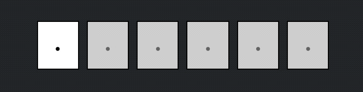
Demo
Features
⚡ Get Started Easily: The component works out of the box without the need to pass it a single prop.
🛠 Highly Configurable: Change the behaviour of the component to fit your needs by passing props.
💅🏼 Custom Styling: Customize the component's styling to match the look of your application.
👨🏼💻 TypeScript Support: The package contains TypeScript declarations so you can enjoy IntelliSense in your editor.
✅ Compatibility: Compatible with React 16 (>=16.8.0), React 17 and React 18. Support of new versions of React as they are released will be ensured.
Getting Started
First, install the package using npm or yarn.
Now, import the React component like this:
import VerificationInput from "react-verification-input";
And in your JSX write:
<VerificationInput />
That's it! You now have a basic verification input with default configuration rendered on your page. 🎉😃
The component accepts a variety of props, which allow to configure the component according to your needs. For a complete API overview see here.
API Documentation
All of these props are optional and some also come with a default value. However, it's recommended to use at least the length, validChars and onChange/onComplete props.
| Option | Type | Default | Description |
|---|---|---|---|
| value | String | - | The value of the verification input. Behaves like the value prop of a regular input element. This is necessary if the value needs to be changed from the outside (e.g. clearing the value). If you pass this prop, you are responsible to manage the value state. Otherwise the state will be kept inside the component. |
| length | Number | 6 |
Number of characters the input should allow. |
| validChars | String | 'A-Za-z0-9' |
Set of characters the input should allow. The string is inserted into a regexp character set ( /[]/ ) for input validation. |
| placeholder | String | '·' (U+00B7) |
The character to display in empty fields. In order to use the blank character as a placeholder, specify this option as ' ' or ''. |
| autoFocus | Boolean | false |
Focus the input automatically as soon as it is rendered. |
| passwordMode | Boolean | false |
Hide the input value by displaying * instead. |
| inputProps | Object | {} |
The properties of this object get forwarded as props to the input element. |
| containerProps | Object | {} |
The properties of this object get forwarded as props to the container element. |
| classNames | Object | {} |
CSS class names to add to the specified elements. |
| onChange | Function | - | Callback function that gets called with the string value whenever it changes. |
| onComplete | Function | - | Callback function that gets called with the string value when the input is fully filled. |
| onFocus | Function | - | Callback function that gets called when the component obtains focus. |
| onBlur | Function | - | Callback function that gets called when the component loses focus. |
Custom Styling
Style the input by passing it your custom class names like so:
<VerificationInput
  classNames={{
    container: "container",
    character: "character",
    characterInactive: "character--inactive",
    characterSelected: "character--selected",
    characterFilled: "character--filled",
  }}
/>
Example
Component Structure
The following illustration shows the component structure.
Contributing
Contributions welcome ❤️. If you want to contribute, feel free to have a look at the contribution guide.
Open Source Agenda Badge
