React Loader Spinner Save Abandoned
Collection set of react-spinner for async operation
react-spinner-loader provides simple React SVG spinner component which can be implemented for async await operation before data loads to the view.
Installation
Using NPM:
$ npm install react-loader-spinner --save
Using yarn
$ yarn add react-loader-spinner
Import required css
import "react-loader-spinner/dist/loader/css/react-spinner-loader.css";
Demo
Usage
import Loader from "react-loader-spinner";
export default class App extends React.Component {
  //other logic
  render() {
    return (
      <Loader
        type="Puff"
        color="#00BFFF"
        height={100}
        width={100}
        timeout={3000} //3 secs
      />
    );
  }
}
If webpack throws issue with css. (For older version of this package)
Change webpack config as:
test: /\.scss$/ to test: /\.s?css$/
Newer version just import css file from node modules to app.js
Types of Spinner
react-loader-spinner component has the following types of spinners.
| Spinner Type | Implementation |
|---|---|
| Audio | <Loader type="Audio" color="#00BFFF" height={80} width={80} /> |
| BallTriangle | <Loader type="BallTriangle" color="#00BFFF" height={80} width={80} /> |
| Bars | <Loader type="Bars" color="#00BFFF" height={80} width={80} /> |
| Circles | <Loader type="Circles" color="#00BFFF" height={80} width={80}/> |
| Grid | <Loader type="Grid" color="#00BFFF" height={80} width={80} /> |
| Hearts | <Loader type="Hearts" color="#00BFFF" height={80} width={80} /> |
| Oval | <Loader type="Oval" color="#00BFFF" height={80} width={80} /> |
| Puff | <Loader type="Puff" color="#00BFFF" height={80} width={80} /> |
| Rings | <Loader type="Rings" color="#00BFFF" height={80} width={80} /> |
| TailSpin | <Loader type="TailSpin" color="#00BFFF" height={80} width={80} /> |
| ThreeDots | <Loader type="ThreeDots" color="#00BFFF" height={80} width={80} /> |
There are more. View [demo] to see the full list.
PropTypes Available
react-loader-spinner component accepts the following props. Instructions on how to use them are below.
| name | types | default | Detail |
|---|---|---|---|
| visible | String or boolean | false | Show/ Hide the loader as required. |
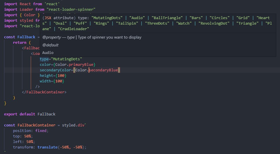
| type | String | "Audio" | Type of spinner you want to display. View the type in Types of Spinner section. |
| height | Number | 80 | Height prop define the height of the svg spinner. Default height is 80px. |
| width | Number | 80 | Width prop define the width of the spinner. |
| color | String | "Blue" | color prop is for adding color to the spinner |
| secondaryColor | String | "Grey" | secondaryColor prop for now is available on Plane and MutatingDots loaders |
| timeout | Number | 0 | Duration in milliseconds after which spinner is disabled |
| radius | Number | value varies | Set radius if the loader has a circle element in it |
Typescript
Typescript support is now also available. It has full propType intellisense support. Just install the component library as usual and use it in any (React) <Typescript> project.Finally, you will get all sorts of propType intellisense & static typeChecking out of the box. Just like Javascript we also ❤ Typescript.
Here are the list of the task for which we want PR:
- Optimize css implementation
- Optimization for multiple color support.
- Optimize css implementation
- Add support for Typescript.
- Optimization for multiple color support.
License
MIT
Open Source Agenda Badge
