Pplu Aws Map Save
Make a network graph of an AWS region
AWS Network Graph
This is a small program for getting a hold of the state of your AWS network. It maps out a VPC region of your choice
Example
Installation
On a recent Ubuntu system these packages are needed
apt-get install -y graphviz-dev libxml2-dev libssl-dev carton
git clone https://github.com/pplu/aws-map.git
cd aws-map
carton install
Generating images
You can scan your infrastructure with two utilities:
carton exec perl -I lib bin/map_network_sgs eu-west-1
This will generate three files: graph.svg, graph.dot and graph.png. These
all have the same contents in different formats SVG, DOT (for graphviz) and PNG
Optionally you can pass a second parameter with the prefix for the the images to be generated. Note that the three extensions will be added to the prefix
Self-Hosted web server
carton exec perl -I lib bin/map-webserver eu-west-1
This will prompt you to visit http://localhost:3000 where there is a small web application
that has a viewer with zooming and panning. This is very convenient to navigate the map
(specially big ones)
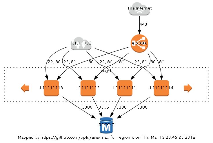
Understanding the graph
The generated graph attempts to show you your AWS region from a networking perspetive. It shows you what can talk to what, at an IP level.
The graphs' nodes are "things" that can talk IP (Network hosts, Instances, etc.)
![]() Network Hosts and Network Ranges.
Network Hosts and Network Ranges.
![]() We have a special icon for 0.0.0.0/0, tagging it as "The Internet"
We have a special icon for 0.0.0.0/0, tagging it as "The Internet"
![]() ...
...![]() Instances, RDSs, ELBs... (AWS objects) are represented with their respetive icons. If there is no icon the object is just a box.
Instances, RDSs, ELBs... (AWS objects) are represented with their respetive icons. If there is no icon the object is just a box.
![]() are Security Groups with nothing in them. You may want to evaluate deleting them.
are Security Groups with nothing in them. You may want to evaluate deleting them.
Instances in an autoscaling group will be surrounded in a dotted box with "autoscaling arrows" to left and right.
Arrows tell you in what direction IP connections (TCP, UDP, ICMP, etc) can flow (what can talk to what). Only incoming connections are graphed (Outbound rules aren't scanned yet). When a port range is not labeled, it means that the ports are TCP (i.e.: "25" means TCP port 25. "25-27" means TCP ports 25 to 27). If the ports are UDP, they are indicated: "25-27 UDP").
With a quick look at the example graph we can see the following:
Things in 1.1.1.1/32 can talk to the instances via HTTP and SSH.
The ELB is open to the Internet via HTTPS. It talks to instances via HTTP.
The instances talk to an RDS on port 3306
Known limitations
This tool only evaluates incoming Security Group rules. That means that Subnet ACLs, Routing tables, etc. are not taken into account to calculate if a host can actually talk to another.
When you graph a big account, it can take a while. Be patient. Also take into account that the graph can be hard to look at.
Contributing
Contributions are more than welcome. Take a look at the Perl Graphviz module to control the graph better: https://metacpan.org/pod/GraphViz2
The source code is located here: https://github.com/pplu/aws-map
Issuses can be opened here: https://github.com/pplu/aws-map/issues
Author
Jose Luis Martinez Torres ([email protected])
Copyright
Copyright (c) 2017 by CAPSiDE
This program is free software; you can redistribute it and/or modify it under the same terms as Perl itself.
The full text of the license can be found in the LICENSE file included with this module.
Icons come from AWS Simple Icons collection and are (c) AWS
