Plotly Calplot Save
The easiest and best looking Calendar Heatmap you'll find, made with Plotly.
Project README
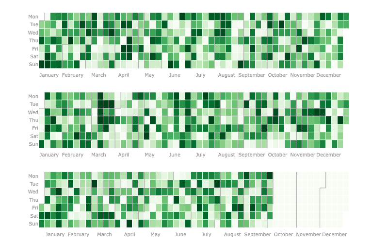
Calendar Heatmap with Plotly
Making it easier to visualize and costumize time relevant or time series data with plotly interaction.
New to the library? Read this Medium article.
This plot is a very similar to the contribuitions available on Github and Gitlab profile pages and to Calplot - which is a pyplot implementation of the calendar heatmap, thus it is not interactive right off the bat.
The first mention I could find of this plot being made with plotly was in this forum post and it got my attention as something that should be easily available to anyone.
Installation
pip install plotly-calplot
Examples
In this Medium article I covered lot's of usage methods for this library.
from plotly_calplot import calplot

fig = calplot(df, x="date", y="value")
fig.show()
# you can also adjust layout and your usual plotly stuff
Open Source Agenda is not affiliated with "Plotly Calplot" Project. README Source: brunorosilva/plotly-calplot
Stars
90
Open Issues
9
Last Commit
5 months ago
Repository
