MultiProgressView Save
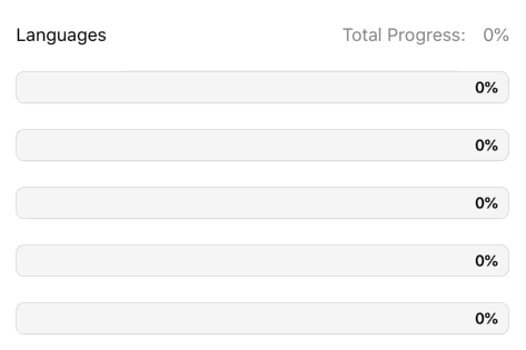
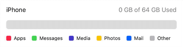
📊 An animatable view that depicts multiple progresses over time. Modeled after UIProgressView


)

📊 MultiProgressView is an animatable view that depicts multiple progresses over time. Modeled after UIProgressView.
Examples
To run the example project, clone the repo and run the MultiProgressViewExample target.
Basic Usage
Programmatic
-
Add a
MultiProgressViewto your view hierarchy:let progressView = MultiProgressView() view.addSubview(progressView) -
Conform your class to the
MultiProgressViewDataSourceprotocol and set your progress view'sdataSource:func numberOfSections(in progressView: MultiProgressView) -> Int func progressView(_ progressView: MultiProgressView, viewForSection section: Int) -> ProgressViewSectionprogressView.dataSource = self -
Call
setProgress(section:to:)to update your view's progress:progressView.setProgress(section: 0, to: 0.4) //animatable
Storyboards
-
Drag a
UIViewonto your view controller and set the view's class toMultiProgressViewin the Identity Inspector: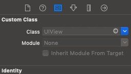
-
Connect your progress view to your view controller with an
IBOutlet: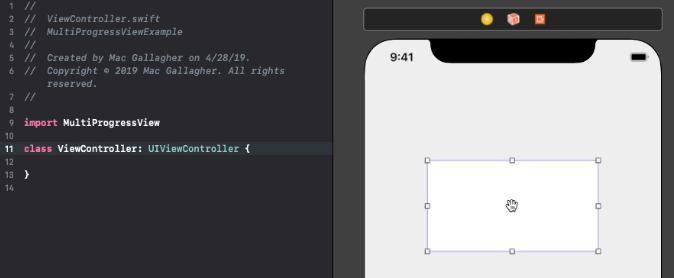
-
Conform your view controller to the
MultiProgressViewDataSourceprotocol and implement the required methods:func numberOfSections(in progressView: MultiProgressView) -> Int func progressView(_ progressView: MultiProgressView, viewForSection section: Int) -> ProgressViewSection -
Set your view controller as the progress view's
dataSource: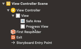
-
Call
setProgress(section:to:)to update your view's progress:progressView.setProgress(section: 0, to: 0.4) //animatable
Customization
MultiProgressView
Each MultiProgressView exposes the variables listed below. If using storyboards, many of these properties can be customized directly in the view's Attribute Inspector.
var cornerRadius: CGFloat = 0
var borderWidth: CGFloat = 0
var borderColor: UIColor? = .black
var lineCap: LineCapType = .square

var trackInset: CGFloat = 0
var trackBackgroundColor: UIColor? = .clear
var trackBorderColor: UIColor? = .black
var trackBorderWidth: CGFloat = 0

var trackImageView: UIImageView

var trackTitleLabel: UILabel
var trackTitleEdgeInsets: UIEdgeInsets = .zero
var trackTitleAlignment: AlignmentType = .center
Note: To apply a corner radius (using layer.cornerRadius or the cornerRadius variable) the lineCap type must be set to .round.
ProgressViewSection
Each ProgressViewSection exposes the following variables:
var imageView: UIImageView
var titleLabel: UILabel
var titleEdgeInsets: UIEdgeInsets = .zero
var titleAlignment: AlignmentType = .center
Installation
CocoaPods
MultiProgressView is available through CocoaPods. To install it, simply add the following line to your Podfile:
pod 'MultiProgressView'
Carthage
MultiProgressView is available through Carthage. To install it, simply add the following line to your Cartfile:
github "mac-gallagher/MultiProgressView"
Swift Package Manager
MultiProgressView is available through Swift PM. To install it, simply add the package as a dependency in Package.swift:
dependencies: [
  .package(url: "https://github.com/mac-gallagher/MultiProgressView.git", from: "1.2.0"),
]
Manual
Download and drop the MultiProgressView directory into your project.
Requirements
- iOS 9.0+
- Xcode 10.2+
- Swift 5.0+
Apps Using MultiProgressView
We love to hear about apps that use MultiProgressView - feel free to submit a pull request and share yours here!
Made with ❤️ by Mac Gallagher (Header design by Mazen Ghani)
Open Source Agenda Badge
