MSCircularSlider Save
A fully-featured, powerful circular slider for iOS applications
MSCircularSlider


A fully IBDesignable and IBInspectable circular slider for iOS applications

Getting Started
MSCircularSlider provides a fluid and straightforward interface to a multipurpose slider UIControl. The entire library is written in Swift 5 along with the accompanying example project
Installation
CocoaPods (recommended)
For the latest CocoaPods release
pod 'MSCircularSlider'
Manual Installation
Simply clone the entire repo and extract the files in the MSCircularSlider folder, then import them into your XCode project.
Or use one of the shorthand methods below
GIT
-
cdinto your project directory - Use
sparse-checkoutto pull the library files only into your project directorygit init MSCircularSlider cd MSCircularSlider git remote add -f origin https://github.com/ThunderStruct/MSCircularSlider.git git config core.sparseCheckout true echo "MSCircularSlider/*" >> .git/info/sparse-checkout git pull --depth=1 origin master - Import the newly pulled files into your XCode project
SVN
-
cdinto your project directory -
checkoutthe library filessvn checkout https://github.com/ThunderStruct/MSCircularSlider/trunk/MSCircularSlider - Import the newly checked out files into your XCode project
Usage
Initialization
Most members are IBInspectable, providing multiple ways of complete initialization; through the Interface Builder or programmatically
Interface Builder Initialization
Programmatic Initialization
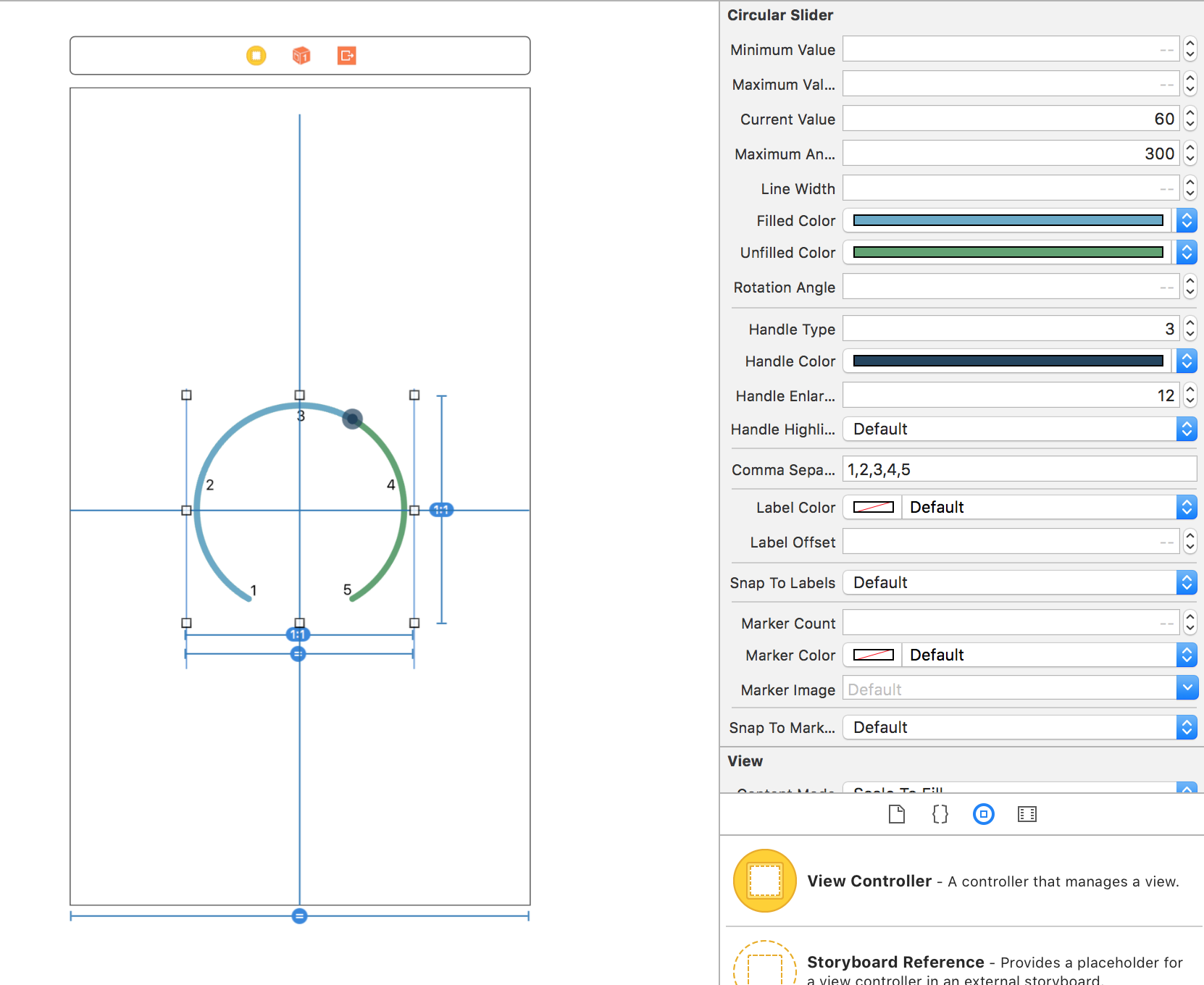
The following code instantiates and initializes the slider to make it identical to the one in the IB sample above
let frame = CGRect(x: view.center.x - 200, y: view.center.y - 200, width: 400, height 400)     // center in superview
let slider = MSCircularSlider(frame: frame)
slider.currentValue = 60.0
slider.maximumAngle = 300.0
slider.filledColor = UIColor(red: 127 / 255.0, green: 168 / 255.0, blue: 198 / 255.0, alpha: 1.0)
slider.unfilledColor = UIColor(red: 80 / 255.0, green: 148 / 255.0, blue: 95 / 255.0, alpha: 1.0)
slider.handleType = .doubleCircle
slider.handleColor = UIColor(red: 35 / 255.0, green: 69 / 255.0, blue: 96 / 255.0, alpha: 1.0)
slider.handleEnlargementPoints = 12
slider.labels = ["1", "2", "3", "4", "5"]
view.addSubview(slider!)
Members and Methods
MSCircularSlider
-
delegate: takes a class conforming to MSCircularSliderDelegate and handles delegation - default nil- note: please check the Protocols segment below for more info about the abstract delegation model used
-
minimumValue: the value the slider takes at angle 0° - default 0.0 -
maximumValue: the value the slider takes at maximumAngle - default 100.0 -
currentValue: the value the slider has at the current angle - default 0.0 -
maximumAngle: the arc's maximum angle (360° = full circle) - default 360.0 -
sliderPadding: the padding between the frame and the drawn slider (can be used to prevent labels' clipping by enlarging the frame and increasing the padding) - default 0.0 -
lineWidth: the arc's line width - default 5 -
filledColor: the color shown for the part "filled" by the handle - default .darkGrey -
unfilledColor: the color shown for the "unfilled" part of the circle - default .lightGrey -
rotationAngle: the rotation transformation angle of the entire slider view - default calculated so that the gap is facing downwards- note: the slider adds an inverted rotational transformation to all of its subviews to cancel any applied rotation
-
handleType: indicates the type of the handle - default .largeCircle -
handleColor: the handle's color - default .darkGrey -
hanldeImage: the handle's image - default nil -
handleEnlargementPoints: the number of points the handle is larger than lineWidth - default 10- note: this property only applies to handles of types .largeCircle or .doubleCircle
-
handleHighlightable: indicates whether the handle should highlight (becomes semitransparent) while being pressed - default true -
handleRotatable: specifies whether or not the handle should rotate to always point outwards - default false -
labels: the string array that contains all labels to be displayed in an evenly-distributed manner - default [ ]- note: all changes to this array will not be applied instantly unless they go through the assignment operator (=). To perform changes, use the provided methods below
-
labelColor: the color applied to the displayed labels - default .black -
snapToLabels: indicates whether the handle should snap to the nearest label upon handle-release - default false -
labelFont: the font applied to the displayed labels - default .systemFont(ofSize: 12) -
labelOffset: the number of point labels are pushed off away from the slider's center - default 0.0- note: a negative number can be used to draw the labels inwards towards the center
-
markerCount: indicates the number of markers to be displayed in an evenly-distributed manner - default 0 -
markerColor: the color applied to the displayed markers - default .darkGrey -
markerPath: an optional UIBezierPath to draw custom-shaped markers instead of the standard ellipse markers - default nil -
markerImage: an optional UIImage to be drawn instead of the standard ellipse markers - default nil- note: markerPath takes precedence over markerImage, so if both members are set, the images will not be drawn
-
snapToMarkers: indicates whether the handle should snap to the nearest marker upon handle-release - default false- ~note: if both snapToMarkers and snapToLabels are true, the handle will be snapped to the nearest marker~ removed mutual-exclusion in 1.1.0
-
slidingDirection: indicates the current handle sliding direction - default .none -
revolutionsCount: indicates the number of times the handle has revolved (requiresmaximumAngle= 360) - default 0 -
maximumRevolutions: specifies the maximum number of revolutions before the slider is bounded at 100% (angle= 360.0) - default -1- note: this property is valid only when
maximumAngle = 360.0, it also prevents -ve revolutions by bounding the counter-clockwise sliding at 0% (angle= 0.0) andrevolutionsCount= 0. Setting this property to any -ve value will allow the slider to revolve endlessly
- note: this property is valid only when
-
addLabel(_ string: String): adds a string to the labels array and triggers required drawing methods -
changeLabel(at index: Int, string: String): replaces the label's string at the given index with the provided string -
removeLabel(at index: Int): removes the string from the labels array at the given index
MSDoubleHandleCircularSlider
Inherits from MSCircularSlider with the following differences
-
delegate: takes a class conforming to MSDoubleHandleCircularSliderDelegate and handles delegation - default nil- note: please check the Protocols segment below for more info about the abstract delegation model used
-
minimumHandlesDistance: indicates the minimum arc length between the two handles - default 10.0 -
secondCurrentValue: the current value of the second handle - default calculated from 60° angle -
secondHandleType: indicates the type of the second handle - default .largeCircle -
secondHandleColor: the second handle's color - default .darkGrey -
secondHandleImage: the second handle's image - default nil -
secondHandleEnlargementPoints: the number of points the second handle is larger than lineWidth - default 10- note: this property only applies to handles of types .largeCircle or .doubleCircle
-
secondHandleHighlightable: indicates whether the second handle should highlight (becomes semitransparent) while being pressed - default true -
secondHandleRotatable: specifies whether or not the second handle should rotate to always point outwards - default false -
snapToLabels: indicates whether both handles should snap to the nearest marker upon handle-release - default false - ~overridden and made unavailable~ available in 1.3.0 -
snapToMarkers: findicates whether both handles should snap to the nearest label upon handle-release - default false - ~overriden and made unavailable~ available in 1.3.0
MSGradientCircularSlider
Inherits from MSCircularSlider with the following differences
-
gradientColors: the colors array upon which the gradient is calculated (as ordered in the array) - default [.lightGray, .blue, .darkGray]- note: all changes to this array will not be applied instantly unless they go through the assignment operator (=). To perform changes, use the provided methods below
-
addColor(_ color: UIColor): adds a color to the gradientColors array and triggers required drawing methods -
changeColor(at index: Int, newColor: UIColor): replaces the color at the given index with the provided newColor -
removeColor(at index: Int): removes the color from the gradientColors array at the given index
Protocols and Enums
There are three protocols used in the MSCircularSlider library
MSCircularSliderProtocol
An internal protocol that acts only as an abstract super class with no defined methods. The main and only delegate member exposed in all classes is of type MSCircularSliderProtocol and gets cast to one of the other two protocols appropriately
MSCircularSliderDelegate
Inherits from MSCircularSliderProtocol and contains all methods (documented below) used by MSCircularSlider and MSGradientCircularSlider
-
circularSlider(_ slider: MSCircularSlider, valueChangedTo value: Double, fromUser: Bool): called upon currentValue change and provides a fromUser Bool that indicates whether the value was changed by the user (by scrolling the handle) or through other means (programmatically or so -currentValue = 20) -
circularSlider(_ slider: MSCircularSlider, startedTrackingWith value: Double): indicates that the handle started scrolling -
circularSlider(_ slider: MSCircularSlider, endedTrackingWith value: Double): indicates that the slider's handle was released -
circularSlider(_ slider: MSCircularSlider, directionChangedTo value: MSCircularSliderDirection): indicates which direction the user is currently sliding -
circularSlider(_ slider: MSCircularSlider, revolutionsChangedTo value: Int): indicates how many times the handle has revolved around the entire slider (only valid formaximumAngle= 360.0 / full circle)
MSDoubleHandleCircularSliderDelegate
Inherits from MSCircularSliderProtocol and is used only by MSDoubleHandleCircularSlider
-
circularSlider(_ slider: MSCircularSlider, valueChangedTo firstValue: Double, secondValue: Double, isFirstHandle: Bool?, fromUser: Bool): called upon any of the two current values changes and provides an isFirstHandle Bool indicating whether the change came from the first or second handle -
circularSlider(_ slider: MSCircularSlider, startedTrackingWith firstValue: Double, secondValue: Double, isFirstHandle: Bool): indicates that the handle started scrolling -
circularSlider(_ slider: MSCircularSlider, endedTrackingWith firstValue: Double, secondValue: Double, isFirstHandle: Bool): indicates that the active slider's handle was released
MSCircularSliderDirection
Used to indicate which direction the user is currently sliding
-
.none -
.clockwise -
.counterclockwise
Todos
- Eliminate mutual-exlusion between
snapToLabelsandsnapToMarkers - Add snapping feature for
MSDoubleHandleCircularSlider - Add independent members for the second handle in
MSDoubleHandleCircularSliderto customize each handle individually - Add
MSCircularSliderMaterialenum that specifies different finishes for the slider, including- Glossy
- Matte
- Pearlescent
- Add a
setValuemethod with an optional animation parameter
License
This project is licensed under the MIT License - see the LICENSE file for details
Open Source Agenda Badge
