MaterialBanner Save
A library that provides an implementation of the banner widget from the Material design.
MaterialBanner 

A banner displays a prominent message and related optional actions.
MaterialBanner is a library that provides an implementation of the banner widget from the Material design.

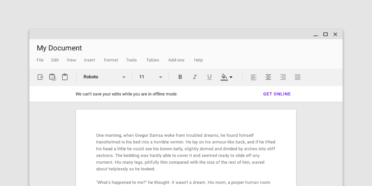
Preview

You can download the sample app here.
Setup
Legacy (version 1.2.0): Add the gradle dependency
jcenter {
    content {
        includeGroup "com.sergivonavi"
    }
}
implementation "com.sergivonavi:materialbanner:1.2.0"
Latest (version 2.0.0)
Download sources and add the MaterialBanner library to your project.
Check your theme
In order to use this banner your app theme should inherit from a Material Components theme.
More about that: Getting Started - Material Components for Android.
Create your banner
In your layout.xml:
<com.sergivonavi.materialbanner.Banner
    android:id="@+id/banner"
    android:layout_width="match_parent"
    android:layout_height="wrap_content"
    android:visibility="gone" // don't hide if you want to show this banner everytime
    app:buttonLeftText="Dismiss"
    app:buttonRightText="Turn on wifi"
    app:icon="@drawable/ic_signal_wifi_off_40dp"
    app:messageText="You have lost connection to the Internet." />
then in your Activity/Fragment:
Banner banner = findViewById(R.id.banner);
banner.setLeftButtonListener(new BannerInterface.OnClickListener() {
    @Override
    public void onClick(BannerInterface banner) {
        // do something
    }
});
banner.setRightButtonListener(new BannerInterface.OnClickListener() {
    @Override
    public void onClick(BannerInterface banner) {
        // do something
    }
});
// show when needed
banner.show();

// and later on
banner.dismiss();
From the code using Builder:
Banner banner = new Banner.Builder(context).setParent(rootView)
    .setIcon(R.drawable.ic_signal_wifi_off_40dp)
    .setMessage("You have lost connection to the Internet. This app is offline.")
    .setLeftButton("Dismiss", new BannerInterface.OnClickListener() {
        @Override
        public void onClick(BannerInterface banner) {
            banner.dismiss();
        }
    })
    .setRightButton("Turn on wifi", new BannerInterface.OnClickListener() {
        @Override
        public void onClick(BannerInterface banner) {
            // do something
        }
    })
    .create(); // or show() if you want to show the Banner immediately

    ...

    banner.show();
DO NOT forget to call Builder#setParent(...). Pass here a ViewGroup that will be a parent for your banner.
Or you can use:
- setParent(ViewGroup, int) to specify the index of the banner in ViewGroup's hierarchy;
- setParent(ViewGroup, int, ViewGroup.LayoutParams) to change the default LayoutParams.
Note
You don't need to set both left and right buttons: you can set one of them (doesn't matter which one).
Additional setup
Add listeners
If you want to know when your banner was shown or dismissed you can set appropriate listeners from BannerInterface:
banner.setOnDismissListener(new BannerInterface.OnDismissListener() {
    @Override
    public void onDismiss() {
        // do something
    }
})
banner.setOnShowListener(new BannerInterface.OnShowListener() {
    @Override
    public void onShow() {
        // do something
    }
})
Or chain these calls to the Builder:
new Banner.Builder(context)
    ...
    .setOnDismissListener(new BannerInterface.OnDismissListener() {
        @Override
        public void onDismiss() {
            // do something
        }
    })
    .setOnShowListener(new BannerInterface.OnShowListener() {
        @Override
        public void onShow() {
            // do something
        }
    })
    ...
Styling
For the style guidelines read Banners - theming.
Changing style of a single banner
In your layout.xml
Available attributes:
- backgroundColor
- iconTint
- messageTextAppearance
- messageTextColor
- buttonsTextAppearance
- buttonsTextColor
- buttonsRippleColor
- lineColor
- lineOpacity
Usage:
<com.sergivonavi.materialbanner.Banner
    ...
    app:backgroundColor="@color/custom_background"
    app:iconTint="@color/custom_icon_tint"
    app:messageTextAppearance="@style/BannerMessageTextAppearance"
    app:messageTextColor="@color/custom_message_text"
    app:buttonsTextAppearance="@style/BannerButtonsTextAppearance"
    app:buttonsTextColor="@color/custom_buttons_text"
    app:buttonsRippleColor="@color/custom_buttons_ripple"
    app:lineColor="@color/custom_line"
    app:lineOpacity="0.8" />
From the code
Available methods:
- setBackgroundColor
- setIconTintColor
- setMessageTextAppearance
- setMessageTextColor
- setButtonsTextAppearance
- setButtonsTextColor
- setButtonsRippleColor
- setLineColor
- setLineOpacity
Usage:
banner.setBackgroundColor(ContextCompat.getColor(this, R.color.custom_background));
banner.setIconTintColor(R.color.custom_icon_tint);
banner.setMessageTextAppearance(R.style.BannerMessageTextAppearance);
banner.setMessageTextColor(R.color.custom_message_text);
banner.setButtonsTextAppearance(R.style.BannerButtonsTextAppearance);
banner.setButtonsTextColor(R.color.custom_buttons_text);
banner.setButtonsRippleColor(R.color.custom_buttons_ripple);
banner.setLineColor(R.color.custom_line);
banner.setLineOpacity(0.8f);
Global style
You can change style of your banner globally.
Add bannerStyle attribute to your theme:
<style name="CustomTheme" parent="Theme.MaterialComponents.Light.DarkActionBar">
    ...
    <item name="bannerStyle">@style/CustomBanner</item>
</style>
And create your custom style (you can inherit from the provided default banner styles):
<style name="CustomBanner" parent="@style/Widget.Material.Banner">
    <!-- change what you want -->
    <item name="messageTextAppearance">@style/BannerMessageTextAppearance</item>
    <item name="buttonsTextAppearance">@style/BannerButtonsTextAppearance</item>
    ...
</style>

<style name="BannerMessageTextAppearance" parent="TextAppearance.Banner.Message">
    <item name="android:textSize">16sp</item>
    ...
</style>

<style name="BannerButtonsTextAppearance" parent="TextAppearance.Banner.Button">
    <item name="android:textStyle">bold</item>
    ...
</style>
Change padding of the banner's content to fit your layout
If you want to do something like this:
 You can change the content's padding using provided attributes or methods:
- attr: contentPaddingStart
- attr: contentPaddingEnd
- setContentPaddingStart
- setContentPaddingEnd
But account for the default padding:
- the end padding is always 16dp (a distance between the button's last character and the end edge of a banner)
- the start padding depends on a user's device
On mobile:
- the start padding is always 16dp regardless if icon set or not
On tablet (sw720dp):
- the start padding depends whether icon set or not
- if set then 16dp
- otherwise 24dp
See Banners - specs for visualisation.
Example
- If the content of your screen has 32dp margin from both sides and you set an icon then you can set 16dp padding for your banner:
app:contentPaddingEnd="16dp"
app:contentPaddingStart="16dp"

or

banner.setContentPaddingStart(R.dimen.banner_content_padding);
banner.setContentPaddingEnd(R.dimen.banner_content_padding);
- Everything is the same but no icon:
- for mobile devices - 16dp padding from both sides;
- for tablets
- 16dp end padding
- 8dp start padding (32dp margin - 24dp margin of the message)
See the sample app for example.
Note
DO NOT set padding directly using the default padding attributes or methods. It will break the appearance of the widget.
License
Copyright 2023 Sergey Ivanov

Licensed under the Apache License, Version 2.0 (the "License");
you may not use this file except in compliance with the License.
You may obtain a copy of the License at

   http://www.apache.org/licenses/LICENSE-2.0

Unless required by applicable law or agreed to in writing, software
distributed under the License is distributed on an "AS IS" BASIS,
WITHOUT WARRANTIES OR CONDITIONS OF ANY KIND, either express or implied.
See the License for the specific language governing permissions and
limitations under the License.
Open Source Agenda Badge
