Katana Ui Swift Save
UIKit port of React, built on top of Katana.


Katana UI is a modern Swift framework for writing iOS apps, strongly inspired by React and Redux, that gives structure to all the aspects of your app:
- logic: the app state is entirely described by a single serializable data structure, and the only way to change the state is to dispatch an action. An action is an intent to transform the state, and contains all the information to do so. Because all the changes are centralized and are happening in a strict order, there are no subtle race conditions to watch out for. The logic layer is provided by Katana.
- UI: the UI is defined in terms of a tree of components declaratively described by props (the configuration data, i.e. a background color for a button) and state (the internal state data, i.e. the highlighted state for a button). This approach lets you think about components as isolated, reusable pieces of UI, since the way a component is rendered only depends on the current props and state of the component itself.
- logic ↔️ UI: the UI components are connected to the app state and will be automatically updated on every state change. You control how they change, selecting the portion of app state that will feed the component props. To render this process as fast as possible, only the relevant portion of the UI is updated.
- layout: Katana defines a concise language (inspired by Plastic) to describe fully responsive layouts that will gracefully scale at every aspect ratio or size, including font sizes and images.
| Katana UI | |
|---|---|
| 🎙 | Declaratively define your UI |
| 📦 | Store all your app state in a single place |
| 💂 | Clearly define what are the actions that can change the state |
| 😎 | Describe asynchronous actions like HTTP requests |
| 💪 | Support for middleware |
| 🎩 | Automatically update the UI when your app state changes |
| 📐 | Automatically scale your UI to every size and aspect ratio |
| 🐎 | Easily animate UI changes |
| 📝 | Gradually migrate your application to Katana |
State of the project
We wrote several successful applications using the declarative UI layer that Katana UI provides. We still think that the declarative approach is really a good one when it comes to complex UIs that have to manage several states and transitions. At the same time, we also spent a considerable amunt of time in bridging UIKit's features into Katana UI layer. While in some cases the bridge was easy to implement, in other cases we had to create non trivial code to manage the gap between UIKit and Katana. We felt that being continously in contrast with UIKit really wasn't the way to go and so we decided to put some effort to fix this problem. The result is Tempura. Tempura is a lightweight, UIKit friendly, UI layer that aims to provide a declarative-like approach to UI without being in contrast with UIKit. We love it, and we really encourage you to check it out!
Overview
Defining the logic of your app
The business logic of the application is written using Katana. Please refer to the project's documentation for more information about how to model the state and modify it.
Defining the UI
In Katana you declaratively describe a specific piece of UI providing a NodeDescription. Each NodeDescription will define the component in terms of:
-
StateTypethe internal state of the component (es. highlighted for a button) -
PropsTypethe inputs coming from outside the component (es. backgroundColor for a view) -
NativeViewthe UIKit/AppKit element associated with the component
struct CounterScreen: NodeDescription {
	typealias StateType = EmptyState
	typealias PropsType = CounterScreenProps
	typealias NativeView = UIView

	var props: PropsType
}
Inside the props you want to specify all the inputs needed to render your NativeView and to feed your children components.
struct CounterScreenProps: NodeDescriptionProps {
  var count: Int = 0
  var frame: CGRect = .zero
  var alpha: CGFloat = 1.0
  var key: String?
}
When it's time to render the component, the method applyPropsToNativeView is called: this is where we need to adjust our nativeView to reflect the props and the state. Note that for common properties like frame, backgroundColor and more we already provide a standard applyPropsToNativeView so we got you covered.
struct CounterScreen: NodeDescription {
  ...
  public static func applyPropsToNativeView(
      props: PropsType,
      state: StateType,
      view: NativeView, ...) {

  	view.frame = props.frame
  	view.alpha = props.alpha
  }
}
NodeDescriptions lets you split the UI into small independent, reusable pieces. That's why it is very common for a NodeDescription to be composed by other NodeDescriptions as children, generating the UI tree. To define child components, implement the method childrenDescriptions.
struct CounterScreen: NodeDescription {
...
public static func childrenDescriptions(
props: PropsType,
state: StateType, ...) -> [AnyNodeDescription] {
return [
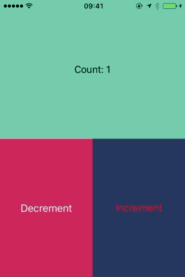
Label(props: LabelProps.build({ (labelProps) in
labelProps.key = CounterScreen.Keys.label.rawValue
labelProps.textAlignment = .center
labelProps.backgroundColor = .mediumAquamarine
labelProps.text = NSAttributedString(string: "Count: \(props.count)")
})),
Button(props: ButtonProps.build({ (buttonProps) in
buttonProps.key = CounterScreen.Keys.decrementButton.rawValue
buttonProps.titles[.normal] = "Decrement"
buttonProps.backgroundColor = .dogwoodRose
buttonProps.titleColors = [.highlighted : .red]
buttonProps.touchHandlers = [
.touchUpInside : {
dispatch(DecrementCounter())
}
]
})),
Button(props: ButtonProps.build({ (buttonProps) in
buttonProps.key = CounterScreen.Keys.incrementButton.rawValue
buttonProps.titles[.normal] = "Increment"
buttonProps.backgroundColor = .japaneseIndigo
buttonProps.titleColors = [.highlighted : .red]
buttonProps.touchHandlers = [
.touchUpInside : {
dispatch(IncrementCounter())
}
]
}))
]
}
}
Attaching the UI to the Logic
The Renderer is responsible for rendering the UI tree and updating it when the Store changes.
You create a Renderer object starting from the top level NodeDescription and the Store.
renderer = Renderer(rootDescription: counterScreen, store: store)
renderer.render(in: view)
Every time a new app State is available, the Store dispatches an event that is captured by the Renderer and dispatched down to the tree of UI components.
If you want a component to receive updates from the Store just declare its NodeDescription as ConnectedNodeDescription and implement the method connect to attach the app Store to the component props.
struct CounterScreen: ConnectedNodeDescription {
  ...
  static func connect(props: inout PropsType, to storeState: StateType) {
  	props.count = storeState.counter
  }
}
Layout of the UI
Katana has its own language (inspired by Plastic) to programmatically define fully responsive layouts that will gracefully scale at every aspect ratio or size, including font sizes and images.
If you want to opt in, just implement the PlasticNodeDescription protocol and its layout method where you can define the layout of the children, based on the given referenceSize. The layout system will use the reference size to compute the proper scaling.
struct CounterScreen: ConnectedNodeDescription, PlasticNodeDescription, PlasticReferenceSizeable {
  ...
  static var referenceSize = CGSize(width: 640, height: 960)

  static func layout(views: ViewsContainer<CounterScreen.Keys>, props: PropsType, state: StateType) {
    let nativeView = views.nativeView

    let label = views[.label]!
    let decrementButton = views[.decrementButton]!
    let incrementButton = views[.incrementButton]!
    label.asHeader(nativeView)
    [label, decrementButton].fill(top: nativeView.top, bottom: nativeView.bottom)
    incrementButton.top = decrementButton.top
    incrementButton.bottom = decrementButton.bottom
    [decrementButton, incrementButton].fill(left: nativeView.left, right: nativeView.right)
  }
}
You can find the complete example here
|
|---|
Where to go from here
Give it a shot
pod try KatanaUI
Explore sample projects

|

|

|
|---|---|---|
| Animations Example | Table Example | Minesweeper Example |
Installation
Katana UI is available through CocoaPods
Requirements
-
iOS 8.4+ / macOS 10.10+
-
Xcode 8.0+
-
Swift 3.0+
CocoaPods
CocoaPods is a dependency manager for Cocoa projects. You can install it with the following command:
$ sudo gem install cocoapods
To integrate Katana UI into your Xcode project using CocoaPods you need to create a Podfile.
For iOS platforms, this is the content
use_frameworks!
source 'https://github.com/CocoaPods/Specs.git'
platform :ios, '8.4'

target 'MyApp' do
  pod 'Katana'
  pod 'KatanaUI'
  pod 'KatanaElements'
end
Now, you just need to run:
$ pod install
Gradual Adoption
You can easily integrate Katana UI in existing applications. This can be very useful in at least two scenarios:
- You want to try katana in a real world application, but you don't want to rewrite it entirely
- You want to gradually migrate your application to Katana
A gradual adoption doesn't require nothing different from the standard Katana UI usage. You just need to render your initial NodeDescription in the view where you want to place the UI managed by Katana.
Assuming you are in a view controller and you have a NodeDescription named Description, you can do something like this:
// get the view where you want to render the UI managed by Katana UI
let view = methodToGetView()
let description = Description(props: Props.build {
	$0.frame = view.frame
})

// here we are not using the store. But you can create it normally
// You should also retain a reference to renderer, in order to don't deallocate all the UI that will be created when the method ends
let renderer = Renderer(rootDescription: description, store: nil)

// render the UI
renderer!.render(in: view)
Get in touch
- if you have any questions you can find us on twitter: @maurobolis, @luca_1987, @smaramba
Special thanks
- Everyone at Bending Spoons for providing their priceless input;
- @orta for providing input on how to opensource the project.
Contribute
- If you've found a bug, open an issue;
- If you have a feature request, open an issue;
- If you want to contribute, submit a pull request;
- If you have an idea on how to improve the framework or how to spread the word, please get in touch;
- If you want to try the framework for your project or to write a demo, please send us the link of the repo.
Run the project
In order to run the project, you need xcake. Once you have installed it, go in the Katana UI project root and run xcake make
License
Katana UI is available under the MIT license.
About
Katana has been created by Bending Spoons. We create our own tech products, used and loved by millions all around the world. Interested? Check us out!
Open Source Agenda Badge
