Json Schema Form Save
Angular JSON Schema Form Library
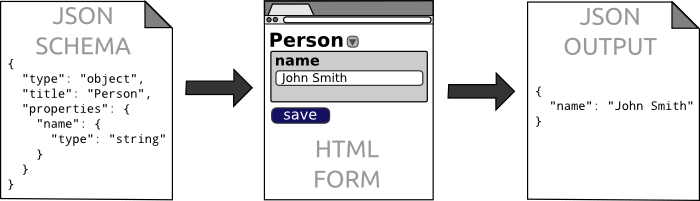
A Lightweight Angular JSON Schema Form Component

Goal
- Implement any web form with flexible styling and validation in a completely declarative way
- Live demo: https://dashjoin.github.io/
- Stackblitz: https://stackblitz.com/edit/dashjoin
- Video Tutorial
Features
- Supports JSON Schema Draft 6
- Can load referenced schemas from URLs
- Renders compact forms
- Supports 2-way databinding
- Autocomplete & typeahead based on REST services (complex responses can be processed via extended JSONata)
- CSS styling
- Built-in validation
- Flexible layout options (tab, table, vertical, horizontal, ...)
- Several input widgets (file upload, date / color picker, autocomplete, ...)
- Lightweight: < 1000 lines of code
Installation
To use the library in your project, follow these steps:
npm i @dashjoin/json-schema-form
npm i @angular/material
npm i jsonata
In your app module add:
import { BrowserModule } from '@angular/platform-browser';
import { BrowserAnimationsModule } from '@angular/platform-browser/animations';
import { JsonSchemaFormModule } from '@dashjoin/json-schema-form';
...

@NgModule({
  ...
  imports: [
    BrowserModule,
    BrowserAnimationsModule,
    JsonSchemaFormModule,
    ...
  ],
  ...
}
Note: You need import CommonModule for nested lazy loading modules
import { CommonModule } from '@angular/common';
import { JsonSchemaFormModule } from '@dashjoin/json-schema-form';

@NgModule({
  ...
  imports: [
    CommonModule,
    JsonSchemaFormModule,
    ...
  ],
  ...
}
A small sample component:
import { Component } from '@angular/core';
import { State } from '@dashjoin/json-schema-form';
import { FormArray } from '@angular/forms';

@Component({
  selector: 'app-root',
  template: `
    <lib-json-schema-form [state]="state"></lib-json-schema-form>
  `
})
export class AppComponent {

  state: State = {
    schema: {
      type: 'array',
      items: {
        type: 'object',
        properties: {
          name: { type: 'string' },
          bday: { type: 'string', widget: 'date' }
        }
      }
    },
    value: any = [{
      name: 'Joe',
      bday: '2018-09-09T22:00:00.000Z'
    }];
    name: 'myform',

    // pick FormArray, FormGroup or FormControl for arrays, objects, or single values respectively
    control: new FormArray([])
  };

  foo() {
    // subscribe to form value change / validation or state events
    this.state.control.valueChanges.subscribe(res => {
      console.log(res);
    })
  }
}
Finally, add the material style and icons to styles.css:
@import "~@angular/material/prebuilt-themes/indigo-pink.css";
@import "https://fonts.googleapis.com/icon?family=Material+Icons";
JSON Schema Extensions
We define a couple of extensions to JSON Schema in order to define the user interface and layout of the form. Please also see the demo playground where examples of all configuration options are available.
Widget
This option specifies a specific input widget to be used. The default is a simple text field. The following options are available:
{
  "type": "string",
  "widget": "date"
}
- select: shows a select input field with options (No free text entry is possible. Options can be loaded via rest (see below))
- upload: the JSON property is set to the contents of an uploaded file
- date: uses the material date picker component
- textarea: displays a multi line textarea
- password: input is shown as *****
- color: shows a color picker widget
- datetime-local, email, month, tel, time, url, week: uses the browser native input types
Custom Widgets
It is possible to create custom widgets using the following steps:
- Create a component that extends BaseComponent. All relevant data such as the applicable subschema and the current value are passed to the component. Make sure to emit value changes via state.control. An example can be found here
- Include the component in your @NgModule declarations
- In the parent component, add this service to your constructor: private service: JsonSchemaFormService
- Register your widget in ngOnInit() using this service: this.service.registerComponent('rich-text-editor', CustomComponent);
- Include the widget in your schema: { "widget": "custom", "widgetType": "rich-text-editor" }
Autocomplete choices
The following fields control how select and autocomplete options are obtained from a REST backend:
{
  "type": "string",
  "choicesUrl": "/assets/autocomplete-simple.json",
  "choicesVerb": "GET"
}
- choices: string array that allows defining the choices statically
- choicesUrl: defines the REST service URL
- choicesVerb: defines the HTTP verb to use for the REST service URL, default is POST
- choicesUrlArgs: defines the REST service parameter. The convention is to have a single parameter. Multiple fields need to be wrapped into a single object
- jsonata: used to transform the REST result into a string array or an array of objects with name and value fields if it is not already in that form. The transformation is expressed using JSONata
- choicesLoad: determines whether the choices are loaded upon page load (onLoad) or upon focus (onFocus), which is the default
Autocomplete and Select Display Names and Values
If you want the option's control value (what is saved in the form) to be different than the option's display value (what is displayed in the text field), the "displayWith" option allows you to do so. The value of "displayWith" is the name under which the implementation class to perform this job was registered. The class must implement the ChoiceHandler interface. An example can be found at the end of the playground component. The registration can be done in ngOnInit() using this service: this.service.registerDisplayWith('states', new MyDisplayer()); Consider the following example:
{
  "type": "string",
  "displayWith": "localName",
  "choices": [
    "https://en.wikipedia.org/wiki/Indonesia",
    "https://en.wikipedia.org/wiki/Peru",
    "As is - no tooltip"
  ]
}
The autocomplete is configured with "localName" which is a built-in displayer. It treats options like URLs and displays the local name which is the text after the last slash, hash, colon or dot. This causes the dropdown to display "Peru" with the tooltip indicating the real value "https://en.wikipedia.org/wiki/Peru" which is written to the JSON value.
The custom implementation also enables you to exercise tight control over filtering, typeahead loading of options, and determining the display value. For an example of a typeahead implementation, see the class MyTypeAhead at the bottom of the playground component.
Layout options
Layout options determine how the input elements of arrays and objects are arranged. These options can be applied for each nesting layer (e.g. if you're entering an array of objects):
{
  "type": "array",
  "layout": "horizontal",
  "items": {
    "type": "object",
    "layout": "vertical",
    "properties": {
      "name": {
        "type": "string"
      },
      "version": {
        "type": "number"
      }
    }
  }
}
- horizontal (default): input controls are arranged horizontally and flex-wrap if there is insufficient space
- vertical: input controls are arranged vertically
- tab: controls are shown in tabs (only applies to arrays and objects with additionalProperties)
- table: controls are shown in a table with the property names being the column names (only applies to an array of objects)
- select: array is shown as a multi-select (only applies to arrays of string)
- Any element can be placed in an expansion panel by adding "expanded": true / false. The Boolean value indicates whether the panel is expanded by default or not
The order field allows to control the inputs of objects:
- The order field can be a list of field names. For example "order": ["firstname", "lastname"] defines the first name input to appear before the last name, regardless of their order in the properties
- If a property is omitted, the form does not display an input. So in the example above, an age field is not in the form even if it is listed in properties.
- Order can also specify a 2-level hierarchy like "order": [["firstname", "lastname"], "emails"]. If a vertical layout is chosen, this displays firstname and lastname in the first row and the array of emails in the second row. The first row automatically chooses the opposite layout direction internally.
The style and class fields allow passing CSS styles and classes to the input fields. For instance, you could emphasize the input with a higher z elevation and accommodate for longer input values by increasing the default input element width:
{
  "type": "string",
  "class": [
    "mat-elevation-z2"
  ],
  "style": {
    "width": "400px"
  }
}
Please also see the definition of the Schema object.
Application Logic
In some situations, you would like to compute a field based on the contents of other fields. This can be achieved via the "compute" option. It can be placed within an object as follows:
{
  "type": "object",
  "properties": { "first": {"type": "string"}, "last": { "type": "string" }, "salutation": { "type": "string", "readOnly": true } },
  "computed": {
    "salutation": '"Dear " & first & " " & last & "," & $context("var")'
  }
}
In this example, any change to the first or last fields trigger a change in salutation which is displayed as a read only form field. The expression defining the salutation value is expressed in JSONata (https://jsonata.org/). The custom function $context allows the host application to reference data which was set via this.service.setContext(key, value).
Validation and Submitting
Some JSON Schema constructs like "pattern" or "required" allow validating an object against the schema. The result of this validation is displayed on the UI but it is also propagated to the parent component via the "error" output variable. Error contains the first validation error message or null if the form is valid. The following example shows how this information can be used to deactivate form submission:
<lib-json-schema-form [(value)]="value" [schema]="schema" [label]="schema.title" (errorChange)="error=$event">
</lib-json-schema-form>
<button [disabled]="error !== null" (click)="submit()">Submit</button>
Note that not all JSON schema validation constructs are supported. Also, arrays and additional property objects do not propagate the information and the invalid value is undefined.
Unsupported JSON Schema properties
We support JSON Schema Draft 6 with these exceptions:
- patternProperties: allows defining a property type depending on the property name. You can work around this using additionalProperties.
- const: allows defining a value to be constant. Work around this using default and /or enum with a single option.
- Combining schemas (oneOf, anyOf, not, allOf): this allows giving multiple options (schemas) for a property. These constructs make a lot of sense for validation but are hard to apply in the context of a form and therefore, they are not supported.
- contains: specifies that an array must contain one instance of a given type. As with the schema combination constructs, this makes sense for validation for not for forms.
Referenced Schemas
In order to foster reuse, schemas are often made available on the web. In this case, you can use JSON schema's $ref mechanism to have the browser load the schema as follows:
<lib-json-schema-form [schema]="{$ref:'https://raw.githubusercontent.com/riskine/ontology/master/schemas/core/profession.json'}">
The URL can also be relative to the form's URL:
<lib-json-schema-form [schema]="{$ref:'schema.json'}">
If you do not want the schema to be downloaded, you can also manually provide referenced schemas via the root schema:
{
  ...
  referenced: {
    'http://example.org/': { $id: 'http://example.org/', ... },
    'urn:myschema': { $id: 'urn:myschema', ... },
  }
}
Structure of this repository
The repository contains:
Contribute
We welcome contributions. If you are interested in contributing to Dashjoin, let us know! You'll get to know an open-minded and motivated team working together to build the next generation platform.
- Join our Slack and say hello
- Follow us on Twitter
- Submit your ideas by opening an issue with the enhancement label
- Help out by fixing "a good first issue"
Open Source Agenda Badge
