Introduction Screen Save
Add easily to your app an introduction screen to provide informations to new users
IntroductionScreen 
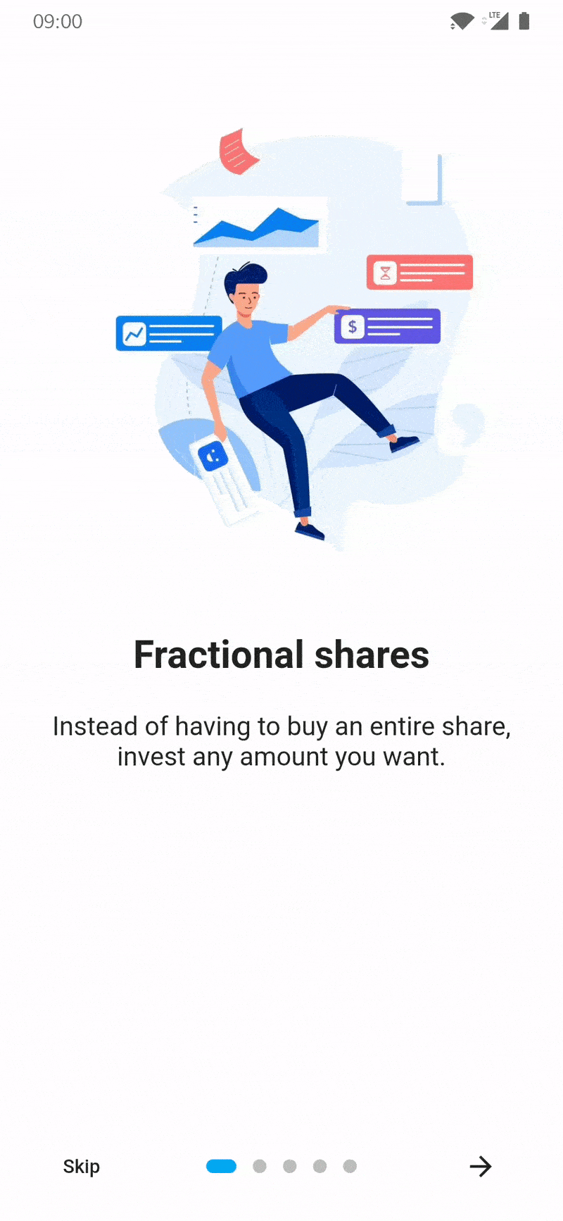
Introduction Screen allows you to have a screen on an app's first launch to, for example, explain your app. This widget is very customizable with a great design.
introduction_screen uses another package, dots_indicator, that I also created.
Installation
You just need to add introduction_screen as a dependency in your pubspec.yaml file.
dependencies:
  introduction_screen: ^3.1.14
Examples
Not all of the many parameters in each class are used in these examples. See Parameter Lists for the complete documentation for each class.
Note: if you want to display IntroductionScreen only once, like on the first start of your app, use
shared_preferences (or a similar strategy)
to save the status of whether it has been already displayed or not.
It's not responsibility of this package to handle this.
PageViewModel
A list of PageViewModels is used for IntroductionScreen's pages parameter.
Simple page
This example only defines the title, body, and image parameters.
(You can define image as any widget.)
PageViewModel(
  title: "Title of introduction page",
  body: "Welcome to the app! This is a description of how it works.",
  image: const Center(
    child: Icon(Icons.waving_hand, size: 50.0),
  ),
)
Page with custom colors
This example defines the color of the page using the decoration parameter.
The image link does not exist and is only for example.
PageViewModel(
  title: "Title of blue page",
  body: "Welcome to the app! This is a description on a page with a blue background.",
  image: Center(
    child: Image.network("https://example.com/image.png", height: 175.0),
  ),
  decoration: const PageDecoration(
    pageColor: Colors.blue,
  ),
)
Page with custom text style
This example defines custom TextStyles in the decoration parameter for the title and body.
PageViewModel(
  title: "Title of orange text and bold page",
  body: "This is a description on a page with an orange title and bold, big body.",
  image: const Center(
    child: Text("👋", style: TextStyle(fontSize: 100.0)),
  ),
  decoration: const PageDecoration(
    titleTextStyle: TextStyle(color: Colors.orange),
    bodyTextStyle: TextStyle(fontWeight: FontWeight.w700, fontSize: 20.0),
  ),
)
Page with a footer (button)
This example defines a footer for the page with a button.
The image does not exist and is only for example.
PageViewModel(
  title: "Title of custom button page",
  body: "This is a description on a page with a custom button below.",
  image: Image.asset("res/images/logo.png", height: 175.0),
  footer: ElevatedButton(
    onPressed: () {
      // On button pressed
    },
    child: const Text("Let's Go!"),
  ),
)
Page with widget body
This example defines the page body using bodyWidget and a Widget, rather than with body and a String.
Only use body or bodyWidget.
The titleWidget parameter does the same thing for the title.
PageViewModel(
  title: "Title of custom body page",
  bodyWidget: Row(
    mainAxisAlignment: MainAxisAlignment.center,
    children: const [
      Text("Click on "),
      Icon(Icons.edit),
      Text(" to edit a post"),
    ],
  ),
  image: const Center(child: Icon(Icons.android)),
)
IntroductionScreen
The IntroductionScreen Widget is the single object that holds all pages and related navigation and settings.
In these examples, listPagesViewModel is a list of pages.
A page is a PageViewModel object, like the examples in the previous section.
Note:
- If you not provide the
nextparameter, the "Next" button will be not displayed. The parametershowNextButtonmust then be set tofalse. - If you want to display the "Skip" button, you must add a
skipparameter and setshowSkipButtontotrue. - The
doneparameter is only required ifshowDoneButtonistrue.
Simple intro screen
This example only defines the pages, showNextButton, done, and onDone parameters.
IntroductionScreen(
  pages: listPagesViewModel,
  showNextButton: false,
  done: const Text("Done"),
  onDone: () {
    // On button pressed
  },
)
Intro screen with skip button
This example defines showSkipButton and skip to show the "Skip" button on all pages except the last one.
IntroductionScreen(
  pages: listPagesViewModel,
  showSkipButton: true,
  showNextButton: false,
  skip: const Text("Skip"),
  done: const Text("Done"),
  onDone: () {
    // On button pressed
  },
)
Intro screen with back button
This example defines showBackButton and back to show the "Back" button on all pages except the first one.
IntroductionScreen(
  pages: listPagesViewModel,
  showBackButton: true,
  showNextButton: false,
  back: const Icon(Icons.arrow_back),
  done: const Text("Done"),
  onDone: () {
    // On button pressed
  },
)
Intro screen with custom button text and dots indicators
This example defines dotsDecorator to show a custom implementation of the page progress dots.
This example also uses a custom style for the "Done" button, bolding it.
IntroductionScreen(
  pages: listPagesViewModel,
  showSkipButton: true,
  skip: const Icon(Icons.skip_next),
  next: const Text("Next"),
  done: const Text("Done", style: TextStyle(fontWeight: FontWeight.w700)),
  onDone: () {
    // On Done button pressed
  },
  onSkip: () {
    // On Skip button pressed
  },
  dotsDecorator: DotsDecorator(
    size: const Size.square(10.0),
    activeSize: const Size(20.0, 10.0),
    activeColor: Theme.of(context).colorScheme.secondary,
    color: Colors.black26,
    spacing: const EdgeInsets.symmetric(horizontal: 3.0),
    activeShape: RoundedRectangleBorder(
        borderRadius: BorderRadius.circular(25.0)
    ),
  ),
)
Intro screen with custom button style
A custom style will be applied to all buttons using the baseBtnStyle parameter ("Back", "Skip", "Next", "Done").
Specific button style parameters may also be used: backStyle, skipStyle, nextStyle, doneStyle.
If both baseBtnStyle and a specific button style are defined, the baseBtnStyle will be merge with specific style.
The following is the default button style:
TextButton.styleFrom(
  shape: RoundedRectangleBorder(
    borderRadius: BorderRadius.circular(8.0),
  ),
)
This example will override the default in the following ways:
- All buttons have a light grey background
- The "Skip" button is red
- The "Done" button is green
- The "Next" button is blue
IntroductionScreen(
  pages: listPagesViewModel,
  showSkipButton: true,
  skip: const Text("Skip"),
  next: const Text("Next"),
  done: const Text("Done"),
  onDone: () {
    // When done button is press
  },
  baseBtnStyle: TextButton.styleFrom(
    backgroundColor: Colors.grey.shade200,
  ),
  skipStyle: TextButton.styleFrom(primary: Colors.red),
  doneStyle: TextButton.styleFrom(primary: Colors.green),
  nextStyle: TextButton.styleFrom(primary: Colors.blue),
)
Intro screen with key param to change page manually
To change page manually / programatically, in response to user input or another event:
- Define a
GlobalKeyas part of the parent widget's state - Pass that key to the
IntroductionScreenkeyparam - Use the
currentStatemember to access functions defined inIntroductionScreenStatee.g.-
next() -
previous() -
skipToEnd() -
animateScroll()
-
This example moves to the next page after a delay:
class IntroScreenDemo extends StatefulWidget {
  @override
  State<IntroScreenDemo> createState() => _IntroScreenDemoState();
}

class _IntroScreenDemoState extends State<IntroScreenDemo> {
  // 1. Define a `GlobalKey` as part of the parent widget's state
  final _introKey = GlobalKey<IntroductionScreenState>();
  String _status = 'Waiting...';

  @override
  Widget build(BuildContext context) {
    return IntroductionScreen(
      // 2. Pass that key to the `IntroductionScreen` `key` param
      key: _introKey,
      pages: [
        PageViewModel(
            title: 'Page One',
            bodyWidget: Column(
              children: [
                Text(_status),
                ElevatedButton(
                    onPressed: () {
                      setState(() => _status = 'Going to the next page...');

                      // 3. Use the `currentState` member to access functions defined in `IntroductionScreenState`
                      Future.delayed(const Duration(seconds: 3),
                          () => _introKey.currentState?.next());
                    },
                    child: const Text('Start'))
              ],
            )),
        PageViewModel(
            title: 'Page Two', bodyWidget: const Text('That\'s all folks'))
      ],
      showNextButton: false,
      showDoneButton: false,
    );
  }
}
Parameter Lists
IntroductionScreen parameters
Many parameters can be used to customize your app introduction like you want! This is the full list:
Pages
- Page that will be display (
PageViewModel), by addingpages: [..]parameter. - Use your own pages (Widget) without using those predefined, by adding
rawPages: [..]parameter.- If you provide both
rawPagesandpagesparameter,pageswill be used.
- If you provide both
Callbacks
- Set a custom callback when done button is pressed, by adding
onDone: () {}parameter.- This param is required if you define
doneparam, EXCEPT if you setshowDoneButton: false - If you set
overrideDoneparam, it will be ignored.
- This param is required if you define
- Set a custom callback when skip button is pressed, by adding
onSkip: () {}parameter.- By default, it will go to the last page
- If you set
overrideSkipparam, it will be ignored.
- Add callback to listen page changes, by adding
onChange: (page) {}parameter.
Use pre-made buttons
- Define pre-made Done button child (Widget), by adding
done: Text('Done')- This param or
overrideDoneare required, EXCEPT if you setshowDoneButton: false - By providing
done, the parameteronDoneis also required.
- This param or
- Define pre-made Next button child (Widget), by adding
next: Text('Next')- This param is required, EXCEPT if you set
showNextButton: false
- This param is required, EXCEPT if you set
- Define pre-made Skip button child (Widget), by adding
skip: Text('Skip')- This param is required if you set
showSkipButton: trueDefine pre-made Back button child (Widget), by addingback: Text('Back') - This param is required if you set
showBackButton: true
- This param is required if you set
Use custom buttons
If you want to control pages, you can use key param. Search this repo's Issues for more detailed information.
- Define your custom Done button (Widget), by using
overrideDone- This param or
doneare required, EXCEPT if you setshowDoneButton: false - This parameter has priority over the
doneparameter.
- This param or
- Define your custom Next button (Widget), by using
overrideNext- This param or
nextare required, EXCEPT if you setshowNextButton: false - This parameter has priority over the
nextparameter.
- This param or
- Define your custom Skip button (Widget), by using
overrideSkip- This param or
skipare required if you setshowSkipButton: true - This parameter has priority over the
skipparameter.
- This param or
- Define your custom Back button (Widget), by using
overrideBack- This param or
backare required if you setshowBackButton: true - This parameter has priority over the
skipparameter.
- This param or
- Define your custom dots widget (or the widget that you want on that position), by using
customProgress
Manage display of pre-made or custom buttons
- Hide/show Skip button, by adding
showSkipButton: falseparameter.- Default
false
- Default
- Hide/show Next button, by adding
showNextButton: falseparameter.- Default
true
- Default
- Hide/show Done button, by adding
showDoneButton: falseparameter.- Default
true
- Default
- Hide/show Back button, by adding
showBackButton: falseparameter.- Default
false
- Default
Controls
- Display or not the progress dots, by adding
isProgress: falseparameter.- Default
true
- Default
- Enable or disable dots progress tap, by adding
isProgressTap: falseparameter.- Default
true
- Default
Page
- Freeze the scroll, by adding
freeze: trueparameter.- Default
false
- Default
- Duration of scrolling animation, by adding
animationDuration: 400parameter.- Default
350
- Default
- Initial page, by adding
initialPage: 2parameter.- Default
0
- Default
- You can provide a ScrollController for each page by adding
scrollControllers: [..]parameter.- If you have 5 pages, you can provide 5 differents ScrollController.
- If you want to have only one ScrollController for page 1, you can provide:
scrollControllers: [controller1] - If you want to have only one ScrollController for page 3, you can provide:
scrollControllers: [null, null, controller1] - Will be ignored for page(s) if
useScrollViewis set tofalsein PageViewModel(s)
Pages style
- Global background color, by adding
globalBackgroundColor: Colors.blueparameter.- Tips: use
Colors.transparentto display an image as background (using Stack with IntroductionScreen inside for example)
- Tips: use
- Customize dots (progression) by adding
dotsDecorator: DotsDecorator(...)- You can customize dots size, shape, colors, spacing.
- Customize dots container by adding
dotsContainerDecorator: BoxDecorator(...)- You can customize container that contain controls.
- Skip/Back button flex, by adding
skipOrBackFlex: 1parameter.- Set 0 to disable Expanded behaviour, default
1
- Set 0 to disable Expanded behaviour, default
- Dots indicator flex, by adding
dotsFlex: 1parameter.- Set 0 to disable Expanded behaviour, default
1
- Set 0 to disable Expanded behaviour, default
- Next/Done button flex, by adding
nextFlex: 1parameter.- Set 0 to disable Expanded behaviour, default
1
- Set 0 to disable Expanded behaviour, default
- Animation curve between pages, by adding
curve: Curves.elasticInparameter.- Default
Curves.easeIn
- Default
Buttons style
- Change global style of buttons (for skip, next, done, back), by adding
baseBtnStyleparameter. - Change skip button style, by adding
skipStyle: TextButton.styleFrom(alignment: Alignment.centerLeft)parameter. - Change next button style, by adding
nextStyle: TextButton.styleFrom(alignment: Alignment.centerRight)parameter. - Change done button style, by adding
doneStyle: TextButton.styleFrom(splashFactory: NoSplash.splashFactory)parameter. - Change back button style, by adding
backStyle: TextButton.styleFrom(primary: Colors.red)parameter.
Semantic
- Change skip button semantic label, by adding
skipSemantic: 'Skip introduction'parameter. - Change next button semantic label, by adding
nextSemantic: 'Go to next page'parameter. - Change done button semantic label, by adding
doneSemantic: 'Exit introduction'parameter. - Change back button semantic label, by adding
backSemantic: 'Go to previous page'parameter.
Layout
- Show the bottom part of the page, that include skip, next, done buttons by setting
showBottomPart: trueparameter. - Hide the bottom part of the page when the keyboard is open with
hideBottomOnKeyboardparameter. - Customize controls position on screen, by adding
controlsPosition: const Position(left: 0, right: 0, bottom: 100)parameter.- Default
const Position(left: 0, right: 0, bottom: 0)
- Default
- Customize margin of controls's container, by adding
controlsMargin: EdgeInsets.all(16.0)parameter.- Default
EdgeInsets.zero
- Default
- Customize padding of controls's container, by adding
controlsPadding: EdgeInsets.all(8.0)parameter.- Default
EdgeInsets.all(16.0)
- Default
- Add global header (top), static and displayed above pages, by adding
globalHeader: Image.asset(...)parameter. - Add global footer below controls/dots, by adding
globalFooter: ElevatedButton(...)parameter. - Change axis of scroll by adding
pagesAxis: Axis.vertical.- Default
Axis.horizontal
- Default
- Change default scroll physics of PageView by adding
scrollPhysics: ClampingScrollPhysics().- Default
BouncingScrollPhysics()
- Default
- You can also enable right-to-left behavior by adding
rtl: true.- Default
false
- Default
- Change default implicit scrolling behavior by adding
allowImplicitScrolling: true- Default
false - Reference: PageView's
allowImplicitScrollingparameter
- Default
- Activate the SafeArea by setting
safeAreaList: [true,true,true,true]parameter.
PageViewModel parameters
You can provide many parameters to customize each pages:
-
title: "Title of the page"ortitleWidget: Text("Custom widget for title") -
body: "Body of the page"orbodyWidget: Text("Custom widget for body") -
image: Image.asset(...)image of the page.- It's expecting a Widget, so if you want to pass a Video, Text, or anything else, you can.
-
footer: ElevatedButton(...), display a widget below body- Like image param, it's expecting a Widget, you can pass what you want.
-
decoration: PageDecoration(...), page decoration to customize page- See next section for all parameters you can pass
-
reverse: true, reverse order of image and content (title/body). (Default:false) -
useScrollView: false, by default pages use a Scrollview to handle small screen or long body text. You can remove ScrollView by setting to false. -
scrollViewKeyboardDismissBehavior: ScrollViewKeyboardDismissBehavior.manual, by default the keyboard dismiss behavious is manual, you can change it.- Only used if useScrollView not set to false.
PageDecoration parameters
-
pageColor: Colors.white, background color of the page- You cannot use both pageColor and boxDecoration params
-
titleTextStyle: TextStyle(...), TextStyle of the title -
bodyTextStyle: TextStyle(...), TextStyle of the body -
boxDecoration: BoxDecoration(...), BoxDecoration of page container- You cannot use both pageColor and boxDecoration params
-
imageFlex: 2, flex ratio of the image -
bodyFlex: 3, flex ratio of the content (title/body) -
footerFlex: 1, flex ratio of the content (title/body) -
footerFit: FlexFit.loose, flex ratio of the content (title/body) -
imagePadding: EdgeInsets.only(bottom: 12.0), padding of the image Widget. (DefaultEdgeInsets.only(bottom: 24.0)) -
contentPadding: EdgeInsets.only(all: 24.0), padding of the content (title/body/footer) Widget. (DefaultEdgeInsets.all(16)) -
titlePadding: EdgeInsets.only(bottom: 24.0), padding of the title text/Widget. (DefaultEdgeInsets.only(top: 16.0, bottom: 24.0)) -
descriptionPadding: EdgeInsets.only(bottom: 24.0), padding of the body text/Widget. (DefaultEdgeInsets.zero) -
footerPadding: EdgeInsets.only(top: 24.0), padding of the footer text/Widget. (DefaultEdgeInsets.symmetric(vertical: 24.0)) -
bodyAlignment: Align.center, content (title, body, footer) alignment. (DefaultAlign.topCenter) -
imageAlignment: Align.center, image alignment. (DefaultAlign.bottomCenter) -
fullScreen: true, Set image as fullscreen (background). (Defaultfalse)
Open Source Agenda Badge
