Integration Widget Save
Our integration widget allows your users to explore 6,000+ Zapier integrations right inside your app.
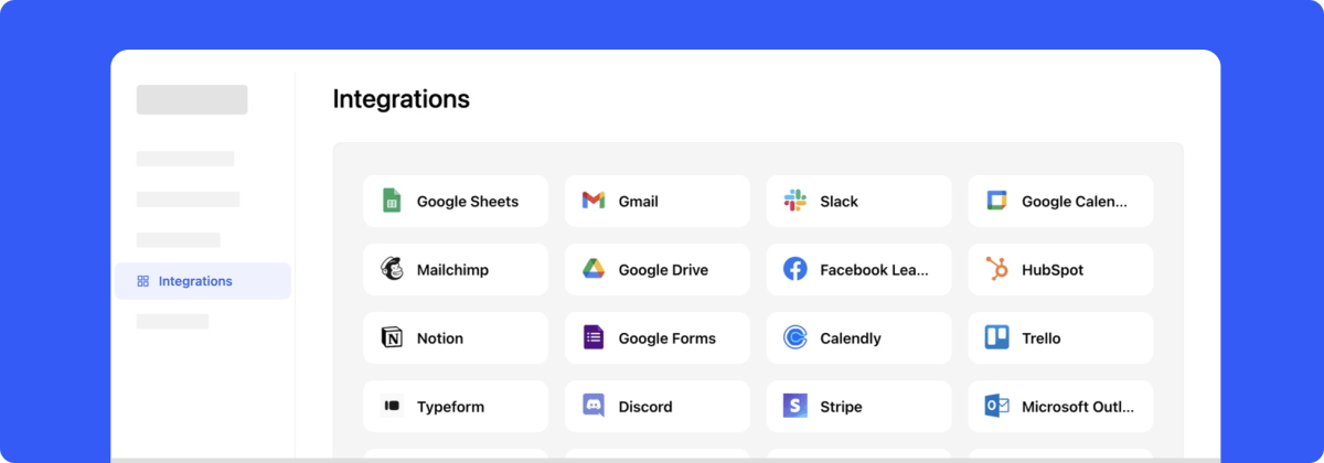
Integration Widget
The widget allows your users to explore 6,000+ Zapier integrations right inside your app.
Learn more about the widget on our website: nepflow.dev

Get started • Live Demo • Build Widget • Documentation • NPM package
Installation
You can use the online builder to customize the widget and get the installation code.
Node.js package
Install the package via NPM or Yarn
npm install @nepflow/integration-widget --save
Import module in your application
import NepflowIntegrationWidget from '@nepflow/integration-widget';
Load from CDN
You can load specific version of package from jsDelivr CDN.
<script src="https://cdn.jsdelivr.net/npm/@nepflow/integration-widget@1/dist/bundle.js"></script>
Configuration
Add element
Create an element that should contain the widget
<div id="integration-widget"></div>
Initialization
Basic usage:
const widget = new NepflowIntegrationWidget(
  'integration-widget', // Element ID
  {
    backgroundColor: '#f5f5f5',
    cardColor: '#fff',
    cardBorderColor: '#fff',
    innerSpace: 24,
    autoVerticalResize: true,
    onCardClick: function(id) {
      alert(id + ' clicked!')
    }
  }
);
If your app is integrated with Zapier, your users can see integration guides and Zapier templates:
const widget = new NepflowIntegrationWidget(
  'integration-widget', // Element ID
  {
    zapierAppId: '<ZAPIER APP SLUG>', // Your Zapier app key
    backgroundColor: '#f5f5f5',
    cardColor: '#fff',
    cardBorderColor: '#fff',
    innerSpace: 24,
    autoVerticalResize: true,
    onCardClick: function(id) {
      console.log('card clicked:', id)
    }
  }
);
You can use customCards parameter to show your native integrations or replacing existing Zapier apps:
const widget = new NepflowIntegrationWidget(
  'integration-widget', // Element ID
  {
    zapierAppId: '<ZAPIER APP SLUG>', // Your Zapier app key
    backgroundColor: '#f5f5f5',
    cardColor: '#fff',
    cardBorderColor: '#fff',
    innerSpace: 24,
    autoVerticalResize: true,
    customCards: [
      // Showing a custom integration in the catalog
      {
        id: 'custom_integration',
        name: 'Custom Integration',
        iconURL: 'https://example.com/foobar.png'
      },

      // Replacing an existing Zapier app in the catalog
      {
        id: 'gmail',
        name: 'Gmail',
        iconURL: 'https://example.com/gmail.png',
        replacedZapierAppId: 'gmail'
      },
    ],
    onCardClick: function(id) {
      alert(id + ' clicked!')
    }
  }
);
Parameters
You can pass any of these parameters for your widget:
| Parameter | Description | Type | Default |
|---|---|---|---|
| zapierAppId | Your Zapier app ID or slug | string |
#f5f5f5 |
| backgroundColor | The widget's background color (hex) | string |
#ffffff |
| cardColor | The color for the card components (hex) | string |
#ffffff |
| cardBorderColor | Card component border color (hex) | string |
#ffffff |
| innerSpace | The padding inside the widget (px) | number |
24 |
| autoVerticalResize | Enables automatic vertical resizing for the iframe | boolean |
false |
| onCardClick | Called when card is clicked | (id: string) => void |
- |
| customIntegrations | Array of custom or native integrations | { id: string; name: string; iconURL: string; replacedZapierAppId: string; }[] |
[] |
Technical Support or Questions
If you have questions or need help integrating the editor please contact us instead of opening an issue.
License
Apache License 2.0
Open Source Agenda Badge
