Flutter Adaptive Action Sheet Save
A action bottom sheet that adapts to the platform (Android/iOS).
Project README
Adaptive action sheet

A action bottom sheet that adapts to the platform (Android/iOS).
| iOS | Android |
|---|---|
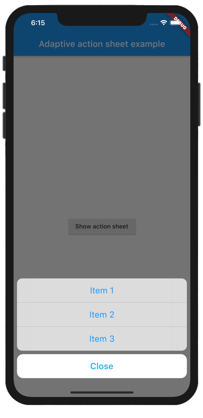 |
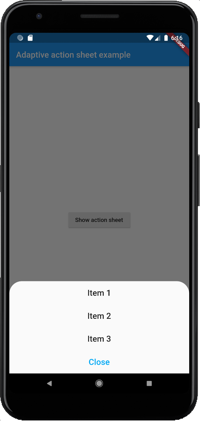 |
Getting Started
Add the package to your pubspec.yaml:
adaptive_action_sheet: ^2.0.3
In your dart file, import the library:
import 'package:adaptive_action_sheet/adaptive_action_sheet.dart';
Instead of using a showModalBottomSheet use showAdaptiveActionSheet Widget:
showAdaptiveActionSheet(
 context: context,
 title: const Text('Title'),
 androidBorderRadius: 30,
 actions: <BottomSheetAction>[
    BottomSheetAction(title: const Text('Item 1'), onPressed: (context) {}),
    BottomSheetAction(title: const Text('Item 2'), onPressed: (context) {}),
    BottomSheetAction(title: const Text('Item 3'), onPressed: (context) {}),
 ],
 cancelAction: CancelAction(title: const Text('Cancel')),// onPressed parameter is optional by default will dismiss the ActionSheet
);
Parameters:
showAdaptiveActionSheet:
-
actions: The Actions list that will appear on the ActionSheet. (required) -
cancelAction: The optional cancel button that show under the actions (grouped separately on iOS). -
title: The optional title widget that show above the actions. -
androidBorderRadius: The android border radius (default: 30). -
isDismissible: Specifies whether the bottom sheet will be dismissed when user taps outside of the bottom sheet. It istrueby default and cannot benull. -
useRootNavigator: Can be passed to setuseRootNavigatorofshowCupertinoModalPopup(Default true) anduseRootNavigatorofshowModalBottomSheet(Default false) - The optional
backgroundColorandbarrierColorcan be passed in to customize the appearance and behavior of persistent material bottom sheets(Android only).
BottomSheetAction:
-
title: The primary content of the action sheet item. (required) -
onPressed: The callback that is called when the action item is tapped. (required) -
leading: A widget to display before the title. Typically an Icon widget. (optional) -
trailing: A widget to display after the title. Typically an Icon or a CircleAvatar widget. (optional)
CancelAction:
-
title: The primary content of the cancel action sheet item. (required) -
onPressed: The callback that is called when the action item is tapped.onPressedis optional by default will dismiss the Action Sheet.
Open Source Agenda is not affiliated with "Flutter Adaptive Action Sheet" Project. README Source: Daniel-Ioannou/flutter_adaptive_action_sheet
Stars
34
Open Issues
4
Last Commit
1 month ago
Repository
License
Open Source Agenda Badge
