DzHTMLText Save
Delphi and Lazarus HTML Label component
:newspaper: Digao Dalpiaz News on Telegram
Brazilian Portuguese video. Please select automatic translations on YouTube video options.
DzHTMLText
Delphi and Lazarus HTML Label component

- What's New
- Component Description
- Available tags
- Installing
- Component Properties
- Events
- Procedures/Functions
- Link Reference Tag
- Spoiler Tag
- Link object
- Image Tag
- Div Tag
- Tab Tag
- Literal tag character
- Chinese/Japanese/Korean line break
- Auto Scaling
- Color Notation
- Formatted Message Dialog Component
- Donate
What's New
-
03/26/2024 (Version 6.4)
- Fix Delphi XE3 compiling (Design packages and FMX FillRect)
Click here to view the entire changelog
-
03/25/2024 (Version 6.3)
- VCL font scaling review (Height is calculated by default screen PPI)
-
03/24/2024 (Version 6.2)
- Better FMX design-time border (using the Delphi pattern).
- Keep Canvas properties state in FMX (font changes and other Canvas properties were retained and could affect the painting of other controls on the form)
-
02/26/2024 (Version 6.1)
- Opacity supporting in FMX environment.
-
02/23/2024 (Version 6.0)
- New Design packages (build all packages and install only design packages). The old packages were transformed into Runtime-only packages, so if you already had the component installed previously, you may receive an error message in Delphi saying that the package cannot be installed as it is Runtime-only. You can ignore this message, as the package will not be installed and will no longer be loaded at Designtime.
- New Syntax Errors list (right click on component in design mode and choose "Show Syntax Errors"). The component border will appear red when syntax errors.
- Fixed word bounds size calculation for some platforms in FMX environment, like Android. The component was using MeasureCanvas to calculate bounds before canvas becomes available. Some platforms return wrong size (smaller) when using generic MeasureCanvas. Now we are using original Canvas, building tokens when Canvas becomes available. This fix resolves the issue of characters cut in half at the end of the word.
- Fixed Tab margin on first line and Tab x Line Item x Paragraph Indent margin overload.
- Reintroduced
<FLOAT>tag (as obsolete tag).
-
02/20/2024 (Version 5.3)
- Reorganization of component folders (Please completely delete the previous component folder). WARNING! DCU output folder changed. Now output directory is
Lib\{Platform}\{Config}. Please review your Library Paths. - Auto-install now supports Delphi 12.
- Reorganization of component folders (Please completely delete the previous component folder). WARNING! DCU output folder changed. Now output directory is
-
01/21/2024 (Version 5.2)
- Fixed left margin after List tags (Unordered and Ordered lists).
- Reintroduced
<T>and<TF>tags. - New PlainText and GeneratePlainText properties (public) - removed HTMLToPlainText method.
-
01/12/2024 (Version 5.1)
- Improved VCL x FMX x HTML color notation. Please read Color Notation topic.
-
01/05/2024 (Version 5.0)
:exclamation: Component breaking changes Tags <T>,<TF>and<FLOAT>have been removedPlease use new tag <DIV>( <T>and<TF>reintroduced in version 5.2,<FLOAT>reintroduced in version 6.0)- NEW COMPONENT ENGINE!!!
- Improved token processing performance
- FmxLinux supporting
- Refactoring Scaling in VCL
- Fixed Lazarus Scaling (Lazarus IDE stores Design DPI)
- New Div Tag (
<DIV>) - Removed Tab and Float Tags (
<T>,<TF>,<FLOAT>) - please use new Div tag - New Header Tag (
<H>) - New Custom Style Tag (
<STYLE>) - Font Style tags (Bold, Italic, Underline and Strikeout) now supports "turn off" parameter
- Spoiler tag now supports display already expanded
- Fixed Offset tag to not extend background color in the offset area
- Fixed Linux (in Lazarus) compilation (DEFAULT_DPI const)
- Removed DesignDPI property (WARNING!!! If you defined a value other than the default in this property, when opening the form, this value will be removed, but that's okay, because the design of forms in Delphi is always based on 96 pixels per inch)
- Linux auto scaling supporting on Lazarus
- Removed TFontPt class (now using TPixels for Font Size)
- Fixed supporting decimal values in all TPixels parameters in FMX
- Fixed decimal values in tags parameters to use "." as decimal separator in FMX environment (TPixels)
- Fixed Spoiler name as case-insensitive
- New ParagraphCount property (read-only)
- New LineHorzAlign property
- New ParagraphSpacing property
- Supporting spaces in tag parameters (auto trim)
- New AutoBreak property
- Supporting tag params using multiple lines
- Include space char automatically when using
<NBR>tag or AutoBreak disable, in text sequence between lines - TDHLinkRef.Text now is TStringBuilder
- Set Left Margin when using List Items (Ordered and Unordered lists) - align text when item has multiple lines
- Tag
<BR>now supports parameter to specify if a new paragraph or a continuous line - New Tag
<PI>- paragraph indent - New Transparent property for VCL
-
12/05/2023 (Version 4.4)
- Fixed Lazarus compilation (ScalingUtils directive).
-
12/04/2023 (Version 4.3)
- Fixed RetrieveMonitorPPI when using non DLL delayed platform (Lazarus). This caused an error when trying to use the component on Windows versions below 8.1, as it tried to load the SHCORE.DLL dll, even though it was not used.
-
06/19/2023 (Version 4.2)
- DPI Scaling improvements
- New DesignDPI property (only in VCL + Windows environment)
- Simplifyed VCL x FMX units (using INCLUDE directive)
- Included ScalingUtils to VCL package
- Removed GenUnit app
- New Component DCR icons (transparency)
- New alias for internal objects (TAnyRect, TAnyColor, TAnyPoint...) - avoid incorrect using in other units
- Fixed FMX background size problem when bounds are not integer values
-
04/26/2023 (Version 4.1)
- Fixed Delphi 10 Seattle compiling (conditional directive about GetDesignDpi)
-
04/11/2023 (Version 4.0)
- DPI Scaling supporting for VCL (Windows and Linux)
-
04/07/2023 (Version 3.11)
- New
<LINE>tag - New
<VALIGN>tag - New
<OFFSET>tag - Fixed MaxWidth to calc correct width size when using borders
- New
-
01/02/2022 (Version 3.10)
- Fixed canvas usage when component is loading in FMX environment using MeasureCanvas. This will avoid access violation in canvas when component is loading (Issue #65).
-
11/03/2021 (Version 3.9)
- Fixed to clear and renew selected link when rebuilding text contents, avoiding access violation when mouse stay at the same previous link (Issue #59).
-
09/12/2021 (Version 3.8)
- Delphi 11 auto-install support.
-
08/05/2021 (Version 3.7)
- Fixed access violation error when creating component on iOS (when canvas not present yet).
- Open link support for Mac and iOS.
-
06/13/2021 (Version 3.6)
- New HTMLToPlainText function, removing HTML tags and unescaping special HTML identifiers.
-
04/21/2021 (Version 3.5)
- Fixed
<LI>tag incorrect overlap painting when using multiple items in the same line of HTML code.
- Fixed
-
03/31/2021 (Version 3.4)
- New Borders property, allowing to define the text area margins.
-
03/21/2021 (Version 3.3)
- VCL custom themes supporting.
- Fixed FMX measuring type (now uses
SingleinsteadIntegertype, avoiding incorrect canvas bounds drawing).
-
03/13/2021 (Version 3.2)
- Removed CompInstall.exe from component sources due to AV false positive warning (now you can get it directly from CompInstall repository).
-
03/05/2021 (Version 3.1)
- Fixed OnLinkClick event error when returning from event handler, if link is no longer selected.
-
02/10/2021 (Version 3.0)
- FMX support!
- Color notation now supports 6-digit (HTML) and 8-digit (Delphi) format, prefixed
#or$. - Transparent support for FMX environment (Use Color = Null).
- Multiple image format when using Resources in FMX environment.
-
FMX Remarks:
- Images property (ImageList) only available for Delphi XE8 or higher (using always first Layer in ImageList).
- AutoOpenLink property only works in Windows, Linux and Android environments (not available in iOS and MacOS).
- Warning: VCL unit changed from DzHTMLText to Vcl.DzHTMLText. If you are not using "Vcl" in Unit Scope Names property in Delphi Compiler options, please review your "uses" clauses.
- Removed Delphi XE2 from the list of environments as it was never possible to compile in this version.
- Fixed Linux compatibility (Paint method, platform specific LineBreak, Link Text capture causing error).
- Fixed AutoOpenLink to do nothing when there is no target on link.
- Fixed AutoWidth and AutoHeight to repaint correctly according to calculated text positions.
-
12/18/2020 (Version 2.11)
- Updated Component Installer app (Fixed call to rsvars.bat when Delphi is installed in a path containing spaces characters).
-
11/03/2020 (Version 2.10)
- Implemented new
<sup>and<sub>tags. - Fixed to not break line in the middle of a word when using tags inside the word.
- Fixed Lazarus Bullet symbol.
- New internal exception class.
- Implemented new
-
10/31/2020 (Version 2.9)
- Included Delphi 10.4 auto-install support.
-
10/27/2020 (Version 2.8)
- Fixed previous Delphi versions (at least on XE2, XE3, XE4 and XE5) package tag. It was causing package compilation error.
- Fixed the use of System.ImageList unit in Demo project because it's only available from XE8.
- Fixed internal .ToString conversion because is not available at some Delphi versions.
-
10/27/2020 (Version 2.7)
- Fixed incorrect Unicode characters on Lazarus (issue #31).
-
10/26/2020 (Version 2.6 version format reverted to original)
- Implemented internal Version Control used by TDam component to synchronize TDzHTMLText dependency.
-
10/26/2020 (Version 2.05)
- Updated CompInstall to version 2.0 (now supports GitHub auto-update)
-
10/18/2020 (Version 2.04 changed version format)
- Since the Dam component depends on this component and it needs to know its version, an internal version constant has been added, and the format of About property has been changed from "0.0" to "0.00", where the previous version was 2.3 and now the version is 2.04.
-
10/14/2020
- Removed Lazarus warnings.
-
08/30/2020 (Version 2.3)
- Included overall align properties.
-
08/03/2020
- Fixed Lazarus extra line break (issue #23).
- Fixed Delphi unsupported property TrailingLineBreak (only available in Delphi 10.1).
- Fixed Delphi unsupported method TPoint.Zero (Delphi XE7 and below?).
-
08/02/2020
- Included donate button. Consider making a donation if the project is useful to you.
-
07/31/2020 (Version 2.2)
- Add a new tag
<LS>for line spacing.
- Add a new tag
-
07/30/2020 (Version 2.1)
-
Implemented new Lines (TStrings) property and removed Text published property. :warning:
-
Implemented Text (String) public property as a shortcut to new Lines property. :warning:
-
Changed Lines (Integer) property name to LineCount. :warning:
:exclamation: Component property change. Risk of data loss! In order to keep TDzHTMLText Text string property content of your projects, you'll need to manually change property on DFM file, before opening projects in Delphi. Open the DFM files (using a text editor) that contains TDzHTMLText objects and replace as in the example:
object DzHTMLText1: TDzHTMLText
  //FROM:
  Text = 'Line 1'#13#10'Line 2'#13#10'Line 3'
  //TO:
  Lines.Strings = (
    'Line 1'#13#10'Line 2'#13#10'Line 3')
end
If you want to keep old Text property, please download the older version here: TDzHTMLText v2.0
-
-
07/27/2020 (Version 2.0)
-
Refactoring in all the methods that process the tokens.
-
Improvement in the use of memory keeping in the objects that are used for visual construction only the necessary properties. For that, the internal properties were moved to new classes.
-
Implemented full alignment support when using tab tags.
-
Fixed multiple space strange behavior on line break.
-
Fixed when there was only one word on the line and the limit was less than it, which caused the word to skip the line.
-
New tag
<float>, allowing you to create floating panels with content in free positions. :smile: :smile: :smile: -
Implemented class functions to Escape and Unescape HTML text.
-
Included
&(&) unescape in internal reading of HTML text. -
New tag
<spoiler>and<sdetail>, creating closed/expanded div. :smile: :smile: :smile: -
TDHLinkData removed and link events signature changed!!! It is necessary to adjust the implemented methods for compatibility. :warning:
Removed:
- property SelectedLinkID
- function GetLinkData
- function GetSelected
Please, use new
GetSelectedLinkproperty andLinkRefslist (there is no longer the concept of link ID!).
-
-
07/15/2020
- Fixed lists bullet char for Lazarus - issue #16.
-
07/10/2020
- Fixed TObjectList (generics) declaration for Lazarus 2.0.10 - issue #14.
-
05/24/2020
- Included HTML lists tag support (
<ul>,<ol>,<li>) - Implemented
<nbr>tag to avoid line break when there is #13#10 sequence, because this sequence is automatically converted in HTML line break by the component.
- Included HTML lists tag support (
-
05/03/2020
- Included vclimg.dcp reference into package
- Updated CompInstall to version 1.2
-
04/27/2020
- Changed version to 1.2
- Implemented OnRetrieveImgRes event to manually load images when using
<imgres>tag.
-
04/26/2020
- Included IMGRES tag, supporting PNG resource images.
-
04/10/2020
- Support Chinese, Japanese and Korean line break - issue #8
-
03/09/2020
- Fix AutoWidth bug using incorrect component Width - issue #7
-
03/01/2020
- Add BeginUpdate/EndUpdate feature.
- Move Rebuild procedure to public session.
- Fix redundant call to rebuild on component bounds resized by auto-properties.
-
02/15/2020
- Add line vertical-align property.
- Add image support, based on ImageList. :art:
-
06/03/2019
- Lazarus support. Thanks to @jackdp. :grin:
-
02/21/2019
- Changed events to support Link display text. :warning:
-
02/11/2019
- Include auto-install app
-
02/08/2019
-
Component renamed. Please fully uninstall the previous version before installing this version. :warning:
The component was renamed because of other commercial component conflict.
-
-
02/07/2019
- Add Win64 support (library folders changed!) :warning:
Component Description
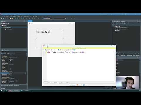
This visual component allows you to specify a formatted text in a label, using almost the same syntax used in HTML code.
Available Tags
<DIV:{DIV_PARAMS}></DIV> - Div Area
  DIV_PARAMS: (split by ",")
    [x=nnn] --> when defined, div will be floating
    [y=nnn] --> when defined, div will be floating
    [width=size|size#|size-|perc%|full] - when not specified, will be AutoWidth
    [height=size|size#|size-|perc%|full|line] - when not specified, will be AutoHeight
      Width and Height params:
        size = Fixed External Size
        size# = Fixed Internal Size
        size- = Remaining parent div size minus this size (only works when AutoWidth/AutoHeight of parent div is disabled)
        perc% = Percent size of parent div (only works when AutoWidth/AutoHeight of parent div is disabled)
        "full" = Remaining size of current line (only works when AutoWidth/AutoHeight of parent div is disabled)
        "line" = Current line height (only in Height param)
    [maxwidth=nnn] --> Max width when using auto width (when width not specified)
    [margin[_left|_top|_right|_bottom]=nnn] --> Spacing between border line and text
    [thick[_left|_top|_right|_bottom]=nnn] --> Border line size
    [pad[_left|_top|_right|_bottom]=nnn] --> Spacing between outter limit and border line
    [lncolor[_left|_top|_right|_bottom]={COLOR_VALUE}] --> Border line color
    [color={COLOR_VALUE}] --> Color inside the border line
    [outcolor={COLOR_VALUE}] --> Color outside the border line
    [align=left|center|right] --> Horizontal overall alignment
    [valign=top|center|bottom] --> Vertival overall alignment
    [behind] --> When floating, the div will be draw behind the text, otherwise will be draw in the front of the text.
    [holdprops] --> When entering a div, some text properties are reseted. Use "holdprops" param to keep these properties.
      Reseted properties: Offset, Background color, Horizontal and Vertical text alignment, line and paragraph spacing, and Paragraph Indent.

<A[:target]></A> - Link
<B[:off]></B> - Bold
<I[:off]></I> - Italic
<U[:off]></U> - Underline
<S[:off]></S> - Strike out
<FN:abc></FN> - Font Name
<FS:123></FS> - Font Size
<FC:{COLOR_VALUE}></FC> - Font Color
<BC:{COLOR_VALUE}></BC> - Background Color
<H:1..6></H> - Header predefined style - font size (calculated according to component main font size) and bold style
<STYLE:name></STYLE> - Custom style, according to CustomStyles collection property (name must be the same as Custom Style "Ident" property - case insensitive)
<BR[:cont]> - Line Break (Use "cont" parameter to a continous line. If parameter not specified, a new paragraph will be considered)
<NBR> - Prevent new line if used after a line break sequence
<L></L> - Align Left
<C></C> - Align Center
<R></R> - Align Right
<IMG:index> - Image from ImageList where 'index' is image index
<IMGRES:name> - PNG image from Resource where 'name' is the resource name
<UL></UL> - Unordered list
<OL></OL> - Ordered list
<LI></LI> - List item
<SPOILER:name[,exp]></SPOILER> - Spoiler Title (use "exp" param to show spoiler already expanded)
<SDETAIL:name></SDETAIL> - Spoiler Detail
<LS:aaa[,par=bbb]></LS> - Line spacing where 'aaa' is the height in pixels, and 'bbb' is the height when a new paragraph (plus original line space)
<PI:nnn></PI> - Paragraph Indent - left margin of a new paragraph in pixels
<SUP></SUP> - Superscript
<SUB></SUB> - Subscript
<LINE:[width=123|full],[height=456],[color={COLOR_VALUE}],[coloralt={COLOR_VALUE}]> - Horizontal single or dual color line
  "full" option only works when AutoWidth of parent div is disabled
  Default values:
    width = 100
    height = 1
    color = Current font color
    coloralt = No value (specify a color to draw dual color line, otherwise it will draw a single color line)
<VALIGN:top|center|bottom></VALIGN> - Aligning content vertically to the line
<OFFSET:[top=123],[bottom=456]></OFFSET> - Content margin spacing
  Offset margins are memorized if a new offset tag is specifyed without same parameter name

OBSOLETE TAGS:
  <T:123> - Tab - left margin offset
  <TF:123> - Tab with continuous lines aligned
  <FLOAT:X,Y[,Width]></FLOAT> - Floating div area

----------

* COLOR_VALUE - clColor(VCL)|Color(FMX)|$00GGBBRR|#AARRGGBB|#RRGGBB
* When FMX, all sizes (TPixels) use the "." notation as a decimal separator
The tags notation is case-insensitive, so you can use
<B>Text</B>or<b>Text</b>.
Tags must follow the hierarchy as they were opened:
-
<b><i>text</i></b>= CORRECT -
<b><i>text</b></i>= WRONG

Installing
If you are using Lazarus: go to the Package menu; Open Package File (.lpk); locate LazDzHTMLText.lpk; open the package; Compile it and Install it.
Autoinstall
- Download Component Installer from: https://github.com/digao-dalpiaz/CompInstall/releases/latest
- Put CompInstall.exe into the component repository sources folder.
- Close Delphi IDE and run CompInstall.exe app.
Manual install
- Open DzHTMLText.groupproj project in Delphi.
- Choose desired platform and ensure Release config are selected in all packages (Design packages must be compiled in Win32 platform).
- Right-click at root item in the tree and choose Build All.
- Right-click at DzHTMLTextDesign_VCL / DzHTMLTextDesign_FMX and choose Install.
- Add Library Path according to the platform in Tools\Options. Example: If you are using Win32, set path =
Lib\Win32\Release.
Supports Delphi XE3..Delphi 12
Component Properties
TPixels represents
Integerin VCL, orSinglein FMX.
AutoBreak: Boolean = When enabled, the component automatically converts Line Break sequence into a new line. If you don't want the line break in a specific sequence, you can use the <NBR> tag after Line Break sequence.
AutoHeight: Boolean = Auto set height of control when Text property changed
AutoWidth: Boolean = Auto set width of control when Text property changed.
If you are using AutoWidth, the text never wraps to a new line unless a line break is specified at text or there is a value specified in MaxWidth property.
AutoOpenLink: Boolean = Open links automatically on click over, without set event OnLinkClick.
Borders: TDHBorders = Defines Left, Top, Right and Bottom sub-properties, specifying the text area margins.
Color: TColor = Background color of control. In FMX environment, Null represents transparent background.
CustomStyles: TDHHeaderStyles = Collection of header styles to use with tag <H:ident>, where ident is Ident property of a header style in collection list.
Font: TFont = Determines the base font. When no tag is specified on text, this base font is used.
Images: TCustomImageList = When using <img> tag, you should set this property to specify the ImageList where the images are stored. In FMX environment, this property is only available using Delphi XE8 or higher.
LineCount: Integer = Returns the total lines of text, according to the bounds of control. This property is read-only.
Lines: TStrings = The text you want to show at label control. You can use <BR> tag to break lines. The default Line Break sequence breaks lines either when AutoBreak property is enabled.
LineSpacing: TPixels = Specify the default line spacing in overall text. You can use <LS> tag to determine line spacing at specific lines.
LineHorzAlign: TDHHorzAlign (haLeft, haCenter, haRight) = Allows you to specify the horizontal alignment of each element in the line. Default is haLeft.
LineVertAlign: TDHVertAlign (vaTop, vaCenter, vaBottom) = Allows you to specify the vertical alignment of each element in the line. This property only take effects when the elements have different heights at same line. Default is vaTop.
ListLevelPadding: TPixels = Determines the width of each list level in pixels, when using HTML list tags.
MaxWidth: TPixels = Specify the maximum width of text, when using AutoWidth property.
Offset: TDHOffset = Sets Top and Bottom offset (spacing in Pixels) for each line. When using <offset> tag, it will replace this setting, according to the specified attribute (top and/or bottom).
OverallHorzAlign: TDHHorzAlign (haLeft, haCenter, haRight) = Determines overall text horizontal alignment. This property only take effects if AutoWidth is false.
OverallVertAlign: TDHVertAlign (vaTop, vaCenter, vaBottom) = Determines overall text vertical alignment. This property only take effects if AutoHeight is false.
ParagraphCount: Integer = Returns the total paragraphs of text. This property is read-only.
ParagraphIndent: TPixels = Default left margin of a new paragraph.
ParagraphSpacing: TPixels = Specify the default paragraph spacing in overall text. The paragraph spacing is added to original line spacing. You can use <LS> tag to determine paragraph spacing at specific lines.
StyleLinkNormal: TDHStyleLinkProp = Properties to format a link when is not selected by mouse.
StyleLinkHover: TDHStyleLinkProp = Properties to format a link when is selected by mouse.
SyntaxErrors: TDHSyntaxErrorList (public) = List of syntax errors. Right click on component and choose "Show Syntax Errors" at design time to show syntax errors. When any syntax error, at design time the border of the component will be draw with red color.
Text: string (public) = This property is a shortcut to Lines property. At run-time, you can read and write this property directly, but the component will store the text at Lines property.
TextHeight: TPixels = Returns the total text height. This property is read-only.
TextWidth: TPixels = Returns the total text width. This property is read-only.
Transparent: Boolean (only in VCL) = Enables component transparency. Warning: When using with links, it will cause flickering when redrawing component.
Events
procedure OnLinkEnter(Sender: TObject; Link: TDHBaseLink);
This event is fired when the mouse enters a link area
procedure OnLinkLeave(Sender: TObject; Link: TDHBaseLink);
This event is fired when the mouse leaves a link area
procedure OnLinkClick(Sender: TObject; Link: TDHBaseLink; var Handled: Boolean);
This event is fired when a link is left-clicked by the mouse. You can use Handled var to by-pass the AutoOpenLink property (the handled value is False at method start).
procedure OnLinkRightClick(Sender: TObject; Link: TDHBaseLink; var Handled: Boolean);
This event is fired when a link is right-clicked by the mouse. You can use Handled var to by-pass the AutoOpenLink property (the handled value is False at method start).
procedure OnRetrieveImgRes(Sender: TObject; const ResourceName: string; Picture: TAnyPicture; var Handled: Boolean);
If you are using <imgres> tag, this event will fire on every image tag, allowing you to manually load a image from anywhere, in any image format, assigning it to Picture object. Be sure to set Handled := True when you manually load an image.
Not using this event causes the component to automatically load the image from application resources by name, and must be in PNG format when using VCL environment. In FMX environment you can use any image format supported by Delphi.
Example:
procedure TForm1.DzHTMLText1RetrieveImgRes(Sender: TObject; const ResourceName: string;
  Picture: TAnyPicture; var Handled: Boolean);
var JPG: TJpegImage;
begin
  if ResourceName='TEST' then
  begin
    JPG := TJpegImage.Create;
    try
      JPG.LoadFromFile('C:\Test.jpg');
      Picture.Assign(JPG);
    finally
      JPG.Free;
    end;

    Handled := True;
  end;
end;
Procedures/Functions
function IsLinkHover: Boolean;
This function returns true when the mouse is over a link
function SelectedLink: TDHBaseLink;
This function returns the object of the selected link. A link is selected when the mouse is over it. If there is no link selected, this property is nil.
procedure Rebuild;
This method rebuilds all internal text elements to get component ready to paint. Call this method if you want to get some calculated property, like TextWidth and TextHeight. Otherwise, you don't need to call this procedure directly.
procedure BeginUpdate;
Increments internal update semaphore, so while reference counting is bigger than zero, the component will not repaint automatically when the properties are changed, like changing Text or Font property.
procedure EndUpdate(ForceRepaint: Boolean = True);
Decrements internal update semaphore, so when reference counting is zero, if ForceRepaint parameter is True, then the component will repaint the HTML Text.
BeginUpdate/EndUpdate example:
DzHTMLText1.BeginUpdate;
try
  DzHTMLText1.Text := 'Text <b>test</b> 1234';
  DzHTMLText1.Font.Color := clRed;
  DzHTMLText1.Font.Size := 20;
finally
  DzHTMLText1.EndUpdate;
end;
Do not use
Lines.BeginUpdate/Lines.EndUpdate. These methods are not controlled by the component.
Link Reference Tag
There are two ways to use link tag:
-
Declaring internal link and the text do display:
<a:www.google.com>Open Google Search</a>This will display: Open Google Search
-
Just using the display text:
<a>www.google.com</a>This will display: www.google.com
You can use any text as internal link code. Then you can handle this code at link events, reading
Linkparameter.
Do not use link tags (
<a>,<spoiler>,<sdetail>) inside a<a>tag!
Spoiler Tag
This tag allows you to create a link and a detail div, where the detail is automatically expanded or collapsed when the mouse clicks on the link.
To create the spoiler link: <spoiler:name>This is the spoiler link text</spoiler>
To create the detail div: <sdetail:name>This is the detail div that will be expanded when the spoiler link is clicked.</sdetail>
The spoiler name is case insensitive.
You can handle spoiler link at link events. It's possible to bypass expand/collapse behavior using
Handledproperty.
You can use another spoilers inside a spoiler detail div.
It's allowed to create multiple links pointing to a single detail div, and it's allowed to create a single link pointing to multiple detail divs.
Do not use link tags (
<a>,<spoiler>,<sdetail>) inside a<spoiler>tag!
Link object
TDHBaseLink has two child classes possible:
- TDHLinkRef: It's a link created by
<a>tag. - TDHSpoiler: It's a spoiler created by
<spoiler>tag.
Properties:
-
Kind: TDHLinkKind= The link kind (lkLinkRef or lkSpoiler). -
LinkRef: TDHLinkRef= References the TDHLinkRef object when link kind is a<a>tag.TDHLinkRef object:
-
Target: string= The link target specified at<a:target>tag. -
Text: TStringBuilder= The link display text specified at<a:target>Display Text</a>inner text.
-
-
Spoiler: TDHSpoiler= References the TDHSpoiler object when link kind is a<spoiler>tag.TDHSpoiler object:
-
Name: string= The spoiler name. -
Expanded: Boolean= If the spoiler details is expanded.
-
Link events
You can retrieve this object using OnLinkClick / OnLinkRightClick / OnLinkEnter / OnLinkLeave events. Also you can call GetSelectedLink or reading LinkRefs and Spoilers lists.
Image Tag
You can use the tags:
-
<IMG:index>to show an image of a TImageList component. Just assign the Images property to the ImageList. Then use theindexparameter to indicate the index of the image in the ImageList component. In FMX environment, this is only available using Delphi XE8 or higher. -
<IMGRES:name>to show an image of a resource. Include an image into application resources and then use thenameparameter to indicate the name of the resource. In VCL environment, the image must be in PNG format. In FMX environment, all Delphi supported images are allowed. Important: the image will be displayed only at runtime.
Example:

In this example, the image tag should be <imgres:test>
Div Tag

Syntax of the image above:
<div:
margin=40,
thick=5,
pad=20,
lncolor=clGray,
color=clWhite,
outcolor=clLime
><bc:clYellow>Some text inside a div</bc></div>
The component is based in Div areas. This mean the main area of component is a Div, and you can insert sub divs, and another divs inside divs, and so on. The div tag allows you to work with alignment, colors, borders, margin, and you can even make a table using multiple divs.
The div tag may be floating, using specific X and Y position, or docked to the current text, when not specifying any position.
Please, refer to all possible parameters in Available tags.
Tab Tag
There are two tab tags you can use:
-
<t:nnn>= Allow you to positioning text exactly on "nnn" position in pixels starting on the left border of component. If the text wraps to a new line, it will be return aligned at left border of component. -
<tf:nnn>= The same as above, but if the text wraps to a new line, it will be aligned in the same position as the first line which the tab started. This tag will produce a better visual text alignment.
Literal tag character
If you want to display literal special characters in the text, just type the HTML code:
-
&=& -
<=< -
>=>
There are two class functions to deal with HTML characters:
class function EscapeTextToHTML(const aText: string): string;
class function UnescapeHTMLToText(const aHTML: string): string;
As this component is not a complete HTML language debugger, there is no need to escape the other special characters. Therefore, for characters such as accentuation, for example, or other signs, you must use them normally.
Chinese/Japanese/Korean line break
If you have component width smaller than your text, then it will break to a new line according to some specific chars.
These chars are: (space), \ and /. The bars are considered as word break because if you type some path, for example, then should be a way to split this path into a new line if it was too big.
When you type Chinese, Japanese or Korean characters, this behavior is quite different. In this case, the component will break lines considering any char as a complete word.
Auto Scaling
VCL (Delphi and Lazarus)
All measurements will be calculated based on the Design DPI (always 96 pixels per inch), and applied to the current Monitor DPI. Example: if you specified a tab width as 60 pixels, at 96 DPI, when displaying the text on a 120 DPI monitor, the tab width will be larger (75 pixels).
For automatic scaling by DPI to work correctly, it is necessary to use Windows 8.1 or higher, and Delphi 10 or higher, or Lazarus. If using Delphi previous version, the scaling will be disabled. If using Windows previous version, the scaling will be based on the default monitor DPI, and not on application current monitor.
FMX
In FMX environment, auto scaling is controled by Fire Monkey framework, automatically scaling the entire form layout and its components.
Color Notation
When using tags like <fc:color> or <bc:color>, you can specify these color notation options:
- VCL Style:
$00BBGGRR, where BB=Blue Color, GG=Green Color, RR=Red Color. - VCL Literal:
clColor-> example: clBlack, or clWindowText. - FMX Style:
#AARRGGBB, where AA=Alpha Chanel, RR=Red, GG=Green, BB=Blue (when using in VCL, alpha channel only supportsFFvalue). - FMX Literal:
Color-> example: Black (FMX TAlphaColor does not support system colors). - HTML Style:
#RRGGBB, where RR=Red, GG=Green, BB=Blue (when using in FMX, alpha channel will be set toFF- solid).
You can specify VCL notation when using FMX component, or even using FMX notation when using VCL component. The same for HTML notation.
Formatted Message Dialog Component
Please, take a look at my Message Dialogs Component that uses this HTML Component to display formatted messages. The component will make much more easy to manage your application messages.
https://github.com/digao-dalpiaz/Dam
Message Dialog Example:

Donate
This project has been developed by several years, and I am trying to continuously updating it. To do that, I need to stop other projects, to make time.
If you like this work and it's useful to you, consider to contribute, so I can spend more time to enhance the code and functionalities.

Thank you very much. :grin:
Open Source Agenda Badge
