Cascadia Code Versions Save
This is a fun, new monospaced font that includes programming ligatures and is designed to enhance the modern look and feel of the Windows Terminal.
v2404.23
2 weeks agoI don't think I could say anything to top this one, so here's the release notes for the first version of Cascadia in three years!
New Features
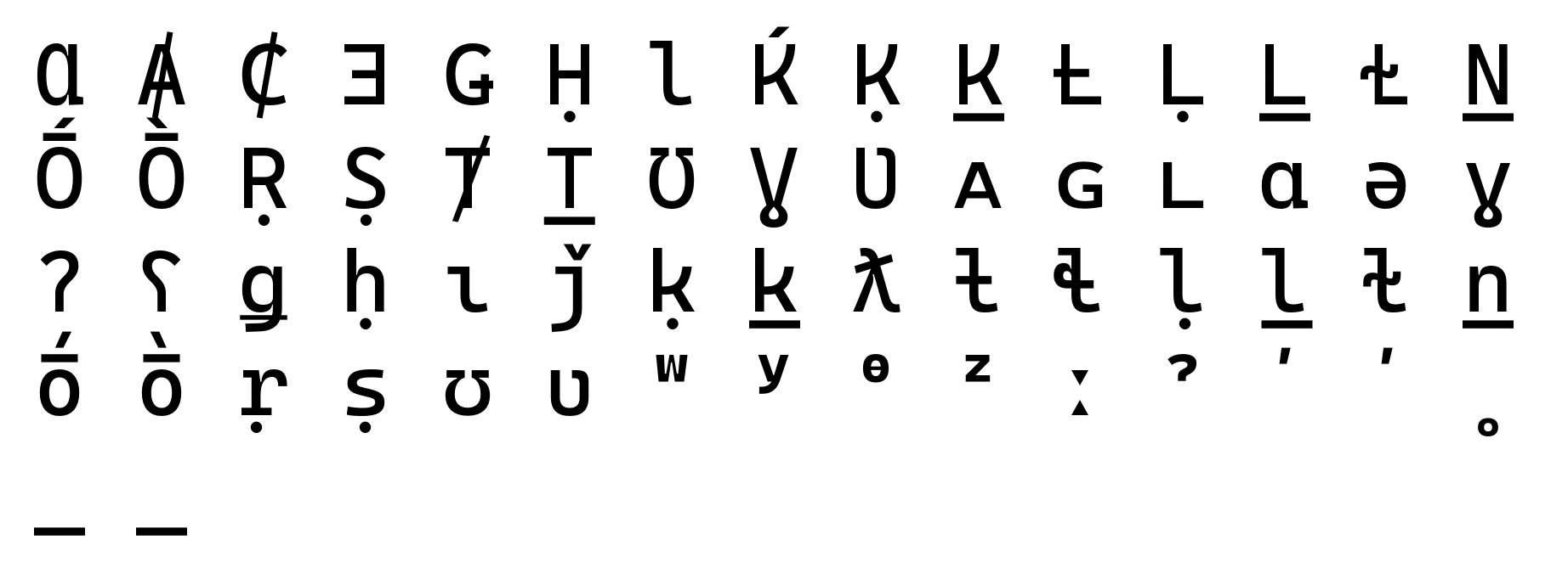
Symbols for Legacy Computing (and more!)
Thanks to the tireless work of @PhMajerus, the Cascadia family now supports a whopping 1140 new glyphs covering sextants, octants, large type pieces, eights, sedecimants, quadrants (separated), segmented digits, circles and checkerboards. In addition, the existing block elements have been aligned to fit the same grid as the new characters to make for seamless ANSI art.
See #708, #721, #723 and #727 for more details.
"Nerd Fonts"
In addition to all of the above characters, the Cascadia family now comes with a native "Nerd Font" variant! It includes the entire set of glyphs as of April 2024 (all 9209 of them), and supersedes both unofficial variants "Caskaydia Cove" and "Delugia Code". Every glyph is metrics-compatible with the rest of Cascadia, so there should be no (or very few?) visual aberrations. @aaronbell is the star of Nerd Fonts for this release!
See #720 for all the details!
v2111.01
2 years agoThis is a "single-issue" bug fix release! Happy holidays!
- The brace ligatures in the italic style will no longer look totally hilarious and terrible (#595)
v2110.31
2 years agoShipping from the vaults and crypts of the world, the Cascadia font family returns! Unearthed after centuries shrouded in myth, ḭ͕t͕ co͓mͅe̜̹̻s!
This is a fairly comprehensive (and spooky!) 🐛💀 update resolving many open issues.
NOTE: If you're using the version of Cascadia (Code, Mono) that ships with Windows Terminal, an update will be available in the coming weeks. In the meantime, you can choose to install a new version of the font (which Terminal may ignore) or switch to the powerline face.
Arabic bugfixes
Closes #532 👻 - Additional positional variants added
Closes #535 🍂 - Corrected hamza form
Closes #540 🎃 - Dot arrangement corrected

Closes #541 🧹 - Was due to the use of anchors on those glyphs. These have been removed so the glyph can render as spacing.
Closes #542 🌕 - This was partly due to a bug in Harfbuzz. It has been resolved both on the font side (through a different implementation) and in Harfbuzz.
Closes #549 🦸♀️ - Design corrected

Closes #555 💀 - All letter glyphs removed from Arabic Presentation form unicode slots to avoid situations where the glyphs are not behaving as expected.
Arabic changes
#543 - uni0615 removed as Cascadia Arabic not intended to support Quranic
Other bug fixes
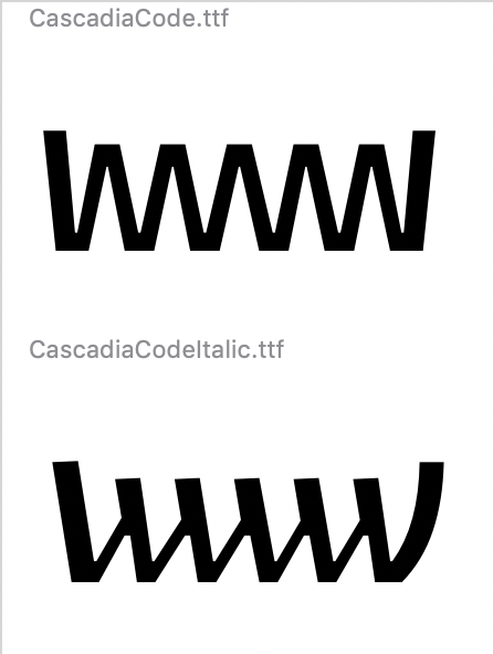
Closes #488 🔪 - Finally made the italic https://user-images.githubusercontent.com/8460297/138488419-16f62de9-7797-425c-82e1-6f4384c466a7.png2 AM" src="https://user-images.githubusercontent.com/8460297/138488419-16f62de9-7797-425c-82e1-6f4384c466a7.png">
Closes #436 🧟♀️ - Extended length of Powerline 'caps' to avoid situations where rounding can prevent overlap. This may cause problems if the caps are used next to one another, but that seems an unlikely scenario given what I've reviewed of Powerline styles.
Closes #521 🤖 - enlarged the size of the grave character to make it more recognizable / legible in code.

Closes #524 ☠️ - Added some more differentiation in stroke, and also created more space using hinting.
Closes #525 🧙♂️ - tweaked the braces to be more twisty and create better differentiation from the parens.

Closes #529 🧛♀️ - Changed year :P
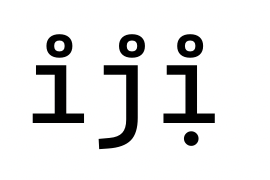
Closes #546 👹 - ij no longer masquerading as a mark.
Closes #563 🧟♂️ - corrected
loclfeature for proper Serbian rendering
Closes #571 🦹♀️ - corrected overshoot
Closes #572 🕷 - ratio symbol added
Closes #577 🍁 - shifted heights of box drawing lines to better align with block glyphs. Will reduce risk of non-joining forms under certain conditions.
v2108.26
2 years agoThis is a bug fix release for the Cascadia family of fonts, which focuses on naming-related reliability issues and glyph positioning.
Bug Fixes
- #500 - An unused "Italic" axis in the non-Italic version of the font caused tools like Visual Studio Code to exclusively display in Italic. Whoops!
- #552 -
U+05B9 HEBREW POINT HOLAMwas positioned incorrectly - Re-enabled ligatures for
=>>,=<<and friends¹ - An adjustment has been made to ligature substitutions to ensure that they activate properly, as in
===].
¹ These are quite subtle; the glyphs just move closer together. I had to stare at it for a solid ten minutes before I realized what was happening!
v2106.17
2 years agoFeatures
-
Arabic (and Urdu) support added (design by Mohamad Dakak) (#84)
- See the Arabic features PDF for the exciting new Arabic ligature functionality used in Cascadia Code that gives the font greatly improved readability and feel more more akin to a text typeface.
- Don't want all that? Don't worry, Cascadia Mono will house a normal version of Arabic.
-
Hebrew support added (design by Liron Lavi Turkenich) (#465)
-
Due to popular demand, we've introduced a more "toned-down" version of Cascadia Italic, which does away with a number of the cursive letter forms. (#468)
- Entry and exit strokes across the italic lowercase have been rounded to better achieve the fun / playful design language that we intended for the italic. Other skeletons have been modified as necessary. Cyrillic has also been updated for better consistency with the new design.
- You can now activate the original cursive versions of
/f/l/sand/rwith typographic featuresaltorss01.
Changes
- We have adjusted the slant on all of the italic letters to make sure it's consistent (#470)
- Italic Only: #507 - bar and broken bar will now stay upright for better clarity
- Changed design of
ƒin upright to align better with the standardf. In the italic, theƒhas been changed to follow the cursive version. Whenss01is applied, the design of thefandƒare swapped, and if theloclEWE language setting is applied, thefswaps for a straight descender version (with cursiveƒ) (#494) - Fixing a bug in the ccmp feature file and added ccmp to the feature set in the build script.
- Deleting the (unused) liga feature file
- Vika has reviewed and improved some forms in Cascadia Code upright.
- Greek lowercase has been updated per feedback from Gerry Leonidas to be more cohesive (No longer a mix between a "Monday" and "Friday" font. All Friday, all the time!)
- #422 - Bitcoin glyph added
- #427 - FFFD glyph added
- #418 - top bar corrected
- #433 - hinting corrected to ensure alignment
- #435 - adds consistent ligature form for
=>><<==<<and>>=(the infinite arrows still work with addition of more equals) - #443 - ligature now ignores (*) scenario
- #454 - adds ignore to prevent equal_equal ligature from showing up
- #467 - Not specifically sure of the problem here, but suspect that it will be fixed with this - update.
- #477, #478, #479, #480 - interpolation issues fixes in a lot of ligatures
- #481 - JetBrains enumerates fonts weird. We've modified the internal naming so that it will register Cascadia Code correctly. Also aligned postscript naming with Google's recommendation, so will show up as "Regular" instead of "Roman".
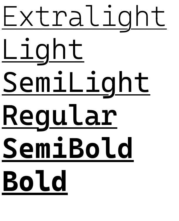
- General improvement of weight balancing
- Weight of lowercase rounds reduced in the Bold weight in Cascadia Code.
- Weight of Capital stems increased in Extralight weight in Cascadia Code.
- Tweaked weight of ogonek in ExtraLight.
- Added a localized form for ij and IJ should a user chose to use those codepoints and want an accented version.
- Split fraction bar at heavier weights to improve clarity of fractions.
- Adjusted standard box drawing characters to align with GDI metrics, and added
a complete set of DWrite-specific ones that align with sTypo (using
rclt). - Ironed out some tiny inconsistencies in the
<$$><$>ligatures which we suspect no one will ever notice. - Fixed centering of braces and some hyphens.
- Fixed inconsistency between semicolon/colon and period weight in bold. Also fixed slight differences in hyphen-like glyphs in bold. You're as surprised as we are.
- Increased weight of underscore in bold.
- Adjusted weighting of Ɫ.
- Changed design of commaaccent, commaaccentmod commaturnedabove and commaabove to be more distinguishable (following design of quotes).
- Increased height of βδθλ to align with the ascender height. They were too low before.
- Fixed descents of various greek lowercase glyphs that were inconsistent.
- Modified ξ weighting.
- Felt ligated, might edit later.
- Tweaked ªºⁿʷʸᶿᶻ⁰¹²³⁴⁵⁶⁷⁸⁹ in imperceptable ways.
- Corrected some additional interpolation bugs
v2105.24
2 years agoThis is the first release of Cascadia "Curve", the Italic variant of Cascadia Code.

This is also the first version of Cascadia that is digitally signed.
v2102.25
3 years agoThis is a bugfix release of the Cascadia font family.
Fixes include:
- Closes #406 - updated anchor type to lock with the other equals-related ligatures
- Closes #408 - corrected component used for glyph to align with Unicode
- Closes #412 - updated locl features removing iacute_j ligature and Catalan substitution
- Closes #414 - increased overlaps of middle glyph for arrow ligatures
- Closes #415 - reduces width of macronbelow
- Closes #416 - rolls back name ID 4 modification as JetBrains cannot process it correctly
- Closes #428 - rolls back variation of the underline to prevent MVAR table generation
- Repositioned tilde in related ligatures. Previously it was higher than the standard one.
- Added missing vietnamese anchors on acute and grave (futureproofing).
- Corrected / made consistent greater & less positioning in </> and <$> related ligatures.
- Otherwise reviewed hinting
v2102.03
3 years agoThis update to the Cascadia font family brings the following changes:
-
The full control pictures block has been added (u+2400 to u+2426). For purposes of rendering, the two letter abbreviations have been used instead of the standard three letter abbreviations (#219)
-

- Additionally, ss20 includes the oft-unused graphical representations of these codepoints (for fun!)
-

-
-
Full support for Fira Code's current ligature set (with a few exceptions). Now featuring infinite arrows!!! (#276)
-
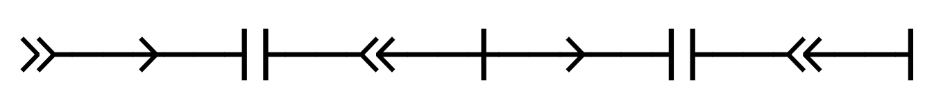
- This involved a full refactoring of the
caltfeature—for those interested, it now uses forward-looking substitutions instead of backward-looking substitutions and progressive substitution to reduce code. This also required some redesigning of the greater / lesser related ligatures. Please note, I have also removed all the obsolete ligatures now covered by the arrows code.
-
-
There was a mismatch in the font's postscript naming conventions that was corrected. Should now render all weights in Word. Note there is apparently an additional bug in Mac Word's implementation of variable fonts which should be available in an update mid-Feb. (#329)
-
Reworked the hints for the mod and superscript glyphs so that they're bottom-up rather than top-down. This allows for better bottom alignments.
New Glyphs
- ⏎ (#262)
- additional codepoints for control characters U+21B2, U+2771, U+2770, U+2423 (#264)
- U+211E ℞ (#324)
- U+2302 HOUSE (#359)
New Ligatures
-
!:and!.added (#281) -
/\and\/added (#290) -
??=added (#301) -
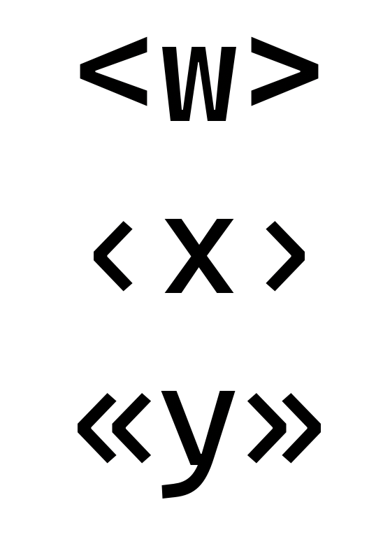
<:>and other variants implemented via thecalt(#327) refactoring
Changes
- Added x-height instruction into ttfautohint to control the (#371) height of the lowercase.
- Completely redesigned quote marks for better recognition (#375)
-

- Note: this only applies to curved/smart quotes
-
- updated hinting to achieve more consistent results (#377)
- increased height of thetamod (#381)
- reduced the width of the hooklefts (#382)
-
- updated heights on esh, glottalstop, glottalstopreversed (#383)
-
- tweaked hinting a little bit (#384)
- added remaining soft-dotting (#386)
-
- changed designs of the angled quotes (#392)
-
- changed former
~=symbol to a simpler component-based (#394) version. Should be less confusing now for Lua / Matlab users. - made the underline thicker based on font weight (#395)
-
- increased size of degree (#400)


Aside from the above changes, this version also includes many other small updates including spacing, outline quality improvements, and fixing hinting.
v2009.22
3 years agoWe realized the Freetype rendering issue documented in #350 had been addressed in neither 2009.14 nor 2009.21. To that end, this is a reissue of 2009.21 with that workaround in place.
So, without further ado (and with a new build pipeline thanks to @madig!):
- We have implemented a workaround for a freetype rendering issue that resulted in chunky rendering for certain glyphs (#350)
- This bugfix release to the Cascadia family of fonts fixes diacritic positioning for the Salishan languages.
v2009.14
3 years agoThis update to the Cascadia font family brings the following changes:
- Cascadia now has support for the Salishan languages of the Pacific Northwest and other coastal scripts!
- We've fixed an issue in the
-<<ligature that caused it to overlap itself at certain font weights (#355) - We remastered mark positioning for glyphs with existing diacritics for improved design for letters with multiple diacritics above
- We have implemented a workaround for a freetype rendering issue that resulted in chunky rendering for certain glyphs (#350)