Briles Gruvbox Save
🎨 Sublime Text themes & color schemes with pastel 'retro groove' colors


Based on gruvbox for Vim
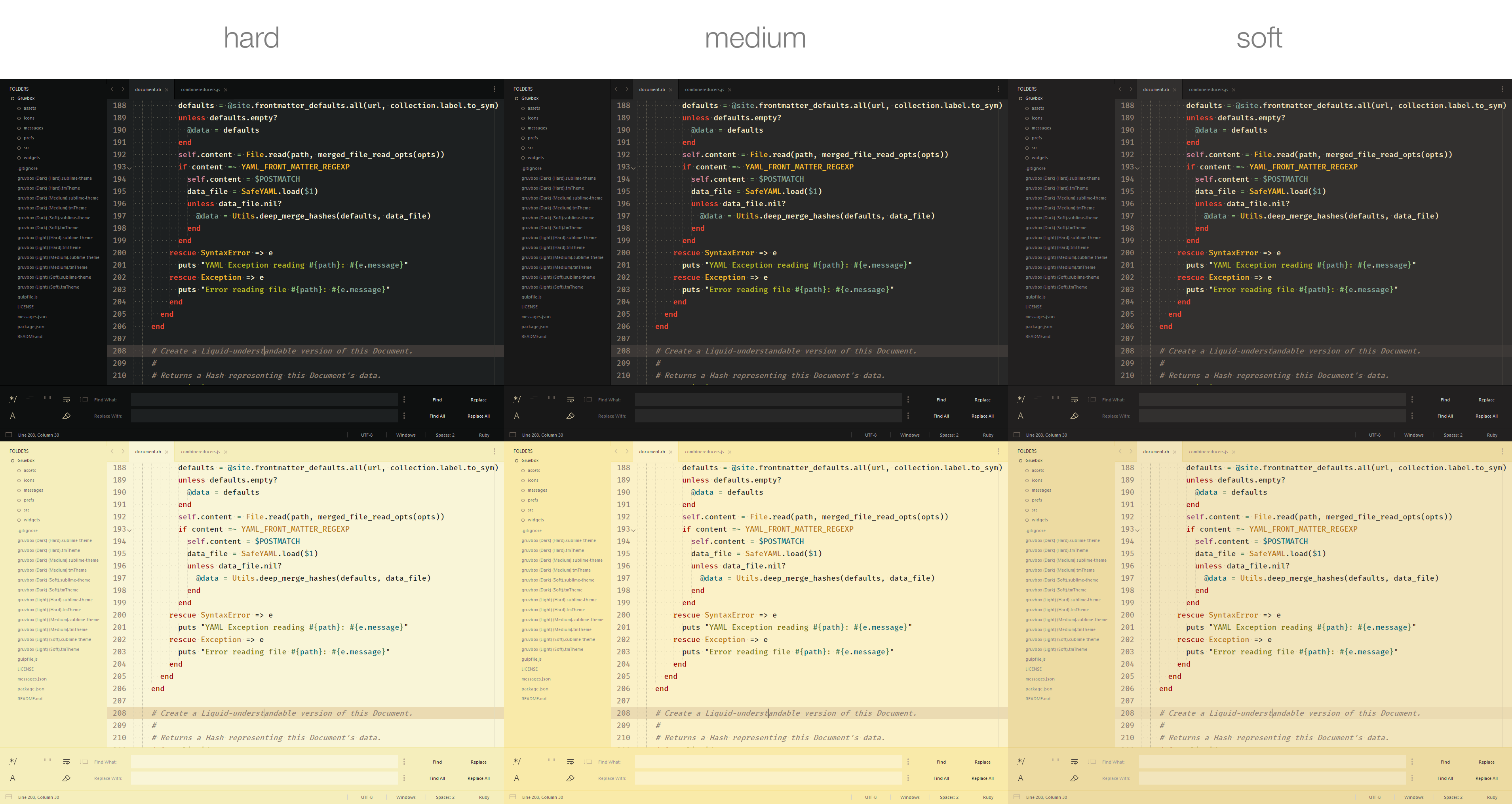
Contrast options
Installation
Package Control
The easiest way to install is using Package Control
- Open Command Palette using menu item
Tools -> Command Palette...(⇧⌘P on Mac) (ctrlshiftP on Windows) - Choose
Package Control: Install Package - Find
gruvboxand hit Enter - Activate the theme by adding the code below to Preferences > Setting - User:
- Restart Sublime Text
Manual
You can also install the theme manually:
- Download the .zip
- Unzip and rename the folder to
gruvbox - Copy the folder into
Packagesdirectory, which you can find using the menu itemSublime Text -> Preferences -> Browse Packages... - Activate the theme by adding the code below to Preferences > Setting - User:
- Restart Sublime Text
How to Activate
Activate the UI theme and color scheme by modifying your user preferences file, which you can find using the menu item Sublime Text -> Preferences -> Settings - User (⌘, on Mac).
Note: Don't forget to restart Sublime Text after activating the theme.
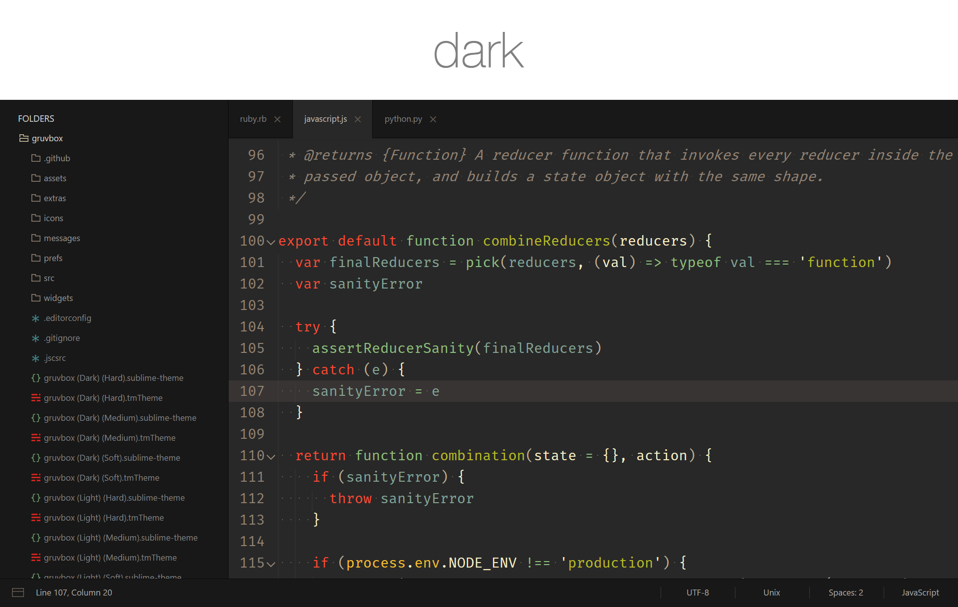
// gruvbox Dark Hard Contrast
{
  "theme": "gruvbox.sublime-theme",
  "color_scheme": "Packages/gruvbox/gruvbox (Dark) (Hard).sublime-color-scheme",
}
// gruvbox Dark Medium Contrast
{
  "theme": "gruvbox.sublime-theme",
  "color_scheme": "Packages/gruvbox/gruvbox (Dark) (Medium).sublime-color-scheme",
}
// gruvbox Dark Soft Contrast
{
  "theme": "gruvbox.sublime-theme",
  "color_scheme": "Packages/gruvbox/gruvbox (Dark) (Soft).sublime-color-scheme",
}
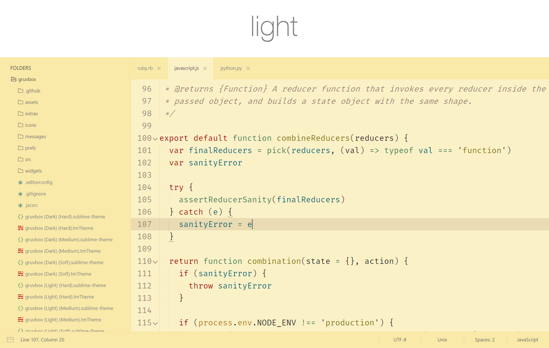
// gruvbox Light Hard Contrast
{
  "theme": "gruvbox.sublime-theme",
  "color_scheme": "Packages/gruvbox/gruvbox (Light) (Hard).sublime-color-scheme",
}
// gruvbox Light Medium Contrast
{
  "theme": "gruvbox.sublime-theme",
  "color_scheme": "Packages/gruvbox/gruvbox (Light) (Medium).sublime-color-scheme",
}
// gruvbox Light Soft Contrast
{
  "theme": "gruvbox.sublime-theme",
  "color_scheme": "Packages/gruvbox/gruvbox (Light) (Soft).sublime-color-scheme",
}
Color Scheme Variations
gruvbox comes with color scheme variations which have different brightness, saturation, or colors than their parent color schemes while still maintaining that excellent gruvbox tone.
No Dimmed Colors
A variant without out any neutral / dimmed colors
"color_scheme": "Packages/gruvbox/gruvbox (Dark) (Hard) NDC.sublime-color-scheme",
"color_scheme": "Packages/gruvbox/gruvbox (Dark) (Medium) NDC.sublime-color-scheme",
"color_scheme": "Packages/gruvbox/gruvbox (Dark) (Soft) NDC.sublime-color-scheme",
"color_scheme": "Packages/gruvbox/gruvbox (Light) (Hard) NDC.sublime-color-scheme",
"color_scheme": "Packages/gruvbox/gruvbox (Light) (Medium) NDC.sublime-color-scheme",
"color_scheme": "Packages/gruvbox/gruvbox (Light) (Soft) NDC.sublime-color-scheme",
Configuration
Accent Colors
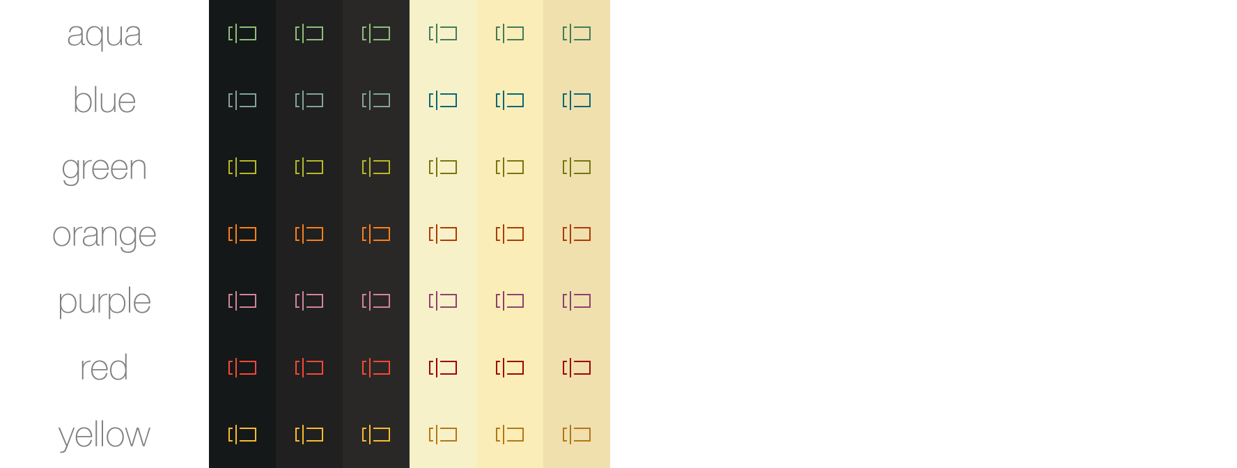
Accent colors affect icons and certain text.
  "gruvbox_accent_aqua": true,    // uses the cyanish color from the color scheme
  "gruvbox_accent_blue": true,    // uses the bluish color from the color scheme
  "gruvbox_accent_green": true,   // uses the greenish color from the color scheme
  "gruvbox_accent_orange": true,  // uses the orangish color from the color scheme
  "gruvbox_accent_purple": true,  // uses the purplish color from the color scheme
  "gruvbox_accent_red": true,     // uses the redish color from the color scheme
  "gruvbox_accent_yellow": true,  // uses the yellowish color from the color scheme
  "gruvbox_accent_pink": true,    // uses the pinkish color from the color scheme
AutoComplete Spacing
Change the space between autocomplete rows
  // sizes are top/bottom in px
  "gruvbox_autocomplete_cramped": true,      //  v  2
  "gruvbox_autocomplete_compact": true,      //  |  4
                                             //  |  6 (Default)
  "gruvbox_autocomplete_comfortable": true,  //  |  8
  "gruvbox_autocomplete_cozy": true,         //  v  10
AutoComplete Border
Add a border around the autocomplete popup
  "gruvbox_autocomplete_border": true,
  "gruvbox_autocomplete_border_thick": true,
Sideline Selected AutoComplete Row
Add a border to the left of the selected autocomplete row
All thicknesses require gruvbox_sideline_autocomplete_row to be true.
  "gruvbox_sideline_autocomplete_row": true,           //  v  1 (Default)
  "gruvbox_sideline_autocomplete_row_thick": true,     //  |  2
  "gruvbox_sideline_autocomplete_row_thickest": true,  //  v  3
Disable Selected AutoComplete Row Highlight
Remove the highlight from the selected autocomplete row.
"gruvbox_disable_autocomplete_row_highlight": true,
Sidebar Spacing
Change the space between sidebar tree rows
  // sizes are top/bottom in px
  "gruvbox_sidebar_cozy": true,         //  v  1
  "gruvbox_sidebar_comfortable": true,  //  |  3
                                        //  |  5 (Default)
  "gruvbox_sidebar_compact": true,      //  |  7
  "gruvbox_sidebar_cramped": true,      //  v  9
Sidebar Indent
Change the indent of sidebar tree rows
  "gruvbox_sidebar_indent_xxs": true,  //  v  4
  "gruvbox_sidebar_indent_xs": true,   //  |  8
  "gruvbox_sidebar_indent_s": true,    //  |  12
                                       //  |  16 (Default)
  "gruvbox_sidebar_indent_l": true,    //  |  20
  "gruvbox_sidebar_indent_xl": true,   //  |  24
  "gruvbox_sidebar_indent_xxl": true,  //  v  28
Sidebar Font Sizes
Change the font size of the sidebar labels
Increasing the font size will distort the icons in the sidebar.
  "gruvbox_sidebar_font_size_10": true,  //  v  10
                                         //  |  11 (Default)
  "gruvbox_sidebar_font_size_12": true,  //  |  12
  "gruvbox_sidebar_font_size_13": true,  //  |  13
  "gruvbox_sidebar_font_size_14": true,  //  |  14
  "gruvbox_sidebar_font_size_15": true,  //  |  15
  "gruvbox_sidebar_font_size_16": true,  //  v  16
Bold Sidebar Labels
Toggle bold fonts for sidebar labels
  "gruvbox_sidebar_heading_bold": true,
  "gruvbox_sidebar_label_bold": true,
Command Palette Spacing
Change the space between command palette rows
  // sizes are top/bottom in px
  "gruvbox_command_palette_cozy": true,         //  v  16
  "gruvbox_command_palette_comfortable": true,  //  |  14
                                                //  |  12 (Default)
  "gruvbox_command_palette_compact": true,      //  |  8
  "gruvbox_command_palette_cramped": true,      //  v  4
Sideline Selected Command Palette Row
Add a border to the left of the selected Command Palette row
All thicknesses require gruvbox_sideline_command_palette_row to be true.
  "gruvbox_sideline_command_palette_row": true,           //  v  1 (Default)
  "gruvbox_sideline_command_palette_row_thick": true,     //  |  2
  "gruvbox_sideline_command_palette_row_thickest": true,  //  v  3
Disable Selected Command Palette Row Highlight
Remove the highlight from the selected Command Palette row.
"gruvbox_disable_command_palette_row_highlight": true,
Statusbar Sizes
Change the height of the statusbar
  // sizes are in px
  "gruvbox_statusbar_xxs": true,  //  v  20
  "gruvbox_statusbar_xs": true,   //  |  25
  "gruvbox_statusbar_s": true,    //  |  30
                                  //  |  35 (Default)
  "gruvbox_statusbar_l": true,    //  |  40
  "gruvbox_statusbar_xl": true,   //  |  45
  "gruvbox_statusbar_xxl": true,  //  v  50
Statusbar Button Widths
Change the minimum width of the buttons in the statusbar
  // sizes are in px
  "gruvbox_statusbar_button_xxs": true,  //  v  44
  "gruvbox_statusbar_button_xs": true,   //  |  55
  "gruvbox_statusbar_button_s": true,    //  |  65
                                         //  |  75 (Default)
  "gruvbox_statusbar_button_l": true,    //  |  85
  "gruvbox_statusbar_button_xl": true,   //  |  95
  "gruvbox_statusbar_button_xxl": true,  //  v  105
Statusbar Font Sizes
Change the font size of the status bar labels
  "gruvbox_statusbar_font_size_10": true,  //  v  10
                                           //  |  11 (Default)
  "gruvbox_statusbar_font_size_12": true,  //  |  12
  "gruvbox_statusbar_font_size_13": true,  //  |  13
  "gruvbox_statusbar_font_size_14": true,  //  |  14
  "gruvbox_statusbar_font_size_15": true,  //  |  15
  "gruvbox_statusbar_font_size_16": true,  //  v  16
Tab Sizes
Change the height of the tabs
  // sizes are in px
  "gruvbox_tabs_xxs": true,  //  v  33
  "gruvbox_tabs_xs": true,   //  |  39
  "gruvbox_tabs_s": true,    //  |  45
                             //  |  51 (Default)
  "gruvbox_tabs_l": true,    //  |  57
  "gruvbox_tabs_xl": true,   //  |  63
  "gruvbox_tabs_xxl": true,  //  v  69
Tab Font Sizes
Change the font size of the tabs
  "gruvbox_tabs_font_size_7": true,   //  v  7
  "gruvbox_tabs_font_size_8": true,   //  |  8
  "gruvbox_tabs_font_size_9": true,   //  |  9
  "gruvbox_tabs_font_size_10": true,  //  |  10
                                      //  |  11 (Default)
  "gruvbox_tabs_font_size_12": true,  //  |  12
  "gruvbox_tabs_font_size_13": true,  //  |  13
  "gruvbox_tabs_font_size_14": true,  //  |  14
  "gruvbox_tabs_font_size_15": true,  //  v  15
Autocollapsing Tab Bar
Autocollapse the tabs when not in use
  "gruvbox_autocollapse_tabs": true,            // enable the autocollapsing tabs

  // Set the height of the trigger area which shows the tabs
  "gruvbox_autocollapse_tabs_trigger_2": true,  //  v  2
  "gruvbox_autocollapse_tabs_trigger_3": true,  //  |  3
                                                //  |  4 (Default)
  "gruvbox_autocollapse_tabs_trigger_5": true,  //  |  5
  "gruvbox_autocollapse_tabs_trigger_6": true,  //  v  6
Underline Modified Tabs
Underline modified tabs with the current accent color
All thicknesses require gruvbox_underline_modified_tabs to be true.
  "gruvbox_underline_modified_tabs": true,        //  |  1 (Default)
  "gruvbox_underline_modified_tabs_thick": true,  //  v  2
Underline Active Tab
Underline the active tab with the current accent color
All thicknesses require gruvbox_underline_active_tab to be true.
  "gruvbox_underline_active_tab": true,          //  |  1 (Default)
  "gruvbox_underline_active_tab_thick": true,    //  |  2
  "gruvbox_underline_active_tab_thicker": true,  //  v  3
Find, Replace, and Console Sizes
Adjust the top & bottom margins of the Find, Replace, and Console panels
  "gruvbox_panel_xxs": true,  //  v  2
  "gruvbox_panel_xs": true,   //  |  4
  "gruvbox_panel_s": true,    //  |  8
                              //  |  11 (Default)
  "gruvbox_panel_l": true,    //  |  13
  "gruvbox_panel_xl": true,   //  |  15
  "gruvbox_panel_xxl": true,  //  v  17
Scrollbar Widths
Adjust the width of the scrollbars
  // sizes are total width in px
  "gruvbox_scrollbar_width_xs": true,  //  v  12
  "gruvbox_scrollbar_width_s": true,   //  |  14
                                       //  |  16 (Default)
  "gruvbox_scrollbar_width_l": true,   //  |  18
  "gruvbox_scrollbar_width_xl": true,  //  v  20
Button Font Sizes
Adjust the font size of the buttons
  "gruvbox_buttons_font_size_10": true,  //  v  10
                                         //  |  11 (Default)
  "gruvbox_buttons_font_size_12": true,  //  |  12
  "gruvbox_buttons_font_size_13": true,  //  |  13
  "gruvbox_buttons_font_size_14": true,  //  |  14
  "gruvbox_buttons_font_size_15": true,  //  |  15
  "gruvbox_buttons_font_size_16": true,  //  v  16
Disable/Enable Borders
  "gruvbox_disable_borders": true,                     // Disable all borders
  "gruvbox_enable_pane_borders": true,                 // Enable borders between panes
  "gruvbox_enable_sidebar_border": true,               // Enable the sidebar border
  "gruvbox_enable_statusbar_border": true,             // Enable borders for the status bar
  "gruvbox_enable_tab_borders": true,                  // Enable borders for the tabs
  "gruvbox_disable_command_palette_row_border": true,  // Disable Command Palette row borders
Alternate Folder Icons
Larger Default Folder Icons
Use larger default folder icons in the sidebar
"gruvbox_folder_icons_large": true,
Square Folder Icons
Use square folder icons in the sidebar
"gruvbox_folder_icons_square": true,
Circle Folder Icons

Use 'circle' folder icons in the sidebar
"gruvbox_folder_icons_circle": true,
Plus/Minus Folder Icons

Use 'plus/minus' folder icons in the sidebar
"gruvbox_folder_icons_plus_minus": true,
Spacegray Folder Icons
Use spacegray-like folder icons in the sidebar
"gruvbox_folder_icons_spacegray": true,
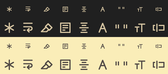
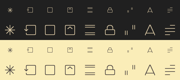
Alternate Icon Sets
Midstroke

Use icons with a 1.5x thicker stroke
"gruvbox_iconset_midstroke": true,
Thick
Use icons with a 2x thicker stroke
"gruvbox_iconset_thick": true,
Spacegray
Use spacegray-like icons
"gruvbox_iconset_spacegray": true,
PlainTasks Support
PlainTasks Support
To use the color scheme with the PlainTasks plugin, add the color scheme path to the "color_scheme" key in Preferences > Package Settings > PlainTasks > Settings - User like so:
// PlainTasks.sublime-settings

{
  "color_scheme": "Packages/gruvbox/gruvbox (Dark) (Medium).sublime-color-scheme",
}
Even More Settings...
Even More Settings...
  "gruvbox_animate_icons": true,              // Enable icon animations
  "gruvbox_buttons_bold": true,               // Enable bold button labels
  "gruvbox_colored_tooltips": true,           // Color the tooltip backgrounds with the current accent color
  "gruvbox_disable_faded_file_icons": true,   // Make file-type icons opaque
  "gruvbox_disable_file_icons": true,         // Disable the sidebar file icons
  "gruvbox_disable_folder_icons": true,       // Disable the sidebar folder icons
  "gruvbox_disable_greyscale": true,          // Use gruvbox colors instead of greyscale colors for certain text
  "gruvbox_disable_panels_button": true,      // Hide the panel-switching button
  "gruvbox_enable_panel_close_button": true,  // Enable the panel close button
  "gruvbox_highlight_active_buttons": true,   // Highlight selected buttons in the Find & Replace panel
  "gruvbox_highlight_active_tree_row": true,  // Highlight the active file in the sidebar tree
  "gruvbox_less_contrast": true,              // Use less contrasting colors in sidebar, tabs, etc.
  "gruvbox_statusbar_bold": true,             // Enable bold status bar labels
  "gruvbox_tabs_autowidth": true,             // Auto-size the tabs
  "gruvbox_tabs_bold": true,                  // Enable bold tabs
Extras
All extras can be found in the extras sub-directory of the package.
App Icons
App icons in PNG, ICO, & ICNS format are located in extras/app-icons/.
SublimeLinter Gutter Theme
Activation
- Add the
gruvboxdirectory fromextras/sublimelinter gutter-themes/toSublime Text/Data/Packages/SublimeLinter/gutter-themes/ - Set
gruvboxas the gutter theme by choosingSublimeLinter: Choose Gutter Themefrom the command palette and selectinggruvboxor by changing"gutter_theme"to"Packages/SublimeLinter/gutter-themes/gruvbox/gruvbox.gutter-theme"inSublimeLinter.sublime-settings - Restart Sublime Text
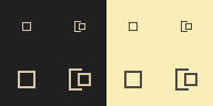
Bracket Highlighter Icons
Activation

- Move all images in
extras/BracketHighlighter/icons/toSublime Text/Data/Packages/BracketHighlighter/icons/ - Restart Sublime Text
Code Fold Icon
Activation
- Rename any
*_fold.pnginextrastofold.png - Add the newly renamed
fold.pngicon toSublime Text/Data/Packages/Theme - Default/ - Restart Sublime Text
Bookmark Icon
Activation
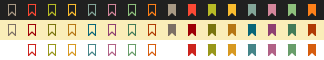
- Rename any
*_bookmark_*.pnginextrastobookmark.png - Add the newly renamed
bookmark.pngicon toSublime Text/Data/Packages/Theme - Default/ - Restart Sublime Text
Palette
Dark mode

Light mode

License
Contributing
Contributions are always welcome. Before contributing please read CONTRIBUTING.md.
For Other Editors
Thanks
Thanks to:
- Pavel Pertsev for creating gruvbox for Vim.
- Will Bond for the mathematical Package Control
- Spacegray and Material Theme for inspiration
Open Source Agenda Badge
