Beercss Versions Save
Build material design interfaces in record time... without stress for devs... 🍺💛
v3.5.4
3 weeks agoCHANGELOG 3.5.4

🚀 Added
- Added
maxhelper tosliderelement, to be used as custom slider - Added
minhelper tofieldelement, to be used as autoresize textarea (https://github.com/beercss/beercss/issues/276) - Updated forEach to native for loop for better performance (https://github.com/beercss/beercss/issues/287)
- Updated list section on homepage (https://github.com/beercss/beercss/issues/284)
- Updated slider section on homepage
- Updated letter spacing like MD3 guidelines
- Followed MD2 RTL guidelines (https://github.com/beercss/beercss/discussions/289)
- Added indeterminate state checkbox (https://github.com/beercss/beercss/issues/295)
- Added RTL / LTR item on homepage menu
🩹 Fixed
- Fixed vertical
progress - Fixed load fonts (https://github.com/beercss/beercss/issues/281)
- Fixed
menuinside table cell (https://github.com/beercss/beercss/discussions/285#discussioncomment-9087479) - Fixed scroll when use
headerorfooterandmain.responsive - Removed
auto-paddingbecause padding doesn't have auto value on CSS (https://github.com/beercss/beercss/issues/296) - Fixed
tootipalignment insidesliderelement
Added max helper to slider element, to be used as custom slider
<...>
  <label class="slider max">
    <input type="range">
    <span></span>
  </label>
</...>
Added min helper to field element, to be used as autoresize textarea
<div class="field textarea border min">
  <textarea></textarea>
</div>
Added indeterminate state checkbox
This is set using the indeterminate property via JavaScript (it cannot be set using an HTML attribute) https://developer.mozilla.org/en-US/docs/Web/HTML/Element/input/checkbox#indeterminate_state_checkboxes:
document.getElementById(elementId).indeterminate = true;
Updated list section on homepage
Updated slider section on homepage
v3.5.5
3 weeks agoCHANGELOG 3.5.5
🚀 Added
- Added
maxhelper tosliderelement, to be used as custom slider - Added
minhelper tofieldelement, to be used as autoresize textarea (https://github.com/beercss/beercss/issues/276) - Updated forEach to native for loop for better performance (https://github.com/beercss/beercss/issues/287)
- Updated list section on homepage (https://github.com/beercss/beercss/issues/284)
- Updated slider section on homepage
- Updated letter spacing like MD3 guidelines
- Followed MD2 RTL guidelines (https://github.com/beercss/beercss/discussions/289)
- Added indeterminate state checkbox (https://github.com/beercss/beercss/issues/295)
- Added RTL / LTR item on homepage menu
🩹 Fixed
- Fixed vertical
progress - Fixed load fonts (https://github.com/beercss/beercss/issues/281)
- Fixed
menuinside table cell (https://github.com/beercss/beercss/discussions/285#discussioncomment-9087479) - Fixed scroll when use
headerorfooterandmain.responsive - Removed
auto-paddingbecause padding doesn't have auto value on CSS (https://github.com/beercss/beercss/issues/296) - Fixed
tootipalignment insidesliderelement
Added max helper to slider element, to be used as custom slider
<...>
  <label class="slider max">
    <input type="range">
    <span></span>
  </label>
</...>
Added min helper to field element, to be used as autoresize textarea
<div class="field textarea border min">
  <textarea></textarea>
</div>
Added indeterminate state checkbox
This is set using the indeterminate property via JavaScript (it cannot be set using an HTML attribute) https://developer.mozilla.org/en-US/docs/Web/HTML/Element/input/checkbox#indeterminate_state_checkboxes:
document.getElementById(elementId).indeterminate = true;
Updated list section on homepage
Updated slider section on homepage
v3.5.1
2 months agoCHANGELOG 3.5.1

🚀 Added
- Reverted the styles on
olandulelements (https://github.com/beercss/beercss/issues/262) - Updated
sliderelement to be like MD3 guidelines (https://github.com/beercss/beercss/issues/261) - Updated
badgeelement to be like MD3 guidelines - Added
minhelper tobadgeelement - Added
max,horizontalandverticalhelpers toprogresselement (https://github.com/beercss/beercss/discussions/263) - Updated wave effect (https://github.com/beercss/beercss/pull/269)
- Added shadow on hovered buttons and chips (except bordered) like MD3 guidelines
- Converted beer-and-woman.jpg to svg (https://github.com/beercss/beercss/pull/267)
- Updated progress section on homepage
- Added grabbing cursor to slider
🩹 Fixed
- Fixed slider binding on other JS frameworks (https://github.com/beercss/beercss/issues/256)
// Added max, horizontal and vertical helpers to progress element
<...>
  ...
  <progress class="max"></progress>
</...>
Updated slider element to be like MD3 guidelines (https://github.com/beercss/beercss/issues/261)
Updated badge element to be like MD3 guidelines
Updated progress section on homepage
v3.4.13
3 months agoCHANGELOG 3.4.13
🚀 Added
- Downsized the final bundle a little more (from 67.3 to 66.0)
- Added support to
ol,ul,liinsidenavelement - Added support to
ol,ul,liinsidemenuelement (https://github.com/beercss/beercss/issues/240) - Added support to
ol,ul,lilikenavandrowelements (except withdrawer,left,right,top,bottomhelpers) - Added
auto-widthandauto-heighthelpers - Updated the minimum height of
ainsidemenuto 48dp like the MD3 guidelines (https://m3.material.io/components/menus/specs) - Updated the minimum height of
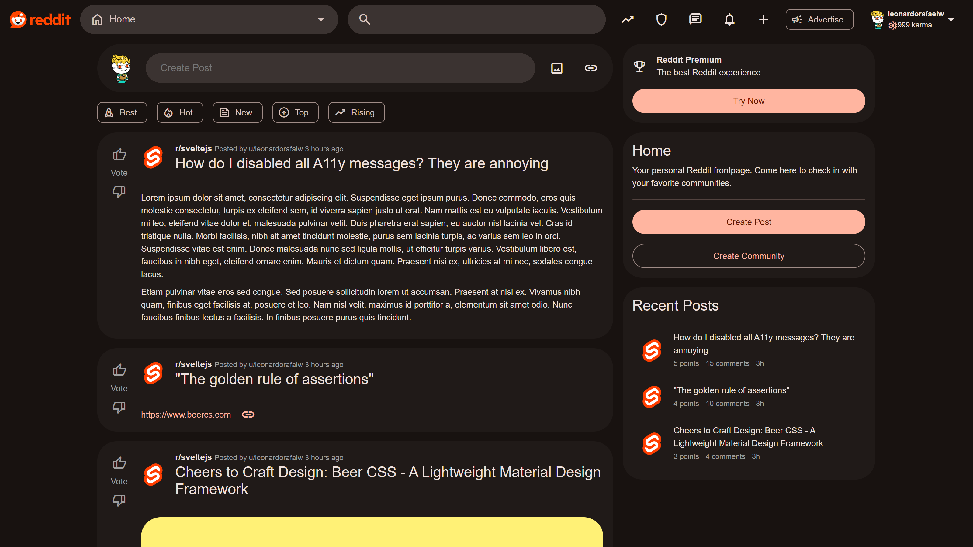
footerto 80dp like the MD3 guidelines (https://m3.material.io/components/bottom-app-bar/specs) - Added Reddit template on homepage
- Updated default
line-heightfrom 1.25 to 1.5, to improve readable texts
ℹ️ Caveats
- The
<ul>and<ol>elements will not work withdrawer,left,right,top,bottomhelpers. This helpers are exclusive for<nav>element.
⚠️ Breaking changes
- If you already have custom styles on
<ol>,<ul>and<li>tags, this release can break for you (or not)
// Added support to ol, ul, li inside nav element
<nav>
  <ul>
    <li>
      <a>Item</a>
    </li>
    <li>
      <a>Item</a>
    </li>
    <li>
      <a>Item</a>
    </li>
  </ul>
</nav>

// Or continue with the minimalist version
<nav>
  <a>Item</a>
  <a>Item</a>
  <a>Item</a>
</nav>
// Added support to li inside menu element
<menu>
  <li>
      <a>Item</a>
  </li>
</menu>

// Or continue with the minimalist version
<menu>
  <a>Item</a>
  <a>Item</a>
  <a>Item</a>
</menu>
// Added support to ol, ul, li like nav and row elements (except with drawer, left, right, top, bottom helpers)
<ul>
  <li>
    <a>Item</a>
  </li>
  <li>
    <a>Item</a>
  </li>
  <li>
    <a>Item</a>
  </li>
</ul>
Added Reddit template on homepage
v3.4.11
4 months agoCHANGELOG 3.4.11
🚀 Added
- Downsized the final bundle a little more (from 67.6 to 67.3)
- Updated
dialogelement like MD3 specs (https://github.com/beercss/beercss/issues/253) - Updated material icon fonts
- Updated dialog section on homepage with a custom blur overlay example
🩹 Fixed
- Fixed strong alignment (https://github.com/beercss/beercss/issues/250)
- Fixed alignment of
progressinsidefield
⚠️ Breaking changes
- Removed
nonehelper frombuttonelement
// Removed none helper from button element

// before
<button class="none">Button</button>

// after (some alternatives)
<button>Button</button>
<button class="transparent">Button</button>
// This is the last release of 2023.
// Merry christmas and a happy new year for us.
// 🎅🍻🎅🏼🍻🎅🏿🍻
v3.4.12
4 months agoCHANGELOG 3.4.11
🚀 Added
- Downsized the final bundle a little more (from 67.6 to 67.3)
- Updated
dialogelement like MD3 specs (https://github.com/beercss/beercss/issues/253) - Updated material icon fonts
- Updated dialog section on homepage with a custom blur overlay example
🩹 Fixed
- Fixed strong alignment (https://github.com/beercss/beercss/issues/250)
- Fixed alignment of
progressinsidefield - Fixed rtl on some elements
⚠️ Breaking changes
- Removed
nonehelper frombuttonelement
// Removed none helper from button element

// before
<button class="none">Button</button>

// after (some alternatives)
<button>Button</button>
<button class="transparent">Button</button>
// This is the last release of 2023.
// Merry christmas and a happy new year for us.
// 🎅🍻🎅🏼🍻🎅🏿🍻
v3.4.9
5 months agoCHANGELOG 3.4.9
🚀 Added
- Downsized the final bundle in 2kb (from 69.7 to 67.6)
- Updated table section on homepage
- Added
stripeshelper fortableelement - Added
minhelper forthandtdelements - Added scrollable table using
fixedhelper fortheadandtfootelements (https://github.com/beercss/beercss/issues/241)
🩹 Fixed
- Using flex-start, flex-end to support Opera browsers (https://github.com/beercss/beercss/issues/246 and https://github.com/beercss/beercss/issues/244)
- Fixed vertical slider
- Fixed responsive header
// Added stripes helper for table element
// Added min helper for th and td elements

<table class="stripes">
  <thead>
    <tr>
      <th class="min">Header</th>
      <th>Header</th>
    </tr>
  </thead>
  <tbody>
    <tr>
      <td class="min">Cell</td>
      <td>Cell</td>
    </tr>
    <tr>
      <td class="min">Cell</td>
      <td>Cell</td>
    </tr>
    <tr>
      <td class="min">Cell</td>
      <td>Cell</td>
    </tr>
  </tbody>
  <tfoot>
    <tr>
      <th class="min">Footer</th>
      <th>Footer</th>
    </tr>
  </tfoot>
</table>
// Added scrollable table using fixed helper for thead and tfoot elements

<div class="small-height scroll">
  <table>
    <thead class="fixed">
      <tr>
        <th>Header</th>
        <th>Header</th>
      </tr>
    </thead>
    <tbody>
      <tr>
        <td>Cell</td>
        <td>Cell</td>
      </tr>
      <tr>
        <td>Cell</td>
        <td>Cell</td>
      </tr>
      <tr>
        <td>Cell</td>
        <td>Cell</td>
      </tr>
      <tr>
        <td>Cell</td>
        <td>Cell</td>
      </tr>
      <tr>
        <td>Cell</td>
        <td>Cell</td>
      </tr>
      <tr>
        <td>Cell</td>
        <td>Cell</td>
      </tr>
    </tbody>
    <tfoot class="fixed">
      <tr>
        <th>Footer</th>
        <th>Footer</th>
      </tr>
    </tfoot>
  </table>
</div>
v3.4.3
6 months agoCHANGELOG 3.4.7
🚀 Added
- Added support for standard navigation drawer (https://m3.material.io/components/navigation-drawer/guidelines#38800092-0149-4251-ac75-4ce8a144042a).
- Added main layouts section on homepage (https://m3.material.io/foundations/layout/applying-layout/window-size-classes)
- Added main layouts docs
- Updated navigations section on homepage
- Updated navigations docs
- Updated font icons
- Added fallback to web fonts
🩹 Fixed
- The
dialogelements were behind navigation rails, now will be above - Fixed
verticalhelper onnavelements - Fixed import fonts on other bundlers (https://github.com/beercss/beercss/issues/239)
// Added support for standard navigation drawer

<nav class="drawer left|right">
  <a>
    <i>home</i>
    <span>Home</span>
  </a>
  <a>
    <i>search</i>
    <span>Search</span>
  </a>
  <a>
    <i>more_vert</i>
    <span>More</span>
  </a>
</nav>

// inside dialog/article
<dialog>
  <nav class="drawer">
    <a>
      <i>home</i>
      <span>Home</span>
    </a>
    <a>
      <i>search</i>
      <span>Search</span>
    </a>
    <a>
      <i>more_vert</i>
      <span>More</span>
    </a>
  </nav>
</dialog>
Main layouts section
Standard navigation drawer
v3.4.0
7 months agoCHANGELOG 3.4.2
🚀 Added
- Added support for RTL (https://github.com/beercss/beercss/issues/207).
- Added new surface colors according to guidelines (https://github.com/beercss/beercss/issues/214).
- Added new colors section on homepage.
- Added support to input color, using the same logic of input file (https://github.com/beercss/beercss/issues/218).
- Added more use cases for input file/color.
- Added vertical divider https://github.com/beercss/beercss/pull/227
🩹 Fixed
- Fixed input label up on file.
- Fixed main content https://github.com/beercss/beercss/issues/228 (reverted in v3.4.2)
⚠️ Breaking changes
- Updated the html of input file inside
fieldelements.
// Updated the html of input file inside field elements

// before
<div class="field">
  <input type="text">
  <input type="file">
</div>

// after
<div class="field">
  <input type="file">
  <input type="text">
</div>
// Added more use cases for input file/color

// inside fields
<div class="field">
  <input type="color|file">
  <input type="text">
</div>

// inside button elements
<button class="circle">
  <input type="color|file">
</button>

// inside other elements
<*>
  <input type="color|file">
</*>
v3.3.0
9 months agoCHANGELOG 3.3.5
🚀 Added
- Added stepper examples on homepage (https://github.com/beercss/beercss/issues/65#issuecomment-1628890530)
- Added style to internal scrollbars
- Updated search to not use
headerinsidemenu(https://github.com/beercss/beercss/issues/188) - Updated default
dialogto be rounded like material 3 guidelines (https://github.com/beercss/beercss/issues/186) - Updated
sliderto be like material 3 guidelines - Added
left|right|top|bottom|horizontal|verticaldirections tomarginandpaddinghelpers, you can use like this{direction}-marginor{direction}-padding(https://github.com/beercss/beercss/pull/150) - Added
auto-marginandauto-paddinghelpers (https://github.com/beercss/beercss/pull/150) - Added clickable icon on
fieldelement using<a>tag (https://github.com/beercss/beercss/issues/195)
🩹 Fixed
- Fixed focus on
textareaelement withoutborder - Fixed data-ui behavior to not focus on element after open a
snackbar(https://github.com/beercss/beercss/issues/183) - Fixed data-ui
menubehavior - Fixed mis-rendered issues (https://github.com/beercss/beercss/issues/194)
- Fixed animation and color of
progresson iOS - Fixed duplicate semicolon (https://github.com/beercss/beercss/pull/202)
- Fixed label align and textarea paddings (https://github.com/beercss/beercss/issues/200)
⚠️ Breaking changes
- Renamed
toasttosnackbarto be material 3 friendly (https://github.com/beercss/beercss/issues/182) - Removed
--inverse-on-primaryvariable, this color doesn't exists on official material color scheme - Updated default
chipto be like material 3 guidelines (https://m3.material.io/components/chips/overview) - Merging
loaderandprogresselements into<progress>tag to be more semantic with a pure css solution
🚩 Examples
// Renamed toast to snackbar to be material 3 friendly

// Before
<div class="toast">...</div>

// After
<div class="snackbar">...</div>
// Updated default chip to be like material 3 guidelines

// Before
<a class="chip">
  <i class="small">today</i>
  <span>Chip</span>
</a>

// After
<a class="chip">
  <i>today</i>
  <span>Chip</span>
</a>
// Merging loader and progress elements into <progress> tag to be more semantic with a pure css solution

// Before
<div class="progress"></div>
<div class="loader"></div>
<div class="progress orange"></div>

// After
<progress></progress>
<progress class="circle"></progress>
<progress class="orange-text"></progress>

<progress value="0.25"></progress>
<progress value="25" max="100"></progress>
// Updated search to not use header tag inside it

// Before
<menu class="min">
  <header class="fixed">
    <div class="field large prefix suffix no-margin">
      <i class="front">arrow_back</i>
      <input placeholder="Search text">
      <i class="front">close</i>
    </div>
  </header>
  ...
</menu>

// After
<menu class="min">
  <div class="field large prefix suffix no-margin fixed">
    <i class="front">arrow_back</i>
    <input placeholder="Search text">
    <i class="front">close</i>
  </div>
  ...
</menu>
// Added stepper examples on homepage

<nav>
  <button class="circle small">1</button>
  <div class="max divider"></div>
  <button class="circle small">2</button>
  <div class="max divider"></div>
  <button class="circle small">3</button>
</nav>
// Added directions to margin and padding helpers
// Added auto-margin and auto-padding helpers

<div class="left-margin"></div>
<div class="horizontal-margin"></div>

<div class="small-margin left-margin"></div>
<div class="small-margin horizontal-margin"></div>

<div class="auto-margin left-margin"></div>
<div class="auto-margin horizontal-margin"></div>
// Added clickable icon on field element using <a> tag

<div class="field prefix">
  <a>
    <i>search</i>
  </a>
  ...
</div>