BackgroundLibrary Save
A framework for directly generating shape through Tags, no need to write shape.xml again(通过标签直接生成shape,无需再写shape.xml)
Project README
BackgroundLibrary
A framework for directly generating shape through Tags, no need to write shape.xml again(通过标签直接生成shape,无需再写shape.xml)
issue回复不及时,可以添加qq群887686934
依赖方式:
allprojects {
    repositories {
        ...
        maven { url 'https://jitpack.io' }
    }
}

implementation "com.android.support:appcompat-v7:$supportVersion"
implementation 'com.github.JavaNoober.BackgroundLibrary:library:1.7.6'
如果项目使用了androidx:
allprojects {
    repositories {
        ...
        maven { url 'https://jitpack.io' }
    }
}

implementation "androidx.appcompat:appcompat:$supportVersion"
implementation 'com.github.JavaNoober.BackgroundLibrary:libraryx:1.7.6'
使用文档
无需任何代码,直接加入bl标签属性即可,与原生view无缝衔接,具体使用方法以及属性内容请查看wiki
重要的事情说3遍!!!
wiki
wiki
wiki
示例效果
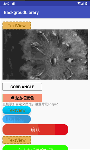
使用效果完全和原生shape selector一样,但是只需要直接在xml中加入属性即可,例如
    <TextView
        android:id="@+id/ttt"
        android:layout_width="130dp"
        android:layout_height="36dp"
        android:layout_marginTop="5dp"
        android:gravity="center"
        android:text="TextView"
        android:textColor="#8c6822"
        android:textSize="20sp"
        app:bl_corners_radius="4dp"
        app:bl_solid_color="#E3B666"
        app:bl_stroke_color="#8c6822"
        app:bl_stroke_dashGap="5dp"
        app:bl_stroke_dashWidth="10dp"
        app:bl_stroke_width="2dp" />
1、边框+背景+圆角
<TextView
    android:layout_width="130dp"
    android:layout_width="130dp"
    android:layout_height="36dp"
    android:gravity="center"
    android:text="TextView"
    android:textColor="#8c6822"
    android:textSize="20sp"
    app:bl_corners_radius="4dp"
    app:bl_solid_color="#E3B666"
    app:bl_stroke_color="#8c6822"
    app:bl_stroke_width="2dp" />
等同于
<shape xmlns:android="http://schemas.android.com/apk/res/android">
    <corners android:radius="2dp"/>
    <solid android:color="#E3B666"/>
    <stroke android:color="#E3B666" android:width="2dp"/>
</shape>
2、渐变
<shape xmlns:android="http://schemas.android.com/apk/res/android">
    <corners android:radius="2dp"/>
    <gradient android:angle="0"
              android:startColor="#63B8FF"
              android:endColor="#4F94CD"/>
</shape>
等同于
 <Button
    android:id="@+id/btn"
    android:layout_width="130dp"
    android:layout_height="36dp"
    android:layout_marginTop="5dp"
    android:gravity="center"
    android:padding="0dp"
    android:text="跳转到列表"
    android:textColor="#4F94CD"
    android:textSize="20sp"
    app:bl_corners_radius="2dp"
    app:bl_gradient_angle="0"
    app:bl_gradient_endColor="#4F94CD"
    app:bl_gradient_startColor="#63B8FF" />
3、点击效果
第一个点赞效果:
android:layout_width="20dp"
android:layout_height="20dp"
android:layout_marginTop="5dp"
app:bl_pressed_drawable="@drawable/circle_like_pressed"
app:bl_unPressed_drawable="@drawable/circle_like_normal" />
就等同于:
<selector xmlns:android="http://schemas.android.com/apk/res/android">
    <item android:state_pressed="true"
        android:drawable="@drawable/circle_like_pressed" />
    <item android:state_pressed="false"
        android:drawable="@drawable/circle_like_normal" />
</selector>
通过代码设置:
Drawable drawable4 = new DrawableCreator.Builder().setCornersRadius(dip2px(20))
        .setPressedDrawable(ContextCompat.getDrawable(this, R.drawable.circle_like_pressed))
        .setUnPressedDrawable(ContextCompat.getDrawable(this, R.drawable.circle_like_normal))
        .build();
tv.setClickable(true);
tv.setBackground(drawable4);
第二个按钮效果:
<Button
        android:layout_width="300dp"
        android:layout_height="50dp"
        android:layout_marginTop="5dp"
        android:gravity="center"
        android:padding="0dp"
        android:text="有波纹触摸反馈的按钮"
        android:textColor="@android:color/white"
        android:textSize="20sp"
        app:bl_corners_radius="20dp"
        app:bl_pressed_drawable="#71C671"
        app:bl_ripple_color="#71C671"
        app:bl_ripple_enable="true"
        app:bl_stroke_color="#8c6822"
        app:bl_stroke_width="2dp"
        app:bl_unPressed_drawable="#7CFC00" />
通过代码设置:
Drawable drawable3 = new DrawableCreator.Builder().setCornersRadius(dip2px(20))
        .setRipple(true, Color.parseColor("#71C671"))
        .setSolidColor(Color.parseColor("#7CFC00"))
        .setStrokeColor(Color.parseColor("#8c6822"))
        .setStrokeWidth(dip2px(2))
        .build();
btn.setBackground(drawable3);
使用其实基本和selector shape一样。
4、点击文字变色
<Button
    android:layout_width="300dp"
    android:layout_height="50dp"
    android:layout_marginTop="5dp"
    android:gravity="center"
    android:padding="0dp"
    android:text="点击文字变色"
    app:bl_pressed_textColor="#919DAF"
    app:bl_unPressed_textColor="@android:color/holo_red_dark"/>
5、点击填充边框变色属性
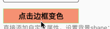
<TextView
    android:layout_width="180dp"
    android:layout_height="36dp"
    android:layout_marginTop="15dp"
    android:gravity="center"
    android:text="点击边框变色"
    android:textColor="@android:color/black"
    android:textSize="18dp"
    android:textStyle="bold"
    android:clickable="true"
    app:bl_pressed_solid_color="#FFDEAD"
    app:bl_unPressed_solid_color="#E9967A"
    app:bl_stroke_width="1dp"
    app:bl_pressed_stroke_color="#C6E2FF"
    app:bl_unPressed_stroke_color="#98FB98"/>
6、style类似的使用方式
style中不要加入"app:", 直接写属性名即可
<style name="bg">
    <item name="bl_corners_radius">4dp</item>
    <item name="bl_solid_color">#E3B666</item>
    <item name="bl_stroke_color">#8c6822</item>
    <item name="bl_stroke_width">2dp</item>
</style>

<TextView
    android:layout_width="130dp"
    android:layout_height="36dp"
    android:gravity="center"
    android:text="TextView"
    android:textColor="#8c6822"
    android:textSize="20sp"
    style="@style/bg"/>
7、设置drawableLeft
    <Button
        android:id="@+id/btn_like"
        android:layout_width="wrap_content"
        android:layout_height="wrap_content"
        android:layout_marginTop="5dp"
        app:bl_position="left"
        android:background="@null"
        android:text="点赞+1"
        app:bl_pressed_drawable="@drawable/circle_like_pressed"
        app:bl_unPressed_drawable="@drawable/circle_like_normal" />

    <Button
        android:id="@+id/btn_like2"
        android:layout_width="wrap_content"
        android:layout_height="wrap_content"
        android:layout_marginTop="5dp"
        app:bl_position="left"
        android:background="@null"
        android:text="未点赞"
        app:bl_selected_textColor="#fbdc4a"
        app:bl_unSelected_textColor="@android:color/black"
        app:bl_selected_drawable="@drawable/circle_like_pressed"
        app:bl_unSelected_drawable="@drawable/circle_like_normal" />
8、设置帧动画
    <View
        android:id="@+id/v_anim"
        android:layout_width="wrap_content"
        android:layout_height="wrap_content"
        app:bl_oneshot="false"
        app:bl_duration="50"
        app:bl_anim_auto_start="true"
        app:bl_frame_drawable_item0="@drawable/img00"
        app:bl_frame_drawable_item1="@drawable/img01"
        app:bl_frame_drawable_item2="@drawable/img02"
        app:bl_frame_drawable_item3="@drawable/img03"
        app:bl_frame_drawable_item4="@drawable/img04"
        app:bl_frame_drawable_item5="@drawable/img05"
        app:bl_frame_drawable_item6="@drawable/img06"
        app:bl_frame_drawable_item7="@drawable/img07"
        app:bl_frame_drawable_item8="@drawable/img08"
        app:bl_frame_drawable_item9="@drawable/img09"
        app:bl_frame_drawable_item10="@drawable/img10"
        app:bl_frame_drawable_item11="@drawable/img11"
        app:bl_frame_drawable_item12="@drawable/img12"
        app:bl_frame_drawable_item13="@drawable/img13"
        app:bl_frame_drawable_item14="@drawable/img14"/>
9、甚至支持直接在xml中设置方法,暂时只支持无参方法,支持父类方法
    <Button
        android:id="@+id/btn"
        android:layout_width="320dp"
        android:layout_height="36dp"
        android:text="通过bl_function属性跳转到列表"
        app:bl_function="finish"/>
加入bl_function属性即可,这样控件就增加了finish点击事件,很多时候返回键只是一个finish,我们仅需要加入该属性即可, 当然使用场景还有很多。
如果有什么问题,方便大家交流,创建了一个qq群,群号887686934,欢迎大家加入
Apache License
   Apache License

   Copyright [2018] [javakepp]

   Licensed under the Apache License, Version 2.0 (the "License");
   you may not use this file except in compliance with the License.
   You may obtain a copy of the License at

       http://www.apache.org/licenses/LICENSE-2.0

   Unless required by applicable law or agreed to in writing, software
   distributed under the License is distributed on an "AS IS" BASIS,
   WITHOUT WARRANTIES OR CONDITIONS OF ANY KIND, either express or implied.
   See the License for the specific language governing permissions and
   limitations under the License.
Open Source Agenda is not affiliated with "BackgroundLibrary" Project. README Source: JavaNoober/BackgroundLibrary
Stars
3,793
Open Issues
10
Last Commit
1 year ago
Repository
License
Open Source Agenda Badge
