AppCompat Extension Library Save
A library that builds on the AppCompat Design Library and provides additional common components such as AccountHeaderView, FloatingActionMenu, CircleImageView, Picker Dialogs, FlexibleToolbarLayout, Delightful Detail Drawables and TypefaceCompat.


AppCompat-Extension-Library
Google's AppCompat Design Library provides some awesome components for your development and design needs. For some applications though those just aren't enough. This library tries to fill the gap and provides additional common components building on the official AppCompat Design Library. If you have any additional features you'd like to see as part of this ongoing effort feel free to open a new issue.
Currently there are the following components:
- AccountHeaderView
- FloatingActionMenu
- CircleImageView
- Picker Dialogs
- FlexibleToolbarLayout
- Delightful Detail Drawables
- TypefaceCompat
There are wikis for every component that explain the setup in more depth, so be sure to check them out. Here's a link to the Wiki Home Page
Importing the library
This library is available as a gradle dependency via JitPack.io. Just add the following lines to your app module build.gradle:
repositories {
    maven { url "https://jitpack.io" }
}
dependencies {
    compile 'com.github.TR4Android:AppCompat-Extension-Library:v0.5.1'
}
The latest Release is Release 0.5.1. You can download a sample.apk with this release.
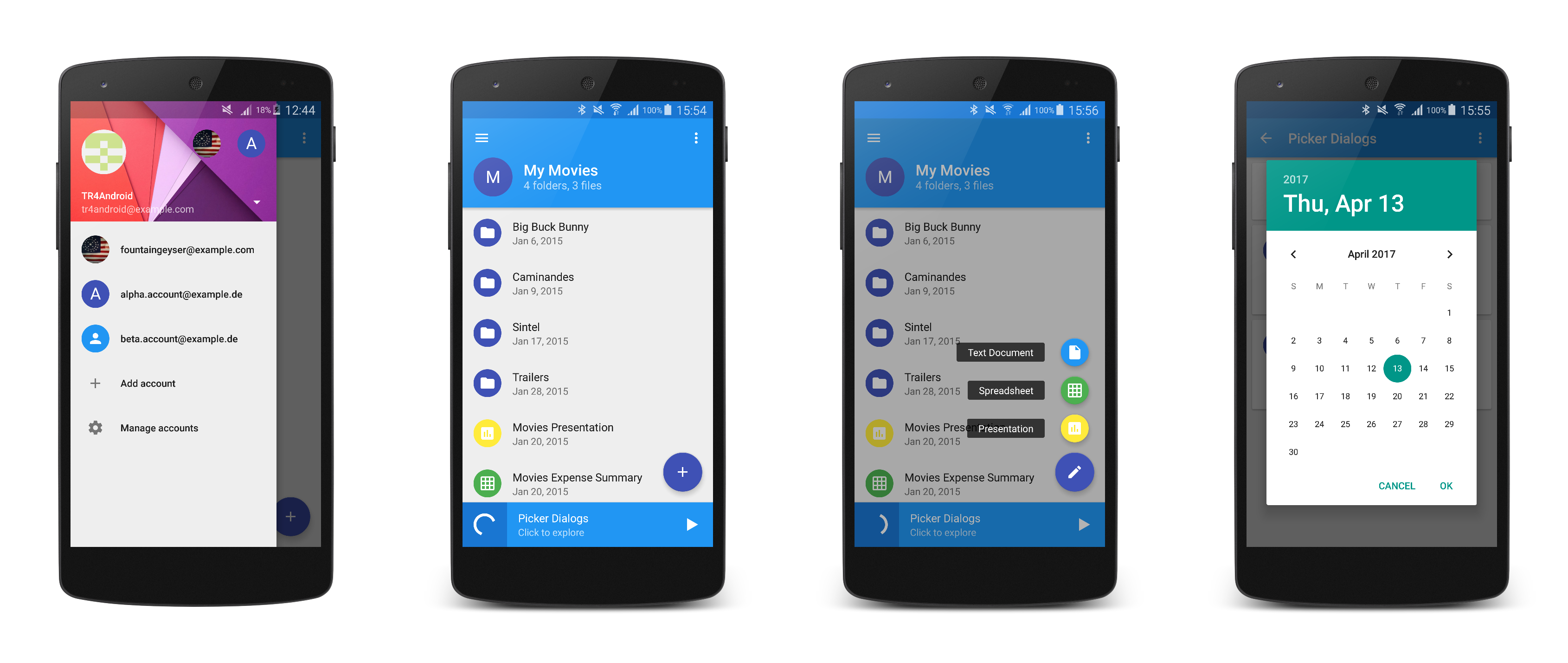
AccountHeaderView
The AccountHeaderView is a component that allows easy switching between accounts in the navigation drawer by clicking on the avatars on the header or by choosing from the dropdown list.
Main features:
- Works seamlessly with the AppCompat Design Library's
NavigationViewso you have full access to its features and can easily switch to an official account header implementation as soon as Google releases it. - Includes a dropdown list of accounts (and optionally account addition and managment items) by hooking up to the internal
ListViewof the AppCompat Design Library'sNavigationViewin an almost magical way! - Automatically creates placeholder avatars with the name's initials when an image is not set to an
Account(see Google's Gmail).
Basic setup:
Use the following layout as the app:headerLayout of the AppCompat Design Library's NavigationView:
<com.tr4android.support.extension.widget.AccountHeaderView xmlns:android="http://schemas.android.com/apk/res/android"
    xmlns:app="http://schemas.android.com/apk/res-auto"
    android:background="@drawable/account_header_cover_background"
    android:layout_width="match_parent"
    android:layout_height="@dimen/account_header_height" />
Then add your accounts to the AccountHeaderView and add a listener for account selections:
accountHeaderView.addAccounts(new Account().setName("TR4Android").setEmail("[email protected]").setIconResource(R.drawable.account_drawer_profile_image_tr4android), ...);
accountHeaderView.setAccountSelectedListener(new AccountHeaderView.OnAccountSelectedListener() {
    @Override
    public void onAccountSelected(Account account) {   }

    @Override
    public void onAccountAddSelected() {   }

    @Override
    public void onAccountManageSelected() {   }
});
For the full documentation and customization options head over to the AccountHeaderView wiki.
FloatingActionMenu
The FloatingActionMenu is a wrapper for multiple FloatingActionButtons that takes the first FloatingActionButton as the main button that stays on screen and flings out all other FloatingActionButtons in speed dial fashion.
Main features:
- Uses the AppCompat Design Library
FloatingActionButtonand thus has native elevation on Lollipop and above devices and even a shadow animation on pre-Lollipop devices! - Allows easy configuration of you main
FloatingActionButton's icon animation: apply any rotation and optionally an alpha transition to a second icon (see Google's Inbox). - Works on all devices back to API level 7 just like the AppCompat Design Library!
Basic setup
<com.tr4android.support.extension.widget.FloatingActionMenu
    android:layout_width="wrap_content"
    android:layout_height="wrap_content"
    android:layout_gravity="end|bottom" >

    <!-- Floating Action Buttons -->

</com.tr4android.support.extension.widget.FloatingActionMenu>
For the full documentation and customization options head over to the FloatingActionMenu wiki.
CircleImageView
The CircleImageView is a supercharged ImageView that provides the ability to set circular images as well as placeholders.
Main features:
- Creates circular images using the AppCompat Support Library's
RoundedBitmapDrawablewhich provides the best performance possible by using Romain Guys techniques! - Allows easy creation of placeholders with a colored circle and a letter (or letters) or an icon if an image should not available (see Google's Gmail email avatars).
Basic setup:
Instead of the default ImageView use the following in your layouts:
<com.tr4android.support.extension.widget.CircleImageView
    android:layout_width="40dp"
    android:layout_height="40dp" />
Then use setImage...() to set a circular image or setPlaceholder() to set a placeholder.
For the full documentation and customization options head over to the CircleImageView wiki.
Picker Dialogs
The AppCompatDatePickerDialog and AppCompatTimePickerDialog are native Android implementations of the picker dialogs detailed in the official Material Design guidelines.
Main features:
- Uses the design presented in the Pickers section of the Material Design guidelines for a fully Material Design compliant user experience!
- Works all the way back to API level 7 while maintaining important features (such as accessibility and right-to-left support) on API levels that support those.
Basic setup:
Setup your app theme by including the following lines (for dark themes remove the .Light part):
<style name="AppTheme.Base" parent="Theme.AppCompat.Light.NoActionBar">
    <!-- other attributes -->
    <item name="datePickerDialogTheme">@style/Theme.AppCompat.Light.DatePickerDialog</item>
    <item name="timePickerDialogTheme">@style/Theme.AppCompat.Light.TimePickerDialog</item>
</style>
Then use the AppCompatDatePickerDialog or AppCompatTimePickerDialog inside a DialogFragment (this example shows the AppCompatDatePickerDialog, but the process is quite similiar with the AppCompatTimePickerDialog):
public static class DatePickerFragment extends DialogFragment implements AppCompatDatePickerDialog.OnDateSetListener {

    @Override
    public Dialog onCreateDialog(Bundle savedInstanceState) {
        // Create a new instance of AppCompatDatePickerDialog and return it
        return new AppCompatDatePickerDialog(getActivity(), this, 2017, 3, 13);
    }

    public void onDateSet(AppCompatDatePicker view, int year, int month, int day) {
        // Do something with the date chosen by the user
    }
}
And later show this DialogFragment anywhere you need it:
DialogFragment datePicker = new DatePickerFragment();
datePicker.show(getSupportFragmentManager(), "datePicker");
For the full documentation and customization options head over to the Picker Dialogs wiki.
FlexibleToolbarLayout
The FlexibleToolbarLayout is a more advanced alternative to the already powerful CollapsingToolbarLayout that excels by also providing a scaled icon and subtitle along with the title.
Main features:
- Collapses more than just a title! You can display a title, a subtitle and even an image which will all be scaled and animated while scrolling and you can style them to fit your personal needs.
- Introduces more advanced elevation handling. The elevation you specified will no longer disappear when you have a solid background, but it still will if you have an immersive image.
Basic setup:
<android.support.design.widget.CoordinatorLayout>
    ...
    <android.support.design.widget.AppBarLayout>

        <com.tr4android.support.extension.widget.FlexibleToolbarLayout
            android:layout_width="match_parent"
            android:layout_height="match_parent"
            app:title="My title"
            app:subtitle="My subtitle"
            app:icon="@drawable/ic_my_icon"
            app:layout_scrollFlags="scroll|exitUntilCollapsed">

            <android.support.v7.widget.Toolbar
                android:layout_width="match_parent"
                android:layout_height="?attr/actionBarSize"
                app:layout_collapseMode="pin" />
        </com.tr4android.support.extension.widget.FlexibleToolbarLayout>
    </android.support.design.widget.AppBarLayout>
</android.support.design.widget.CoordinatorLayout>
Then update your FlexibleToolbarLayout at runtime by using setTitle(), setSubtitle or setIcon().
For the full documentation and customization options head over to the FlexibleToolbarLayout wiki.
Delightful Detail Drawables
The Delightful Detail Drawables provide ready-to-use implementations of the beautifully crafted animations presented in the Delightful Details section of the Material Design guidelines.
Main features:
- Let your users control their media with style by using the
MediaControlDrawablewhich animates between the icons for media playback control (play, pause and stop) and works back to API level 7. - Indulge your users while they are waiting for their content to load by using the
IndeterminateProgressDrawablewhich provides a compatibility implementation of the progress animation that works back to API level 7.
Basic setup:
// build a new MediaControlDrawable
final MediaControlDrawable drawable = new MediaControlDrawable.Builder(this)
        .setColor(Color.WHITE) // ... more options
        .build();
// build a new IndeterminateProgressDrawable
final IndeterminateProgressDrawable drawable = new IndeterminateProgressDrawable.Builder(this)
        .setColor(Color.WHITE) // ... more options
        .build();
For the full documentation and customization options head over to the Delightful Detail Drawables wiki.
TypefaceCompat
The
TypefaceCompatutility has been removed in version0.5.0of this library. The official downloadable fonts or FontsContractCompat should be used instead. While apps will continue to compile, the Roboto typeface will no longer be applied on pre-Lollipop devices as the associated resources have been removed to conserve space.
The TypefaceCompat is a utility for supporting the newest Typography. It automatically sets the text size, color and typeface for the styles specified in the guidelines.
Main features:
- Easily setup with one line of code in your
Activity. - Use one of the
TextAppearance.AppCompat.xxxstyles or use your own styles! - Automatically sets textSize, textColor and fontFamiliy for the
TextAppearance.AppCompat.xxxstyles and loads the new Roboto typeface on pre-Lollipop devices using a cache!
Basic setup:
In your Activity (for ease of use in your BaseActivity, if you have one) add the following line before super.onCreate():
public class SampleActivity extends AppCompatActivity {

    @Override
    protected void onCreate(Bundle savedInstanceState) {
        TypefaceCompatFactory.installViewFactory(this);
        super.onCreate(savedInstanceState);
        ...
    }
}
Then use one of the TextAppearance.AppCompat.xxx styles via android:textAppearance="@style/TextAppearance.AppCompat.xxx" on your TextViews.
To achieve the correct line height use one of the predefined line_spacing_extra_xxx values via android:lineSpacingExtra="@dimen/line_spacing_extra_xxx" on your TextView.
For the full documentation and customization options head over to the TypefaceCompat wiki.
License
Copyright 2015 Thomas Robert Altstidl & fountaingeyser
Licensed under the Apache License, Version 2.0 (the "License"); you may not use this file except in compliance with the License. You may obtain a copy of the License at
http://www.apache.org/licenses/LICENSE-2.0
Unless required by applicable law or agreed to in writing, software distributed under the License is distributed on an "AS IS" BASIS, WITHOUT WARRANTIES OR CONDITIONS OF ANY KIND, either express or implied. See the License for the specific language governing permissions and limitations under the License.
For the licenses of the dependencies check out the Licenses wiki.
Open Source Agenda Badge
