AlohaKit.Controls Save
A set of .NET MAUI drawn controls.
AlohaKit


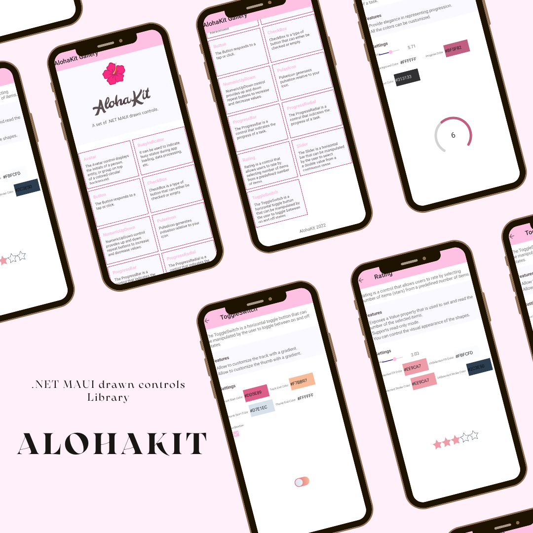
A set of .NET MAUI drawn controls.
NOTE: There is an experimental project in .NET called Microsoft.Maui.Graphics.Controls (GraphicsControls) with drawn controls. The main goal of GraphicsControls is to validate if there are interest in .NET MAUI drawn controls, creating the controls that were available in Xamarin.Forms Visual with Cupertino, Fluent and Material Design. GraphicsControls controls implement existing controls in .NET MAUI in a drawn way with the same properties, events, etc. On the other hand, AlohaKit is a personal project also with drawn controls but without strictly following the .NET MAUI control interfaces. That is, we can have in AlohaKit a Rating control for example that was not part of Xamarin.Forms Visual or the Button control can have a Stroke property of type Brush while in .NET MAUI it is a Color. AlohaKit main goal is to offer more options to developers with more controls showing another way to create controls but is not an alternative or replacement for GraphicsControls, are not the same library and do not have the same goals.
Usage
Step 1: Include the AlohaKit package reference in your project.
Step 2: Enjoy coding!.
Controls
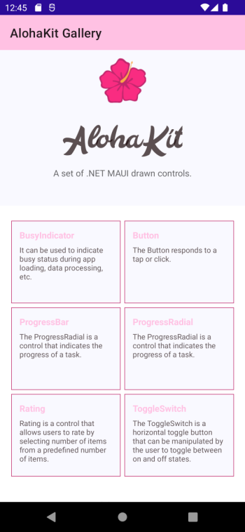
The controls available are:
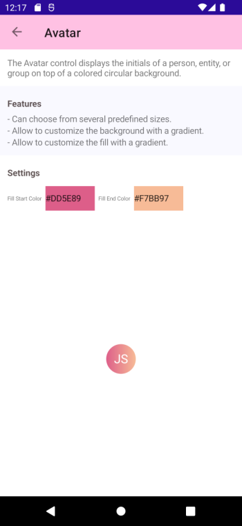
Avatar
The Avatar control displays the initials of a person, entity, or group on top of a colored circular background.
Features:
- Can choose from several predefined sizes.
- Allow to customize the background with a gradient.
- Allow to customize the fill with a gradient.
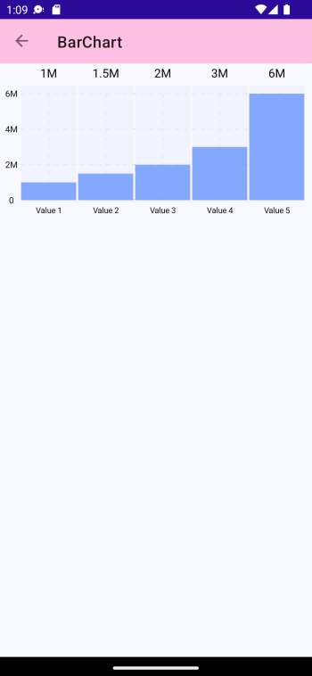
BarChart
The BarChart is a control that provides a way of showing data represented as vertical bars.
Button
The Button responds to a tap or click.
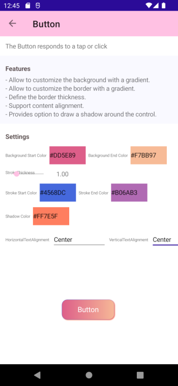
Features:
- Allow to customize the background with a gradient.
- Allow to customize the border with a gradient.
- Define the border thickness.
- Support content alignment.
- Provides option to draw a shadow around the control.
BusyIndicator
It can be used to indicate busy status during app loading, data processing, etc.
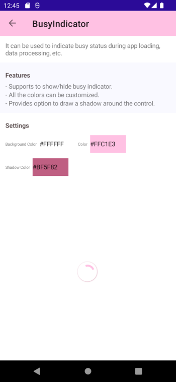
Features:
- Supports to show/hide busy indicator.
- All the colors can be customized.
- Provides option to draw a shadow around the control.
CheckBox
CheckBox is a type of button that can either be checked or empty.
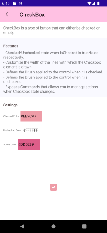
Features:
- Checked/Unchecked state when IsChecked is true/false respectively.
- Customize the width of the lines with which the Checkbox element is drawn.
- Defines the Brush applied to the control when it is checked.
- Defines the Brush applied to the control when it is unchecked.
- Exposes Commands that allows you to manage actions when Checkbox state changes.
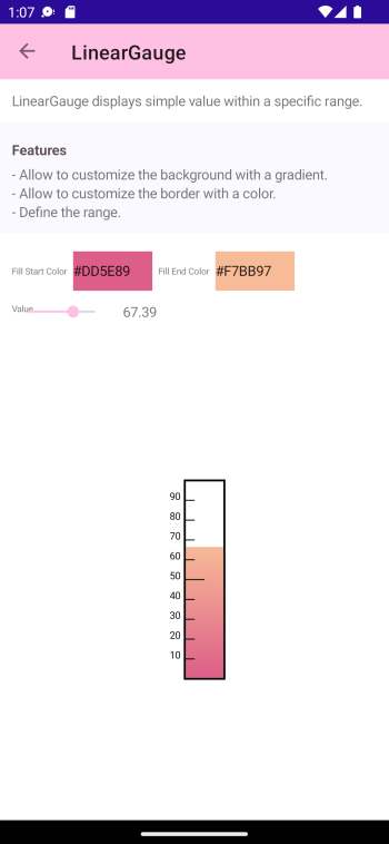
LinearGauge
LinearGauge displays simple value within a specific range.
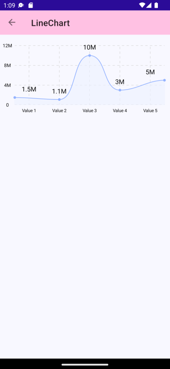
LineChart
The LineChart is a control that provides a way of showing data represented as a line.
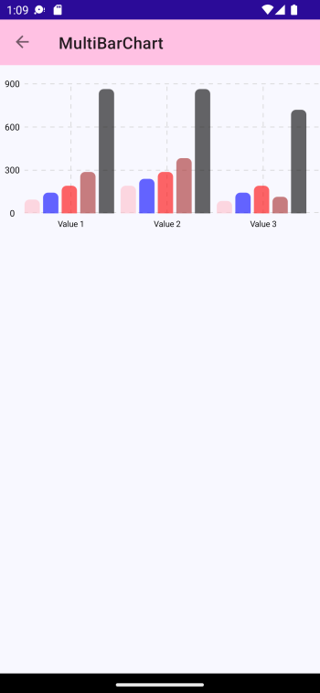
MultiBarChart
The MultiBarChart is a control that provides a way of showing groups of data represented as vertical bars.
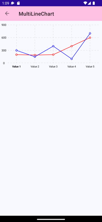
MultiLineChart
The MultiLineChart is a control that provides a way of showing groups of data represented as multiple lines.
PulseIcon
PulseIcon generates pulsation relative to your icon.
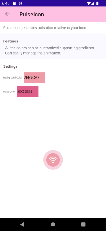
Features:
- All the colors can be customized supporting gradients.
- Can easily manage the animation.
ProgressBar
The ProgressBar visually represents progress as a horizontal or vertical bar that is filled to a percentage represented by a float value.
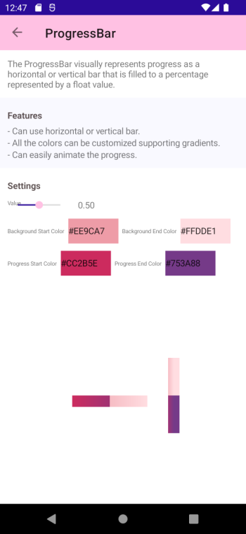
Features:
- Can use horizontal or vertical bar.
- All the colors can be customized supporting gradients.
- Can easily animate the progress.
ProgressRadial
The ProgressRadial is a control that indicates the progress of a task.
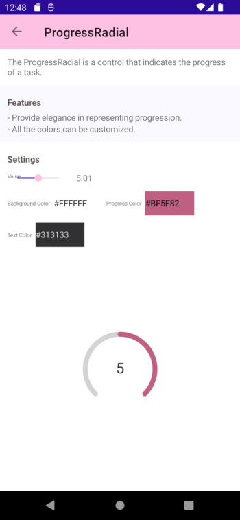
Features:
- Provide elegance in representing progression.
- All the colors can be customized.
Rating
Rating is a control that allows users to rate by selecting number of items (stars) from a predefined number of items.
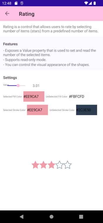
Features:
- Exposes a Value property that is used to set and read the number of the selected items.
- Supports read-only mode.
- You can control the visual appearance of the shapes.
Slider
Slider is a horizontal bar that can be manipulated by the user to select a double value from a continuous range.
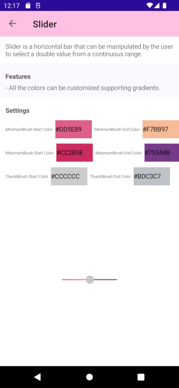
Features:
- All the colors can be customized supporting gradients.
ToggleSwitch
The ToggleSwitch is a horizontal toggle button that can be manipulated by the user to toggle between on and off states.
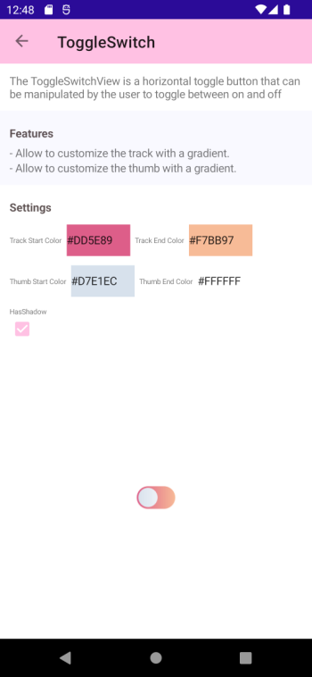
Features:
- Allow to customize the track with a gradient.
- Allow to customize the thumb with a gradient.
Contribute
Do you want to contribute?.
Found a Bug?
If you find a bug, you can help me by submitting an issue. Even better, you can submit a Pull Request with a fix.
Submitting a pull request
For every contribution, you must:
- Test your code.
- target main branch (or an appropriate release branch if appropriate for a bug fix).
Feedback or Requests
Use GitHub Issues for bug reports and feature requests.
Principles
- Principle #1: Kept AlohaKit simple.
- Principle #2: Any control added must be a drawn control and allow to extend and customize everything.
Copyright and license
Code released under the MIT license.
Open Source Agenda Badge
