Gericop DateTimePicker Save
Material themed DateTimePickers from the Android framework for all API levels (API 14+)
Material DatePicker and TimePicker dialogs from the Android framework package with AndroidX
This project is ported from the Android framework. In order to make the pickers material themed on older devices (pre-Lollipop), the appcompat library is used for base theming and vector drawable handling. The widgets always use the custom layouts, this is a complete replacement for the framework pickers. This also means that they have the same look-and-feel on all API levels.

Donation
If you would like to support me, you may donate some small amount via PayPal.

Setup
Add this single line to your gradle file:
implementation 'com.takisoft.datetimepicker:datetimepicker:1.0.3'
And use one of the Theme.AppCompat themes (or a custom one based on that) as your Activity's theme.
Now you can use the following material themed picker dialogs:
-
DatePickerDialog(fromcom.takisoft.datetimepicker.DatePickerDialog) -
TimePickerDialog(fromcom.takisoft.datetimepicker.TimePickerDialog)
Additionally you could technically use DatePicker and TimePicker from the com.takisoft.datetimepicker.widget package inside a layout as an inline view, however, they do not support scrolling containers, so it's recommended to stick with the dialogs instead.
This lib now uses AndroidX. If you don't want / can't migrate to AndroidX yet, check out the
old-supportbranch.
Customization
You can override the following attributes in your theme (check out the default styles for details):
| Attribute | Description | Default (dark) / (light) |
|---|---|---|
datePickerStyle |
The DatePicker's style |
Widget.Material.DatePicker / Widget.Material.Light.DatePicker |
datePickerDialogTheme |
The DatePickerDialog's style |
ThemeOverlay.Material.Dialog.DatePicker |
timePickerStyle |
The TimePicker's style |
Widget.Material.TimePicker / Widget.Material.Light.TimePicker |
timePickerDialogTheme |
The TimePickerDialog's style |
ThemeOverlay.Material.Dialog.TimePicker |
numberPickerStyle |
The NumberPicker's style which is going to be used if there's not enough room on the screen for the normal pickers |
Widget.Material.NumberPicker / Widget.Material.Light.NumberPicker |
calendarViewStyle |
The CalendarView's style |
Widget.Material.CalendarView / Widget.Material.Light.CalendarView |
Watch out not to include the
android:prefix before the attribute names if you want to override them as it will not work. These attributes have been (re)defined for the project in order to be able to access the internal details, which means that they do not belong to theandroidnamespace anymore.
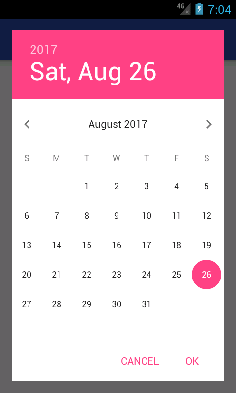
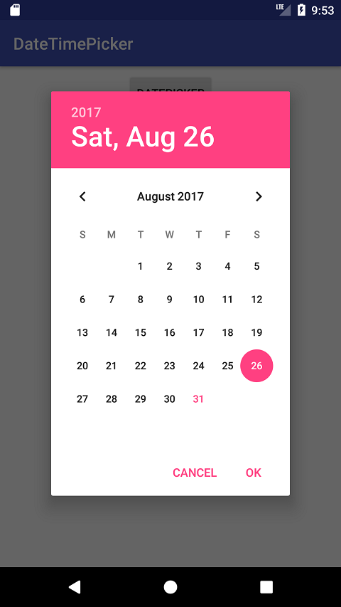
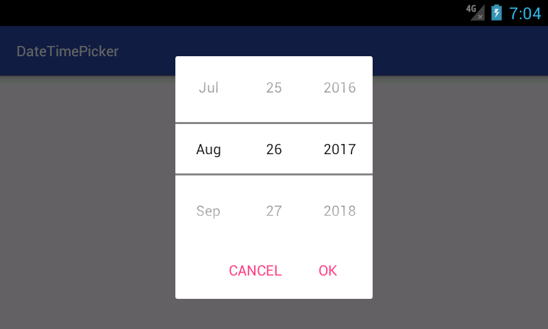
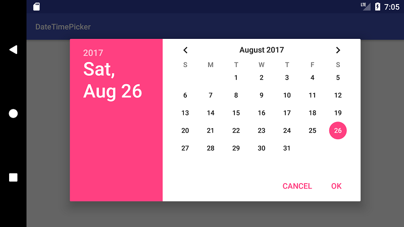
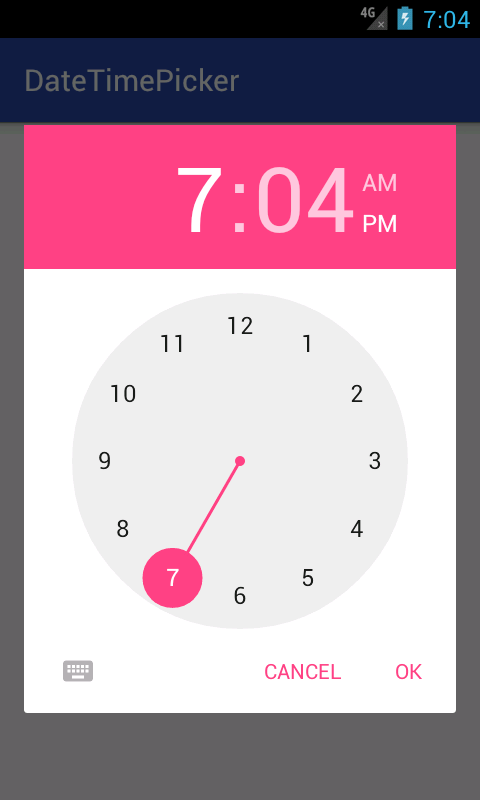
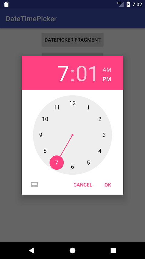
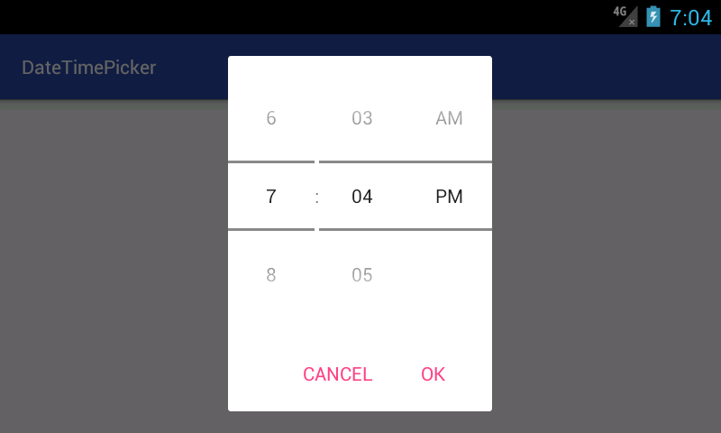
Some pictures
| API 15 | API 26 |
|---|---|
 |
 |
 |
 |
 |
 |
 |
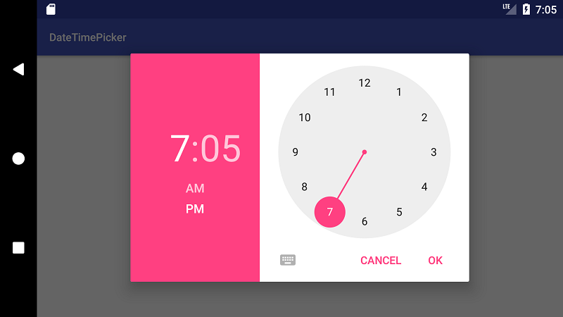 |
You can see that in landscape the API 15 images show spinners instead of a calendar view. This is because there is not enough room for the calendar, so the spinners are used as fallback.
Open Source Agenda Badge
