AnyChart Qlik Versions Save
AnyChart Extension for Qlik - 36+ new chart types (+ Gantt Charts!!!)
v2.6
5 years agoAnyChart Qlik Extension, Release v2.6
Sankey Chart
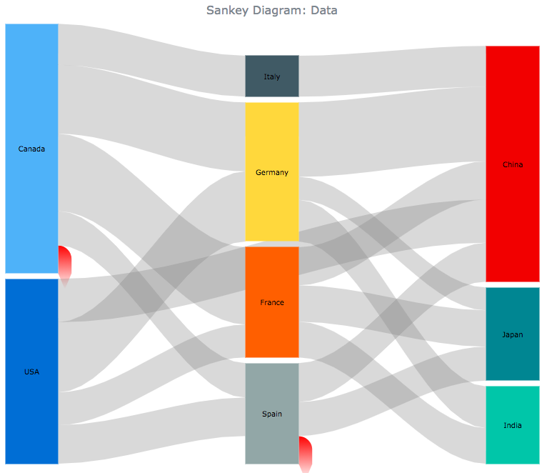 |
A Sankey diagram, or chart, named after Captain Matthew Sankey, is a flow diagram that shows nodes linked by flows, the quantity of each flow being represented as its width. This chart type emphasizes the major transfers or flows within a system and helps to locate dominant contributions to an overall flow. |
Reset to default settings
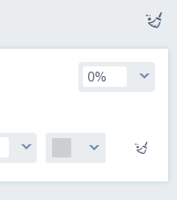 |
User interface extended with reset buttons that allow to reset settings to default values. It can be done on an exact input field and on the whole setting panel level. |
Improvements
- Inproved inputs with function values behaviour
- Fixed bug in custom scale panels
v2.5.1
5 years agoFixed critical missed css file issue from previous release.
v2.5
5 years agoAnyChart Qlik Extension, Release v2.5
Note: this release has a critical issue and was deprecated. Please update to 2.5.1 or higher.
Gantt Chart
 |
Project Gantt Chart is intended for showing a progress of completion of a single task or a group of tasks, taking into consideration their planned and actual time periods, along with a progress made, tasks hierarchy and order. |
Tag Cloud
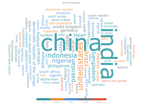 |
A tag cloud, otherwise known as a word cloud or weighted list, is a visual representation of text data. This chart is typically used to show keyword metadata (tags) on websites, or to visualize free form text. Tags are usually single words, and the importance of each tag, which is often based on its frequency, is shown with font size or color. |
Improvements
- Improved data fetching mechanism.
v2.4.1
5 years agov2.4.0
5 years agoAnyChart Qlik Extension, Release v2.4.0
Multiple scales for axes and series
 |
Additional scales of Ordinal, Linear, Logarithmic and DateTime type can now be used. Scales can be set to series, grids and other objects. You can also configure the default chart scale. |
Localization Support
 |
Anychart Qlik Extension now supports full localization of input and output date/time and number formats, based on the AnyChart locale mechanism. Learn more about localization here. |
Falling/Rising coloring controls for Waterfall and OHLC series
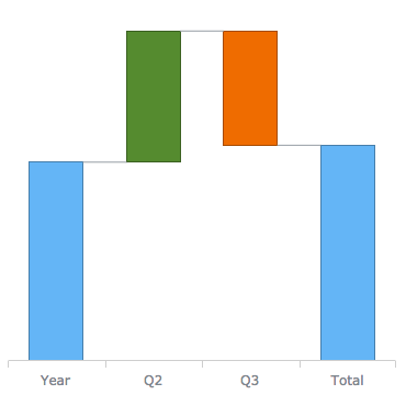 |
Total/falling/rising colors can now be configured for waterfall, candlestick and ohlc series. |
Labels rotation settings
 |
Series and axes labels can now be rotated. |
v2.3.0
6 years agoAnyChart Qlik Extension, Release v2.3.0
Linear Gauges
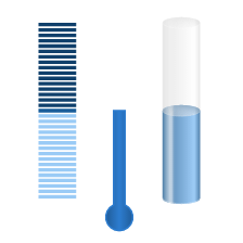 |
The Linear Gauge is a visualization of tools with a linear scale, such as thermometers, tanks, color indicators (LED), and so on. Data values can be displayed on a linear gauge axis with the help of pointers, markers, or ranges. |
Circular Gauges
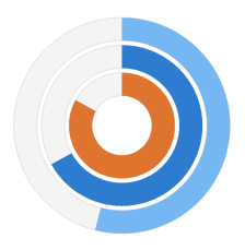 |
A Circular Gauge is a type of gauges with a radial scale such as speedometer, ammeter, voltmeter etc. The specified value is displayed on Circular Gauge axis using a pointer or a marker or a range. |
Data Field Tokens
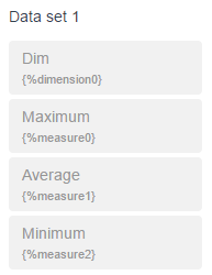 |
Data field tokens are displayed now in the Connected Data Set section. Tokens are presented in {%dimensionN} or {%measureN} formats, and you can use them in settings such as data labels format or tooltip title and caption. |
Lock Series Name Feature
By default, the name of the series is the label value of the corresponding measure or dimension. Lock/unlock button is added to the Series Name field to switch this behavior off and to set the series name manually.
Multidimensional Behavior
When several dimensions are used, the dimensionGroup field is added to the data row. Its value is the sum value of all the dimensions. Also fixed point selection issue with multidimensional data.
Migration from previous version
After update AnyChart Qlik Extension from the previous version 2.2.0 (or older) you should remap your data for few steps:
- Open the Chart Editor by clicking the Run Chart Editor button
- On the screen Setup Chart reselect the data fields for each of the series
- Click Next button
- Click Complete button
All the previous settings of the chart will be retained.
v2.2.0
6 years agoAnyChart Qlik Extension, Release v2.2.0
Treemap Chart
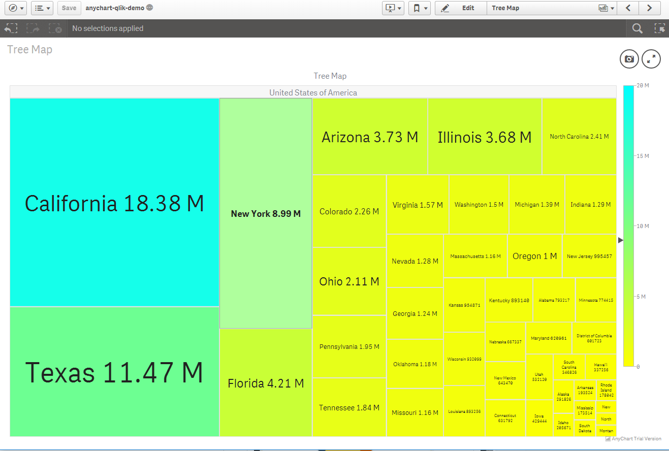 |
The Treemap Chart is intended for the visualization of hierarchical data in the form of nested rectangles. Each level of such a tree structure is depicted as a colored rectangle, often called a branch, which contains other rectangles (leaves). The space inside each of the rectangles composing treemaps is highlighted based on the quantitative value of the corresponding data point. |
Radar Chart
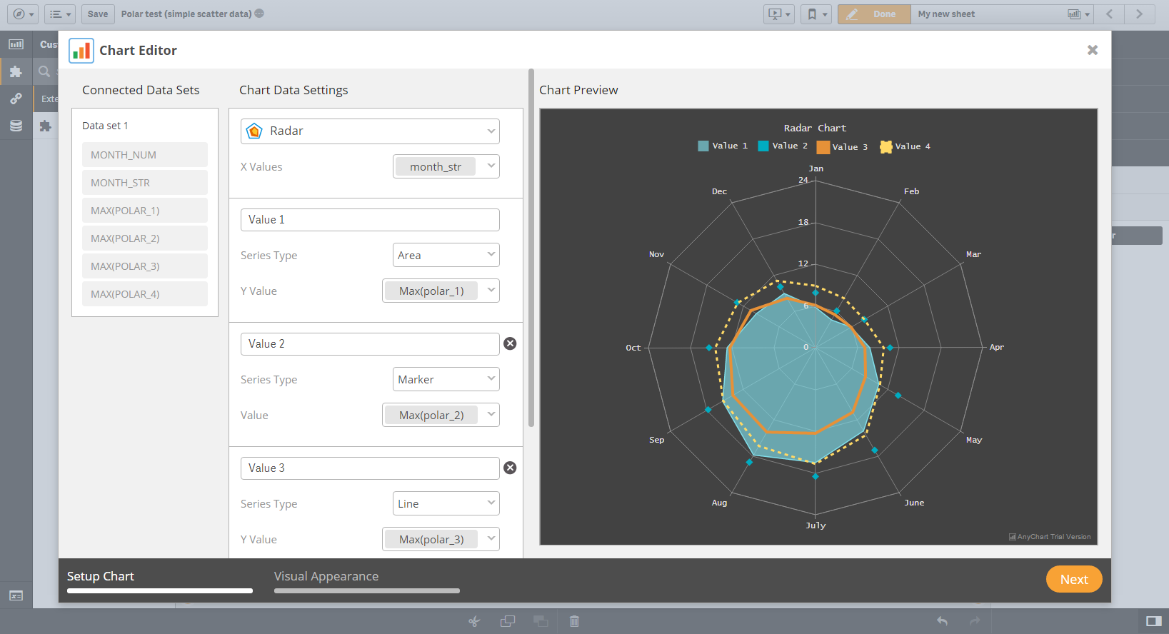 |
Radar Charts are an effective type of data visualization for comparative analysis. Each variable is represented on axes. All axes use one scale and are arranged radially within the same distance from each other. The series is shown as a line that forms a closed polygonal chain by connecting data points on axes, and in this way it displays the value of the phenomenon in question in a given category. |
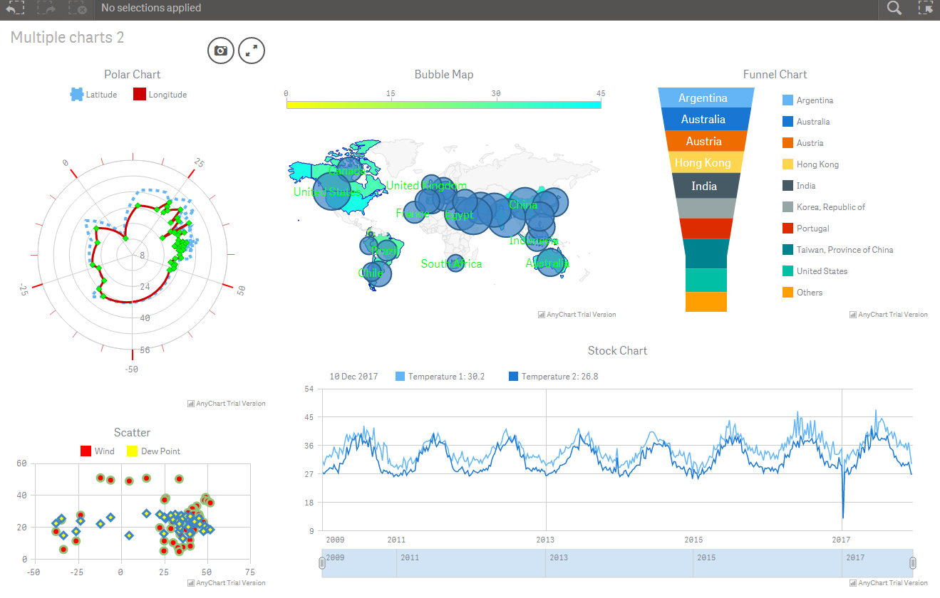
Polar Chart
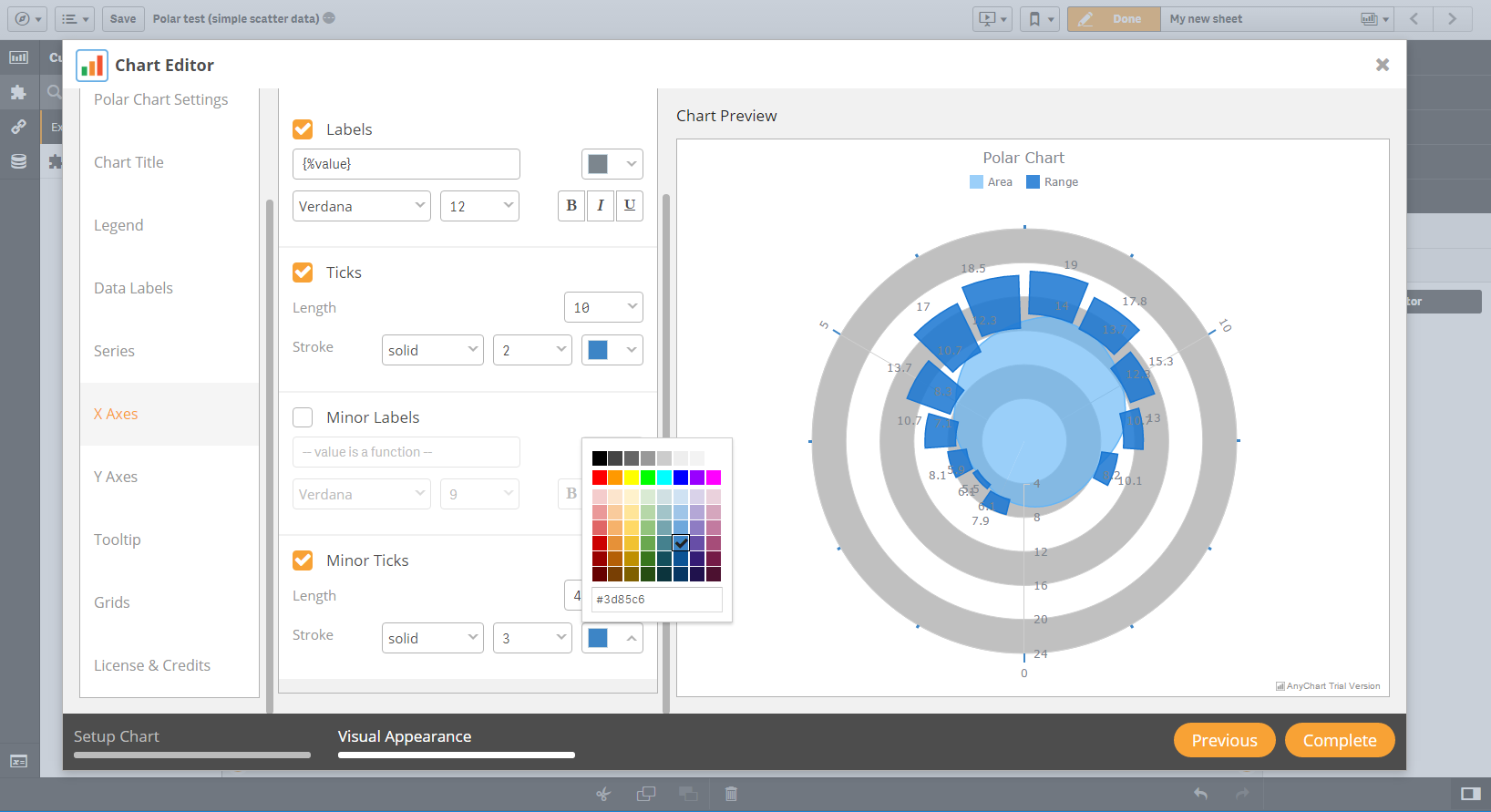 |
The Polar Chart is a common variation of circular graphs.It is useful when relationships between data points can be displayed most easily in terms of angle and radius.The series is represented by a closed curve connecting points in the polar coordinate system.Each data point is determined by the distance from the pole (the radial coordinate) and the angle from the fixed direction (the angular coordinate). |
New Chart Type Select Control
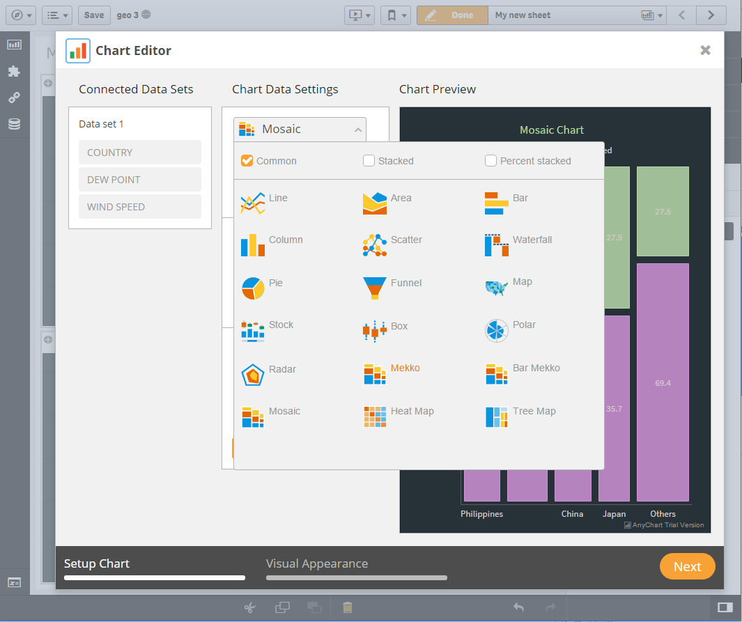 |
New Chart Type Select Control provides an easy, convenient way to select chart type in Chart Editor interface. It gives you an ability to utilize all power of filters and chart preview images. |
AnyChart Qlik Demo Application
 |
AnyChart Qlik Demo Application is a [anychart-qlik-demo-application.qvf](https://static.anychart.com/cdn/images/qlik-screens/anychart-qlik-demo-application.qvf) file which contains several sheets with all chart types available in AnyChart Qlik Extension. This Demo Applications files allows you to learn all the power of AnyChart Charts in combintation with Qlik Data Analytics Platform. |
v2.1.0
6 years agoNew Chart Types
- Waterfall Chart
- Mekko Chart (Marimekko Chart)
- Barmekko Chart
- Mosaic Chart
Improvements
- Added Pie Chart specific setting tab
- Added config.js file with Qlik measures and dimensions settings
Bugfixes
- Fixed bug with DateTime text formatting
- Fixed bug when Chart Editor don't receive more than 6 measures
v2.0.1
6 years ago- Added Area Chart
- Series now inherit their names from the measure labels
- Now you can use measures label as dataset field names
- Added ability to set data label position settings
v2.0.0
6 years agoGeneral Improvements
- Brand new chart building interface using AnyChart Chart Editor
- Ability to add multiple measures
- Ability to setup license settings on the plugin level
New Chart Types
- Heat Map
- Box Chart
- Stacked/Percent Stacked Area Chart
- Stacked/Percent Stacked Bar Chart
- Stacked/Percent Stacked Column Chart
- Funnel Chart
- Stock Chart
- Choropleth Map
- Bubble Map
- Dot (Marker) Map
New Features
- Chart Title settings
- Data Points Labels settings
- Data Points Labels settings
- Series settings
- Grids settings